Monday, December 23, 2013

Merry Merry Christmas 2013


Wow - I can't believe it's already Christmas Eve's Eve! It seems like yesterday we were enjoying our turkey at Thanksgiving and poof now it's almost Christmas. This has been such a great holiday season full of all kinds of firsts for us newly married folk. You've seen our first year decorating our house for Christmas and now here is our first Christmas card:


After several days of celebrating with family, we have landed in Ringgold where we are nestled in for a wonderful Christmas with more celebrations to come this weekend. We have so much to be thankful for this time of year and always! To all of our friends and family far and near and all of you dear readers out there in the blogosphere - Merry Christmas! Gotta go watch Christmas Vacation now...see ya next year! ;)

Photo by Tisha Callaway Saunders of Flashback Photography and Christmas card by Zazzle

Wednesday, December 18, 2013

#Northcliff Kitchen Reveal


There's really nothing quite as satisfying and fascinating as a good Before and After project. So, my gift to you on this day, one week before Christmas, is one of my favorite Before and After reveals to date. I posted a little intro to this remodel back in January where I dubbed this project #Northcliff. If you missed out on that post, here are some of the Before photos to get us all on the same page as to where this story started.


The best before and after projects begin with a client who is open minded. With every project there is an owner. The person who lives in their space every day. . For some everyday for 30 years, for others everyday for 3 months. Regardless, when you live in a space and see it day in and day out it's hard to imagine it any other way. Even for me, a lot of times I like to design a space before actually seeing it in person, this way I don't get the existing layout stuck in my head. When you're working with wall dimensions and anything is possible, you can truly re-imagine a space allowing it work to it's optimal potential. Luckily, these clients were super open-minded, and because of that, the whole space was completely re-designed.


The new design featured an island, a focal wall, loads of symmetry and storage solutions around every corner. The space wasn't terrible before, but even on paper you can see how open the space became by deleting the peninsula, repositioning the cooktop and adding an island. 

As great as ideas on paper can be, you actually need someone to make it all happen. For this project that someone was Chris Pfahl of Dreamweaver Building & Remodeling. I can't stress enough how essential a good, dependable remodeler is. While the design is essential to the redesign of a space, you are no where without someone who can bring the ideas and drawings to life. There are a lot of contractors out there, but few of them can get the job done without making you want to pull your hair out. This is your house, your dream kitchen/bath/basement, your money - you want someone who can see the big picture and make the process as painless as possible. These projects end up being a huge collaboration and it's amazing how much a good team attributes to a great experience. I think we are all proud of how this one turned out, let me show you around:
                      

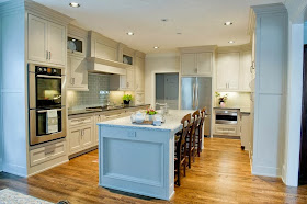
Isn't she pretty? The cabinetry is Bell Custom Cabinetry by Bell Kitchen & Bath Studios. The cabinetry construction is beaded inset and the finish is Benjamin Moore's Smokey Taupe - 983.


I love a good focal wall and this one was created by rearranging some key components in the space. By removing the existing pantry and relocating the cooktop and oven to the back wall, a well balanced and symmetrical focal wall was born.

With the oven and cooktop on this wall, accessories and design details were added to complete the cooking hub in this space.


Deep pot drawers were designed under the cooktop for easy access to pots and pans. Pullouts were placed to either side of the cooktop for easy access to spices and crockery. Yes, crockery - the fancy word for spatulas, wooden spoons, etc...basically all of those utensils typically shoved in a drawer or set in a container on the countertop. 

As a symmetry lover, I designed the wall cabinet to the far right to come down to the counter so as to balance with the oven tower on the far left of the cabinetry run.


An Aventos lift was installed on this cabinet for easy access to the toaster and coffeemaker stored inside.

Here's a shot of the other side of the kitchen: 


The refrigerator is the only appliance that stayed in the same general location. I really like the refrigerator and microwave drawer on this wall. 


To me, this location is ideal for both the refrigerator and microwave because it's close enough for the cook to access when preparing a meal, but out of the way enough that should someone want to pop in to grab a carrot or warm their coffee, their not an interference within the cooking zone. 


This whole corner of the kitchen provides ample storage. We even added a LeMans corner pullout so the blind corner could be easily accessed and utilized. These pullouts are God's gift to kitchen corners - it will save you from getting down on your hands and knees to retrieve stored items. They are so smooth, so easy and so functional. 

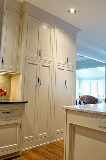
As I mentioned above the house pantry was demolished to make way for the focal wall, so two tall cabinets were installed to house all of the pantry items. 


These pantries are not very deep due to the walk space behind the island but they are super functional. 


Roll outs were installed in each pantry for easy accessibility to all that is stored inside. When it comes to a pantry, deeper is not always better. The deeper a space is, the easier it is for items to get lost. Roll outs allow the goods to come towards you so you can easily see everything inside. 

The breakfast room sits right off the kitchen and came with a desk:


It was decided the desk would be eliminated and a wet bar would be added to the space instead. The wet bar was going to be placed on a different wall between the breakfast room and the living room. Because this piece would be seen from the kitchen we wanted it all to tie together. So the cabinetry construction and color stayed the same, but some custom mullions were designed to give the bar it's own unique personality. 


So beautiful. 

A space totally transformed, a kitchen with a new life - it doesn't get much better than that friends. If only all clients could be this great and all contractors this easy to work with. Merry Christmas and a Happy Kitchen!

All Before photos were provided by the homeowner and all After photos were taken by Jen Wunderlich Photography.

Wednesday, December 11, 2013

Oh Christmas Tree...

....In my front yard,
finally I don't hate you!!
(to the tune of O' Christmas Tree)

OK, hate is a strong word, but I've been waiting for this day for nearly a year; the day the giant Christmas tree in my front yard was relevant. For those of you who have been following along since Brent and I purchased our first home last December you know that I've had a serious love-hate relationship with said Christmas tree. But, finally the time came for us to decorate the beast along with the rest of our house.

In truth, Brent and I have been scheming and planning for this decorating escapade for awhile now. Tossing around ideas, pricing out various decorations and picking up supplies here and there. With less days between Thanksgiving and Christmas this year we wanted to be on our A-game to ensure we got to enjoy these decorations for as long as possible. With that being said don't judge me too hard when I say we started our decorating INSIDE the house the weekend before Thanksgiving.

Yes, we are those people. Let me show you around...

The dining room:
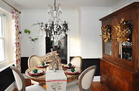

Doesn't Brenta the horse head just make the table? :)

I love the texture and color of the wreaths on the hutch. 

The Living Room: 


Holiday explosion! As I mentioned we bought our tree the weekend before Thanksgiving and our house has been smelling heavenly ever since. 


We jolly - ed up the couch....


and hung our stocking on the mantle with care...


Happy Mail Home fiasco aside, I still decided to throw a wreath the pantry door's way. 


And what outdoor kitchen is complete without a Egg Claus? Ho Ho Ho


Front facade:

The day after Thanksgiving we drug all of our supplies outside and got the party decorating started, but not before we snapped this picture to show most of our loot.


To begin we de-Fall-ified the front porch, something just didn't feel right about introducing a new season while another one still lingered. Bye, bye pumpkins, hello garland!


While Brent worked on the front porch, I was on wreath duty. 


Brent polished off the front porch with a big ol' wreath of his own. 


Next, up on the ladder again, Brent hung lights along the roof line on the front of the house. 


With the front of the house decked out it was time to focus on THE TREE. You know the one....


My Dad and Brent climbed high atop their ladders and began hanging lights.


I hung the first ornament to show everyone how it's done. 


My Dad caught on fast and hung some of the highest ornaments. My Mom was his coach. 


I love this picture! The entire process was a huge team effort, that tree was a tough cookie, but he grew more and more appealing with each added piece of decor. 


The final step was the garland. From the day I knew a white picket fence was in my future I began dreaming of this fence adorned with real garland. The smell! The texture! The charm!

Speaking of charm....


A night shot...


And an up close of the tree, complete with little glowing presents. 


You can see the sparkle from our yard as soon as you turn on to our street! Confession: sometimes we purposefully pass the house just to get the whole experience as we are coming home.The house just feels so cheerful! 

I guess it's official, these decorations can never come down, everything feels too cozy and happy. Yep, you're hearing right we will now have Christmas decor up year round. Funny how quickly we can go from classic charm to redneck, eh? 

Merry Christmas & Happy New Year from the Shearers and The Cow!

All photos are my own. 

Thursday, December 5, 2013

2014 Color of the Year


As if this month wasn't full of enough excitement with the holidays right around the corner, each year Pantone slaps on more anticipation and excitement by choosing December to announce their pick for Color of the Year. This time last year Emerald Green was announced as the color of 2013. There's no doubt Emerald Green had a good run, but I've been itching for a new hue. From the moment the calendar rolled over to December 1st I've been waiting anxiously for the announcement, checking every day and finally the color has been revealed!

.....drum roll please......

Picture from Pantone's website. 

That's right, Pantone's 2014 Color of the Year is Radiant Orchid 18-3224. 

In Pantone's statement about their choice they said, "An enchanting harmony of fuchsia, purple and pink undertones, Radiant Orchid inspires confidence and emanates great joy, love and health. It is a captivating purple, one that draws you in with its beguiling charm."

Ok, so I had this idea that I would be a super designer and paint my front door the Color of the Year each year. You know, really support the cause. But, after Tangerine Tango (people might mistake me for a VOLS fan) and now this purple pink, I think this idea might get me divorced. 

Don't get me wrong, I'm actually pretty excited about this color! Not for a front door but for a whole slew of other applications. As soon as the color popped up on my screen I instantly smiled. It's so bold and soft at the same time and full of personality. Some of you may be surprised to hear my excitement about this color, because of a little color prediction I made of my own back in September. But I'm not bitter, in fact being wrong never felt so right! 

Let's explore some ways you could integrate Radiant Orchid into your life in the coming months. 


The purple hue plays so well with the neutral backdrop and adds a pop of personality to the space. A pillow is the perfect option for those who love the color in the moment but know they don't necessarily want to stick with this color scheme for the long haul. A pillow never hurt anyone.


I love that this color is so versatile. It can be paired with a loud pair of pants and be considered an accent in the ensemble, or it could be worn with dark denim and be the pop. Interestingly, Pantone said, "Radiant Orchid's rosy undertones radiate on the skin, producing a healthy glow when worn by both me and women. A dazzling attention-getter, Radiant Orchid permeated the runways during the spring 2014 fashion shows and is already making its way onto the red carpet." 

I can see this color adorning anything and everything including shoes, a clutch, statement necklaces, cell phone covers, nail polish, and rings...pop, pop, pop! 


I'm loving the Radiant Orchid paired with the yellow, red and white. This color combination really works and makes for a pretty room that's both bold and feminine.  


This room is all like, Hey, I'm neutral with fabulous texture (fuzzy stools) and then BAM...hello Radiant Orchid, don't you just make a statement. Art is always a commitment on some level, purple art, even more so. 

Oh, Radiant Orchid, I love you. You were a pleasant surprise and I can't wait to see you in abundance in the year to come! What do you guys think? Do you see yourself and Radiant Orchid teaming up in the coming year? Or do you want to sit back in your Emerald Green sweater and squeeze your Tangerine Tango pillow and pretend this announcement never happened? 

Unless otherwise noted all photos are from google search. 

Wednesday, November 27, 2013

100th Post - Ask & You Shall Receive


Today marks my 100th post! To celebrate I will be answering YOUR questions as promised. I figured a question or two may have come up over the course of 99 posts and boy was I right.  I was so stoked to receive so many questions over the past few weeks and I've done my best to answer them, so without further adieu, let's dive in:

Question: I enjoy your blog and notice that your husband, Brent, is often working with you on design projects. You make a great team, Beauty and Brawn! Have you ever come up with a design idea for your own home that he hated and you had to talk him into it? If so, can you tell us about it.


Who us? Disagree? NEVER!

...


OK, OK, fine.....The answer is YES, but before I elaborate let me explain a few things:

I'm always thinking about design, even when I don't mean to be, and I have a tendency to obsess over things. 

With that being said, because my world is so consumed with all things design, I'm often inspired by random things which cause me to think up ideas. Some of these ideas are good and some are wacky. Often times Brent does require some coaxing on certain ideas and sometimes he flat out squashes them. But there are other times when he wants to squash them but it's too late. I've already decided on it in my mind and begun the process of obsessing. Once that happens it's hard to talk me back off the ledge. 

A few examples of this: 

1. Painting the chair rail and paneling in our dining room black. 


After it was all said and done I think Brent is pretty happy with the outcome and we are both pleased with how the space has come together. 

2. Painting the brass chandelier blue


Brent was NOT on board with this but I talked him into it and....he was right. Gosh, that was even hard to write. But alas, he was, the blue was all wrong for the space. 

3. We have a three piece octopus painting hanging over our couch in our living room. Now, I know I haven't posted about our living room yet, so you are going to have to trust me here but this picture works. It's the perfect mix of weird and cool. I knew it the first time I laid eyes on it while shopping in Chattanooga. Brent literally laughed in my face, dead against the octopus. He now hangs in our living room and I'm pretty sure Brent likes him more than me. 

These are just a few examples, but the important thing here is the fact that Brent and I are truly a pretty good team. Sometimes I'm right and sometimes Brent's right. We both have our strengths and weakness and we both bring good qualities, ideas and expertise to the table. We balance each other out and, together we have completed some pretty great projects. The easier question might be how many projects do we start out completely in agreement? The answer: very few...but we aways end up on the same page by the time it's all said and done. 

Question: What was the final resting place of the turquoise chandelier? Have not seen it in recent posts?

Who, this guy? 


After the blue chandelier was replaced with our new chandelier in the dining room the blue one went to the basement where it resides to this day. It's final resting place is still TBD. 

Question: I have beige tiles around my fireplace (including the floor that connect to the carpet). I want to have a more cohesive look with the white mantle and trim. What are my options for painting the tiles white? The grout is an off-white color. 

Great question! I think a lot of people can relate to this issue. I know I had a similar situation at my house, except our tile was peach (yack) and connected to hardwood floors... 


To improve the look of the tile surround we simply painted the tiles white. Before painting we primed the tiles and then gave the entire fireplace including the mantle a fresh coat of Benjamin Moore's White Dove, OC-17. Our tiles were ceramic, so before we painted them we sanded the surface so the paint would easily adhere. 


The entire process was quick and easy and drastically improved the look of the space.

Question: So I love our Kitchen, but I feel like it is so builder grade and plain! What would you recommend to spice it up a bit and make it a little more unique? We have black appliances, dark granite counter tops, and oil rubbed bronze hardware on our light brown cabinets. You have seen it before, but I can send you another pic :) HELP please!

Another great question I think a lot of people can relate to!  To get everyone on the same page here is a shot of the kitchen in question:


When I look at this kitchen I don't think builder grade. The space feels warm and layered thanks to the contrasting colors and textures from the cabinets to the countertops to the hardwood flooring. To add another layer of interest you might consider adding a tile backsplash. Because the cabinets are a warm brown tone they will go with pretty much anything, so my suggestion would be to find a backsplash that compliments the granite countertops. Tile comes in so many different forms (travertine, ceramic, glass, metal, etc..) making it a great avenue to really add your own spin and personality to your space. I would also suggest looking into adding crown moulding to the top of the cabinets. You can buy crown moulding from Home Depot or Lowes and have it cut to the length you prefer and install it yourself. You would have to stain it to match the cabinets which might get tricky. If you can't find a stain that matches or  task of installing crown moulding seems daunting, then you might consider getting in touch with a local cabinet company to see if they could install crown moulding and color match it so it blends seamlessly with the stained cabinets. 


Question: You have mentioned the large Christmas tree in your front yard in several posts- what are the plans for decorating the tree this Christmas?

OH, we have plans, big plans. Decorating the tree for our first Christmas has been the only thing standing between the Christmas Tree and a big ol' axe. We wanted at least one holiday season so we could decorate it. Stay tuned for the final results of that! 

Question: Courtney, I love reading your blog and am fascinated by the way that you make seemingly-daunting home improvements seem relatively easy (though I know a lot of sweat - and maybe some tears - have gone into some of your projects!). My question is in regards to the outdoor kitchen. I know your post mentioned that you had to add some additional supports underneath the deck to support the weight of the concrete and the stone. How did you and Brent do that? And, how did you know how much extra support was needed? I'm curious to know if you built additional concrete supports or what!!

Great question and a popular one! During the process of the Outdoor Kitchen I was asked multiple times about the support under the deck. Now, to be fair, about 75% of the time my Mom was the one asking as she had this vision of the entire deck crashing to the ground due to the extra weight of the outdoor kitchen, but she wasn't the only one. As the posts started detailing the stacked stone for the pizza oven, the questioning became more frequent. I mentioned in this post that structural support was added but to ease EVERYONE's mind below is a shot of the supports under our deck. 


We started with 3 posts, but ended up adding 4 more as the process continued.  The 4 far posts are directly below the pizza oven and are connected at the top with (2) 2"x10" boards on either side.  The near posts provide additional support for the rest of the deck. As far as knowing how many supports to add, we kind of just guessed (welcome to Brent's process), but aired on the side of more is better. To install these columns Brent and Mark (Mark = major player in project outdoor kitchen, he helped with supports, stacked stone and concrete counters. It takes an army, folks) dug holes in the ground, placed the posts in the hole and then poured concrete in the hole to set the posts. So, FEAR NOT, our deck, outdoor kitchen, and the people enjoying them will NOT be falling to the ground anytime soon. 

Question: What is your favorite flooring for the kitchen?
Regardless of the specific type of flooring, my favorite look is when the flooring in surrounding areas matches that of the kitchen. There are so many finishes and surfaces throughout a kitchen. I like the idea of the flooring being a backdrop, instead of a focal point. Looks wise, I prefer hardwoods in the kitchen. I like the warmth they add aesthetically and the ease of maintenance. 

QuestionWhat are some creative options for storing spices so they are out of sight, yet easily and readily accessible to the chef?


This is a great question with all kinds of options! Today, I find myself placing spice storage in a variety of locations per the specific clients needs. A popular option for a lot of clients is pullouts to the side of the cooktop as shown in Chattanooga Project below: 


Photo by Gentle Giant Photography
This option keeps spices within reach and provides adjustable shelves for customization depending on the height of your various jars and containers. For those people turned off by the concept of bending down to retrieve spices, I also have some options for storing spices up higher. Another bonus, word on the street is it's not good for your spices to be too close to heat. So, with that in mind the next two options might be more appealing:

Photo from Rev-A-Shelf website. 
Spice storage installed to the back of wall cabinets is a great option for easy access storage. The model shown above is from Rev-A-Shelf and offers adjustability as well for various sized containers. Another plus, because this unit is installed on the door you still have usability inside the cabinet as well.

Photo from Rev-A-Shelf website. 
Spice storage inside a drawer is another great option. Again, the unit above is from Rev-A-Shelf and is tiered so you can see all of the spices you are storing in this space. Obviously, the number of spices you can store would be limited to the space allotted, but this is a great option for everyday spices you want on hand. 

Well, there you have it, answers to some of the most popular questions. This was such a fun post to write and I'm so thankful to all of my readers and everyone that submitted a question!  It was fun hearing from you all and I enjoyed answering your questions. THANK YOU for tuning in each week, you've made these past 100 posts a joy to write!

I hope everyone has a wonderful Thanksgiving tomorrow!

Unless otherwise noted, all photos are my own.