I don't like to play favorites with my projects, but every now and then a project comes together in such a way I can't help but want to put it in a tiny bottle and hang it around my neck so I can look at it whenever I want. Of course I realize this concept is totally unrealistic as no one kitchen is going to go with all of my outfits, so instead I write blog posts about them for all to enjoy.
In all seriousness I really have a treat for you guys today! I truly feel like kitchens like this are the reason why people (including myself) just can't resist a white kitchen. Elegant, classic, bright, happy.....so many adjectives, so little time. Let's dig in...
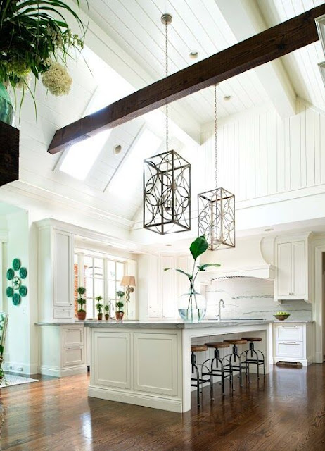
I first met this kitchen in the summer of 2014. The homeowner has great taste and the entire house and property is just beautiful, but the kitchen had never been touched. I so wish I had a before picture of this space, but I don't....Architecturally speaking the kitchen has really great bones with the beams and the skylights, but it was time for a more refined and updated look for this family.
This kitchen is unique in that every wall of this space is a focal in and of itself. There are four entrances into the kitchen from other parts of the house, so it was important to give each side of this kitchen it's own dose of personality, balance and beauty so regardless of which way you enter the room, something pretty is in your line of sight. The kitchen is separated from the family room by a two-way stone fireplace. You can see the mantle poking out in the picture below.
While the fireplace acts somewhat as a boundary line I love the fact that you can see around and through the fireplace into the family room or vice versa, into the kitchen, making this space feel like one big room. Cabinetry speaking, there really are two strong focal points in the actual kitchen space of this big room - the hood wall and the window wall. Luckily the size of each wall allowed for the cabinetry to have great balance.
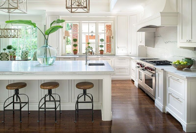
Here is a shot of the window wall. This is the view you would have entering the kitchen from the dining room and front hallway.
The custom hood was centered on the back wall over the 48" range.
As I said, because of the dimensions of this wall, the cabinetry flanking the range was not only functional but symmetrical. Spice and crock pullouts as well as large pot drawers were designed to go on each side of the range. And wall cabinets with custom brackets were designed to hang on each side of the hood. Symmetry really is a kitchens best friend.
Across from the window wall sits the refrigerator wall.
A refrigerator column and freezer column were centered on the wall. While the units themselves are only 84" high we made the wood appliance panels much higher to create a cool visual. The space above the refrigerator was covered with a finished panel so when you open the door to either unit, everything is nice and finished inside. Tricks like this make the appliances feel more like a piece of furniture. We kept all cabinetry on this wall tall so as to provide more storage. The microwave sits on a shelf inside the far right tall unit, so it's within reach when needed without being an eye sore.
Each and every cabinet was considered. From rollouts and two trash cabinets to a LeMans blind corner cabinet and spice and crock pullouts, we made the most of every piece of storage. All cabinetry is inset bead from Bell Kitchen & Bath Studios Signature collection. And while this space looked beautiful once we did our part the homeowner really brought everything to life with her tasteful styling and elegant touches. As soon as you step into this space you feel happy and that my friends is what a successful kitchen remodel is all about.


2 Appreciated Comments :
LOVE the way everything looks in this kitchen! Would you mind sharing the size of the island and if there is any functioning cabinetry across from the range?
What a beautiful remodel! I'm envious, and after seeing your back-splash, I wish I'd gone with something similar. I also had to make a lot of choices based on functionality over design when my husband and I did our remodel. Looking through all of our choices and picking just the right cabinets was time consuming but worth it!
Post a Comment