Monday, July 30, 2012

2012 HouseBeautiful Kitchen of the Year

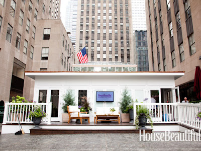
Each year HouseBeautiful selects a designer to design the "Kitchen of the Year," which is on display in Rockefeller Plaza in New York City. I'm not sure how to get to the top of the list of applicants for this opportunity, but I need to find out :). Talk about publicity!


Past designers include Christopher Peacock and Jeff Lewis (from E!'s Flipping Out) to name a few. This year, Mick De Giuilio was the lucky designer. I actually had the opportunity to meet Mick last year in Atlanta. He was speaking at ADAC, Atlanta's Decorative Arts Center. I really enjoyed hearing him speak and meeting with him, and I was very excited when I won an autopgraphed copy of his book - Kitchen Centric.

I'm a little behind the ball on this post, seeing as how this event occurred earlier in July. But, I figured we could all save the money on airfare and explore this Kitchen through photos instead of packing our bags and heading to NYC to see it in person. You're welcome.

Kitchen.
Another ...white... kitchen. I don't mean this negatively at all, but right now everyone is loving the classic white kitchen. Going in this direction was a gutsy move on De Giulio's part. The pressure was really on to create something unique and Kitchen-of-the-Year worthy. This shot doesn't knock my socks off, but I feel like the space is light and elegant. I like how the beams add dimension to the space while the mixture of textures add depth.


I really love this wall. The polished stainless steel open shelving creates an industrial meets elegant vibe. Also, notice the blue sink, it's kind of hard to see from this shot, but I think it was a smart and unexpected addition that gives the wall another layer of interest.

Speaking of blue...............................................

Butler's Pantry.
How beautiful! This is by far my favorite room/space/shot. De Giulio described this room as "a jewel box" and I couldn't agree more. The space was only 100 square feet but the use of light colored cabinetry mixed with glass fronts really makes the space look light and airy. He went as far as lining the interiors of the glass cabinety with a mirrored finish to give the space an even more open look. I also love the contrasting blue ceiling with the gilded iron fixtures - so chic'.


This is an interesting piece. Essentially the pots and pans are being displayed, which is pretty for a show home, but I'm not sure how functional this would be for a I-cook-in-this-kitchen-kind-of-kitchen. I do love the mixture of the walnut wood with the stainless steel and glass.


Dining Area.
This is my least favorite shot. It's a little boring to me and I really don't get the mismatched chairs. In my opinion, the best part of this space is the detailing in the ceiling and the light fixture.


Living Space off Kitchen.
This space sits off the Kitchen and is a place for guests to gather and visit while still being in the Kitchen/heart of the home area. I really like the asymmetrical vibe of the fireplace wall with certain items being off-centered.

Mick De Giulio did a nice job on this project. He definitely played off current trends, but also added some flare here and there that was unique and unexpected. As a kitchen & bath designer it's always an honor when you're work is seen and appreciated. Whether it's in a magazine, winning an award or being added to an idea book on Houzz or being pinned on Pinterest, publicity is publicity. Opportunities like this one through HouseBeautiful not only benefit the featured designer, but homeowners as well. Love it or hate it, it's a good way to get ideas and see the latest trends. 

All photos are from google search.

Thursday, July 19, 2012

Monkey in a Space Suit

The beginning of my week was spent at SubZero-Wolf appliance training. After any training you come away feeling pumped up and full of knowledge. I learned a lot and plan to share some tid bits with you in upcoming blog posts, but today, I want to talk about monkeys in space suits.


I know SubZero-Wolf would be thrilled that this story is the first thing I'm inclined to share with you after two long days of training, but some pieces of information just speak to you more than others, and the story of the monkey in a space suit did just that for me.

Back in the late 1950's, when space exploration was in full swing, the great minds at NASA decided training humans to be astronauts was too expensive and time consuming. Instead, they decided monkeys would be a better choice. The plan was to train the monkeys to flip a switch or push a button when a light flashed or a banana fell (I'm improvising here, but you get the point) while up in space. As life always goes, certain things happened upon arriving to space that were not expected.  If anything occurred that was outside of the specific training the monkeys had received, they had no idea how to handle it. They were incapable of problem solving or thinking outside the box. Obviously, every possible occurrence could not be accounted for, so needless to say, replacing astronauts with monkeys was an epic failure.

Hindsight is always 20-20, but clearly, NASA would of been better off investing in professionals who SPECIALIZED in these tasks, instead of trying to cut corners and go with a cheaper, "too-good-to-be-true" option. I know you are nodding your head in agreement, but steady your head and listen up. This type of situation/mindset/decision happens ALL THE TIME and the people at NASA are not the only guilty ones.

I can't tell you how many times a monkey in a space suit has been chosen over me.

So many people are concerned with getting the cheapest price and forget that cheaper does not always (or ever) mean better. I'm all about a good deal, but you have to understand that when you're talking about investing in your home you need guidance from people that know what their doing. During this recession companies have popped up all over the place that claim to do it all. Regardless of how good this sounds, the reality is, you can't be good at everything. The same company that cuts down your trees should not be designing your kitchen, anymore than the same doctor that cleans your teeth should be removing your spleen. People go to school and specialized trainings and have obtained experience in specific fields to better not only themselves but their ability to help you, the customer.

Just like space, kitchens and baths are not cut and dry. These spaces require a LOT of attention to detail and curve balls are around every corner. Years of experience and training equip qualified designers, contractors and builders with the ability to recognize warning signs and the knowledge to problem solve. Thus, things are less likely to get out of control, and you are more likely to have a good remodeling/building experience.

The best tool you can have is a qualified professional in your corner! Money is money, so before you opt for the cheapest option, consider that if you are unlucky enough to end up with a monkey in a space suit, the additional money required to right the wrongs of the confused, unqualified, stumped monkey brain will be far more substantial than the money you saved. By all means shop around, but keep in mind....


All photos are from google search.

Sunday, July 15, 2012

Cabinetry 2.0

Whether you're in the market to update the cabinets in your house or your just gathering ideas for future projects, I'm here to tell ya, cabinets have come a long long way. Today, cabinetry is so much more than a series of boxes lined up side by side. There are countless add- ons and modifications that can make your cabinetry, and ultimately your life, so much more organized and functional.

Here's the deal, if you're going to do a project, do it right. Doing it right has more to do with the consideration behind the decisions that are made than it does the dollar sign after them. Things don't have to be expensive to be awesome. At the end of the day you're paying to have a project done. You're paying for new cabinetry, so why not make the space work for you in every way possible? Slow down, look at the options you have, and really think about you and your family, and the way you live within your own space.

Below are some examples of cabinetry add-ons that show there is definitely an overall customization movement that puts as much emphasis on function as it does on form.


How handy is this? This space is usually left as a false drawer front because of the plumbing, but this add on is a genius way to make the most of this space. 

What a great way to store miscellaneous kitchen essentials in such a small space. 

We sell the heck out of these "crock pullouts" It's a great place to store your most used kitchen utensils and gets them off the counter top!
Pantry pullouts like this can add so much more storage space to a cabinet. Essentially you're laying the storage as opposed to having an open cave, where stored items cover each other up.

Cool way to get your paper towels off the counter!

I've been incorporating this laundry basket cubbie concept into a lot of my laundry room designs.  Great way to keep various clothes organized, every basket has a place. 
Incorporating an ironing board pull out is a great way to store your ironing board. Super accessible and easily concealed.

HOLY ORGANIZATION! Please keep in mind you would need some depth in your space to achieve this, but what a great concept. Many times we forget to consider where we would store brooms, mops, swiffers, cleaning supplies, etc...A piece like this keeps all things "cleaning" in one area.
I don't care who you are or how laid back you may be, an organized space is a happy space. For some, organizing is a must, and the lack of organization can literally cause them to com bust (Mom....:) ). To other's it's some thing they aspire to achieve, a work in progress if you will. Regardless, the tools are out there....go get them!

All photos are from Pinterest & Houzz.

Tuesday, July 3, 2012

Size Matters

Have you ever walked into a room and instantly loved it for so many reasons, none of which you can put your finger on? This has happened to me countless times. Some houses, rooms, spaces, even outfits just work and while the how is unclear, the fact is, design magic has happened.

There are several factors that come together to spark design magic, but one of the most important of those is scale. Scale is as important to design, as cheese is to cheese dip. Dead serious. Scale is one of those silent components that can really make or break a room.

Scale is the size relationship from one object to another.

Scale comes into play a lot in design. From the way you decorate your mantle, to the cabinets you choose to put on the same wall as your oven, to the pieces of art you choose for both large and small walls in your home. Scale is relevant everywhere.

Let's start with scale gone wrong.

This blog has been a long time coming. The final straw/slap in the face inspiration came while I was in Chicago in April, for the KBIS show.

This photo is my own.
THIS is my hotel room, and that tiny spec you see on the wall is not a cockroach, it's art. The only art on the entire wall. I mean, obviously they're trying (dear God, let's hope) to make some kind of understated design statement by choosing this size art for this size room, but I don't get it. All I see is a whole lot of wall and I'm bored.


It's hard for me to be negative about this room, I mean it has a COW RUG for crying out loud. But, alas I must critique. The scale in this room is off, specifically on the back wall. The frame and accessories used  are far too small to carry off this large wall. A collection of three frames that size over the bed would have worked much better. Also, I would group the gold candle stick holders together instead of having them flank anything. Sometimes too much matchy-matchy balance can be just as bad.


The one picture featured on this wall is WAY to small. While the white space around the fireplace is not vast, the picture still gets lost on the wall around it.


This Kitchen has good and bad scale. The cabinetry scale in this kitchen is good. The cabinets have good symmetry and the variation of depth add interest. The window however, kills the whole thing. While I like the window in general it is far too small to be located where it is with nothing on either side of it. The window  should either be bigger or they should have incorporated more wall cabinets on each side.

Scale done Right.

This room has great scale.There is a lot going on in this room but everything balances, and does so without trying too hard. There are some matchy-matchy elements like the fur ottomans (love), but then other items like the lamps balance without being identical. Another big plus is the mirror, notice the width and height are appropriate for the location within the space. Due to the scale and symmetry, this room feels complete.


While some might find this space really cluttered, I find it fun and unique. Notice that the walls to either side of the fireplace are not equal. The right side is much larger than the left. While this fact could seriously derail some, whoever designed this space brilliantly decorated these walls in such a way that your eye probably doesn't even notice the two walls aren't the same until you look closely. I'm also loving the mixture of shapes, sizes and materials. On the fireplace wall alone we have large mirrored circles, a small round frame, and three varying sized rectangular frames. The mixing of these elements gives the room depth. Depth AND Scale... Home run, every time.


CLAPPING!!!!!!!! This is scale done right, right here. This Kitchen was in the Atlanta Homes & Lifestyle's 2010 Christmas House and was designed by Mike Bell of Inspirations Design Studio. While this kitchen looks vast, it is only 200 square feet. Because the space was small, scale was very important. As you can see all cabinetry goes to the ceiling, but glass cabinets were cleverly used at the top to make the space appear taller. This kitchen is very symmetrical and it's clear a lot of attention was paid to scale, which is one of the main reasons this space is so pleasing to the eye.

As you can see, scale is very important and something to really consider when investing in your space. Scale can truly make the difference in a "ho hum" space and a great space. You want your space to feel complete, not like a piece is missing. I'd rather see a completely blank wall than a wall with two dinky frames floating in the middle, giving the impression there was a BOGO (buy one get one) sale at Hobby Lobby. Don't get me wrong, I'm not knocking Hobby Lobby, you can find all kinds of treasures there. But at the end of the day it's about considering the size of the space you're accessorizing in relation to the size of the accessory you are looking to buy.

Unless otherwise noted all photos are from google search.