Sunday, July 5, 2015

About.com - June Recap


YOU GUYS...thank you SO much for the sweet, sweet comments on our big announcement last week. We so appreciate your excitement and encouragement, it makes the whole experience that much sweeter!

I just got back from 5 fun days in Jamaica, went to work for a day and now I'm enjoying a 3-day weekend. It's a hard life, I know....Despite all of the excitement surrounding June I have been somewhat productive and wrote 7 articles over on About.com, here's a little recap...


A taupe kitchen can be SO warm, inviting and chic'. Over the year's I've designed quite a few kitchens that donned the taupe hue and each and every time the results were beautiful. In this article I'm writing about my favorite taupe paint colors as wells as a few on my "to try list".

2. Meet the Steam Oven


The Wolf Convection Steam unit is truly the bomb dot com. I'm writing all about the features this little appliance has that is sure to make even the most amateur cook (cough, cough...ME! ) look like a pro. 

3. Walk-in Pantry vs. Cabinet Pantry


This comparison or "battle" may see nuts seeing as how most of us would agree that storage is storage...HOWEVER some spaces allow for one vs the other and the debate on which is better can get SERIOUS. People love their storage and over the years it's been hard to convince clients to re-think how they store their goods. In this article I talk about the pros and cons of each pantry solution. 


4. What's in a Name? Exploring Today's Most Popular Design Styles


A few weeks ago I posted about this Tuscan Kitchen Keri Perry and I designed and it got me to thinking....as designers we throw around words like Tuscan, traditional, modern and transitional all the time but what do these titles actually mean? I break down the specifics within several design styles in this article.  


5. 5 Easy Ways to Give the Standard Subway Tile Backsplash New Life


The subway tile is undoubtedly one of the most popular backsplash selections on the market today. In this article I'm talking about a few easy ways to add some pizazz to your subway tile that will set it a part and make it feel a lot more custom and considered. 


6. Is White Marble the Worst Idea Ever?


I can't tell you how many times I've been asked "is white marble the worst idea ever?" Heck, I even asked myself that same question when it came to picking the tops for my kitchen. It's a tricky question and people definitely have their opinions, both good and bad. In this article I'm sharing my honest opinion and experience regarding the tempting stone. 


Over the years I have worked with many different remodelers on various projects and I have seen first hand how important it is to pick the right remodeler for you and your project. Selecting the right team is not only crucial for the successful execution of your project but your sanity. In this article I'm full of tips and suggestions for finding your dream team. 

Well, that's a wrap on my June articles! As always I'm eager to hear from you all if you think up a topic you would like me to cover over on my About.com pageHappy 4th of July weekend everyone! 

Thursday, June 25, 2015

The Project of a Lifetime


Brent and I are excited to tell you all a little about our most recent DIY project. Like all of our projects this DIY was a joint effort and will definitely make our house feel more like a home.


WHOA I know....a BABY! We are having a baby. Holy cow, I just wrote that. 

This is actually not extremely new news to us as I'm 14 weeks pregnant at this point, but now that our family, friends and all of you know, things are starting to feel a lot more REAL. As fun as it has been to have this little secret brewing for all of these months, we are SO excited to finally be able to share our news!


This whole experience feels surreal, terrifying and thrilling all at the same time. Needless to say we are both so excited about this little person who will be joining our life this December. Merry Christmas to us indeed!


Monday, June 15, 2015

Tuscan Kitchen Remodel


A few weeks ago I showed you all some cabinetry that Keri Perry and I designed for some animals. Well, those animals happen to have owners and while we were at it we designed some cabinetry for them too! We're considerate like that. :)

This project began as so many do, as a simple kitchen remodel. Well, maybe simple is the wrong word...From the beginning we had free reign and a blank space with this project. Freedom to move or remove walls and completely revamp and rethink the flow and bones of the kitchen. The only items on the client's wish list were: a fourteen foot island, a LOT of storage and a Tuscan aesthetic.

Let's start with some before photos:


As you can see the kitchen wasn't small, but the layout was choppy and stuff seemed to be every where. We worked through several different ideas but ultimately decided the only way to get a 14 foot island in this space was to completely remove the butler's pantry and the walk-in pantry, both of which made up the space between the existing kitchen and dining room. As much as the client was all about changing things up and improving the overall flow, she was very reluctant to loose the walk-in pantry. It's a fear a lot of people have and one I actually just wrote about over on about.com. Walk-in pantries are great, don't get me wrong, but there are times when they can be be a major hindrance to the design and this was definitely one of them. After much discussion we assured the client that we would design a cabinet solely dedicated to pantry storage, and make it SO wonderful and  SO functional she would never think of that old walk-in pantry again.

On paper we could see there was going to be a LOT of storage in this kitchen, but just to set our clients mind at ease, Keri and I literally mapped out where everything would go. Basically she showed us her stuff and we made a little road map on her kitchen drawings showing where everything would be stored. It might sound like overkill, but this approach is actually really smart and can make moving back into your space less stressful. It can also help you decide to purge items that you no longer use or want taking up valuable space.

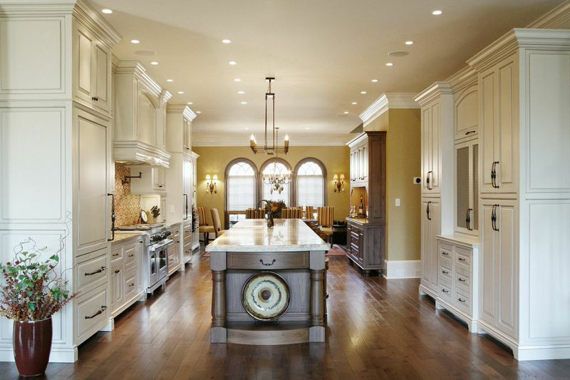
So, after much planning, considering and designing we ended up with this:


By completely opening the space up, not only could we incorporate the large island but we were able to create a bold focal wall, loaded down with storage and symmetry on one side of the room. And a large pantry and hutch on the other.


The range wall is complete with a large, detailed hood, two Sub-Zero IT36 units (refrigerator on top, freezer drawers on bottom), spice and crock pullouts, pot drawers and two Avento lift cabinets for small countertop appliance storage. 

And here's a shot of the pantry cabinet which is loaded down with rollouts, adjustable shelves and door mounted spice racks for additional storage. 


Because we also removed the Butler's Pantry we designed a China Cabinet & a Hutch to store the dining room serving and entertainment pieces. Here is a shot of the china cabinet:


Because this piece sits right in the dining room we really wanted it to feel like a piece of furniture. So, we had it painted the same color as the perimeter cabinetry in the kitchen, and we included a walnut countertop, a v-groove cabinet back and wire mesh to give this piece a true china cabinet vibe. 

Across the room, on the same side of the wall as the pantry we designed this hutch. 


This cabinet was designed in walnut, which is the same finish as the island, but we added custom features such as the feet, a paneled backsplash, a walnut countertop and valance detail to really give it it's own personality. We wanted every piece of the kitchen to be Tuscan, but really paid close attention to the scale and balance of the colors and details to ensure the whole space felt cohesive. 

The island has been present in just about every photo because it's big and can be seen from all angles. How big you say? Well, the island ended up being 190" or 15 feet long. Yes, a fifteen foot island...HELLO STORAGE! It's made completely of walnut and houses an apron front sink, a dishwasher, a microwave drawer, a double trash cabinet, a warming drawer, a cabinet dedicated to tray storage and drawers to house cutlery and other miscellaneous items. And that's just the front. The sides and back of the island also have storage. We have full depth, full height storage with rollouts on the back of the island and two small, but useful curved drawers on each end. Of course there is also room for seating on the back of the island. It's a beast. A big, functional, beautiful beast. 

No Before & After is really complete without a good side by side comparison but this kitchen makes that almost impossible as nothing from the original is even remotely recognizable in the finished product. Projects like these can be challenging, but they are always so rewarding. To be able to completely re-think a space can be extra hard if you live within the walls every day, but sometimes when a new set of eyes gets the chance to imagine what could be, you can end up with a space you never even knew your house was capable of. Cheers to thinking outside the box and making spaces all they can be, no matter how big or how small!

Contractor: Don Overton - GO Construction
Interior Decorator - Rose
Cabinetry & Design - Bell Kitchen & Bath Studios

Before photos by Keri Perry | After photos by Barbara Brown Photography

Sunday, May 31, 2015

About.com - May Recap


I can't believe this is the last day of May! Time is going by so fast, we are officially half way through 2015...crazy! It's been a busy month for me and some of my About.com postings have been a bit sporadic. For whatever reason I didn't post at ALL the first week of May (bad idea), so I've been hustling to get all of my articles out. In fact I just posted my 8th and final article of the month about an hour ago. There's nothing like cutting it close...eek. But, I got it done and I'm pretty happy with this months articles. If you haven't gotten a chance check them out, the topics are all over the place, but of course centered around the best room in the house....the kitchen!


After writing about my experience designing cabinets for animals in this blog post, I decided to do  some research so I could show off additional ways you can integrate pet storage into your kitchen. All options are not only functional but so fun!


The opening picture to this article is a group of naked trolls with colorful hair. Do I really need to say more to encourage you to read?? OK fine....I'm talking color in the kitchen and my ideas don't involve being naked or dying your hair radical colors, so you should check them out!

3. Cabinetry Construction Styles 


The subject of cabinetry can be downright confusing and overwhelming, but you've gotta start somewhere right? In this article I explained the different cabinetry construction styles. Sounds boring and blah, but it's actually one of the most important things you can understand before you set out to design your dream kitchen. 

4. New Kitchen Must Haves


When I design a kitchen there are 4 items that rarely don't make their way into my designs. This article talks about these items and why myself AND clients love them so much!

5. Touch Faucet Love


Our touch faucet is truly one of our favorite features in our kitchen. In this article I'm sharing the reason I truly believe the Touch Faucet is worth every penny and will instantly become a kitchen favorite for any one who has one installed in their space.


For Memorial Day I posted a special article all about how to add a little patriotic flair to your kitchen! Lucky for us, American colors are classic and pretty and when done right a patriotic kitchen can be down right elegant! 

A little food for thought....This is the Brazilian Flag: 


While their futbol teams are unparalleled, their colors are a little harder to decorate around ;)

7. Outdoor Kitchens


I know you all know this outdoor kitchen of mine pretty well. In this article I talked not only about my own outdoor kitchen, but showed off some other really cool outdoor kitchens as a way to pay homage to the kick off of summer!

8. Meet the LeMans Corner Pullout


Corners in the kitchen can be a beast! The LeMans corner pullout is an accessory I put in so many of my kitchen designs. This article talks all about the many benefits of the LeMans pullout. 

As I always I would very much appreciate any feedback regarding topics I should post about. I'm all ears...no literally, my ears....their kind of Yoda like. It's cool, I'm OK with it. :)

Thursday, May 28, 2015

DIY Irrigation System


I've decided 3 day weekends are my jam. They are right up there with cheese dip and shoe shopping. Just down-right satisfying and good for the soul. While Brent and I took full advantage and did a whole lot of resting and relaxing last weekend, we also had time to fit in one very simple and super affordable DIY...

We installed our own irrigation system!

We got really lucky with our yard because the people that lived here before us definitely had a green thumb and we inherited some great plants, shrubs and trees. Over the past two years we have spent a lot of time, money and effort planting additional plants and trying to keep our yard up. However, while our yard is not huge by any means, we have constantly struggled with upkeep. We've got the whole "get inspired and go buy a bunch of stuff, spend a lot of time planting it and then don't touch it again until you notice it's dead" thing down pat. In order to even water our plants or our yard we had to drag out the hose, hook it up to the sprinkler, place it in the yard and then remember to come out and turn it off after a certain amount of time. Sounds simple enough, I guess, but the reality is it rarely happened and was always just too much of an effort. Terrible, I know...

With summer planting upon us we knew we didn't want to go down the same old road again so we did some research on installing our own irrigation system. And by research I mean we went to Home Depot, stood in the irrigation isle and randomly started piecing together what we thought would work. Let me start by saying I didn't even know this type of thing was possible to do yourself (DIY). In my mind I thought installing an irrigation system would require professional installation, major disruption to our yard and a lot of money. I was blown away to find that you can definitely DIY your own irrigation system and Home Depot has a whole isle dedicated to the parts and pieces necessary to make your DIY sprinkler dreams come true!

So, here is what we ended up with:


We began by hooking up the timer and hose to the water spout on the front of the house. We had to get the hose across the stone path into the flower bed, so we pulled up one of the stones and dug a small trench underneath. 


Then, we placed the hose in the trench and covered the whole thing back up with the stone.  Brent used mulch to cover up any exposed hose so the whole transition is completely seamless.


Once we made it to the flower bed we continued our trench digging and snaked the hose through the flower bed, around various shrubs and bushes.


We continued the hose up the whole right side of our yard (if you're looking at our house from the street) under the picket fence to the beds along the street, and back to the large flower bed island in the middle of the yard (where the Christmas Tree used to sit).

Once we got the main hose situated we ran the 1/4" hose to where we wanted each sprinkler to be located.


Then, we hooked up the sprinkler lines into the main hose.


And voilia! 


All of the parts and pieces we used are Rain Bird and there are a wide range of sprinkler head and hose options available. We went with 360 degree sprays everywhere except in front of the fence, where we opted for the 180 degree version. Each sprinkler head is adjustable, so you can alter the pressure and range of the spray to ensure you hit your desired plants. It's great because you can literally customize each head to suit your specific flower bed. We turned the sprinklers on and walked around adjusting various heads until every plant was getting touched. 


Speaking of customization, the timer has to be the best part. It allows you to set the specific time and duration of each watering cycle, meaning we basically do nothing, but sit around and watch our yard flourish. It's a dream really.

I'd say this whole installation took us about a day and cost around $150. Totally painless and 100% worth the effort. We definitely went into the project unsure, but hopeful, and I'm happy to report we are very pleased with the end results! I'm convinced my thumb is already looking greener....I just know this sprinkler system is going to make us look good and keep our greenery investments nourished and happy!

P.S. Wanna read more from me? Check out my articles over on about.com this week! 

I've written about How to create a Patriotic Kitchen and The Beauty of an Outdoor Kitchen. Still need to think of my last topic of the month, only 3 more days until June!

All photos are my own, about.com logo from Google Search. 

Sunday, May 17, 2015

Hallway Makeover


You know that Alanis Morissette song - Ironic where she says "it's like 10,000 spoon when all you need is a knife"? Well that pretty much summed up our life back in March, as the weeks drew nearer to the Junior League Tour of Kitchens. Brent and I were definitely feeling the pressure. It's like one minute it was September and we had all the time in the world to get our lives together and the next, it was March 20th and we were one week out from show time and the smallest space in our house was giving us the most grief. The hallway.


Getting the new stair runner installed was a huge first step for the hallway, but we still needed to add more life. We had always talked about doing some kind of ceiling treatment, and went back and forth considering everything from wallpaper, to a cool wood trim installation to just painting it. We stayed on the wallpaper train a long time and looked and looked at wallpaper options but just never could find anything that blew us away. The wood trim concept was our next focus, and as cool as we thought it could be, we feared if we opened that can of worms so late in the game it could get expensive and time consuming quickly. So, we decided to go the painting route.

On a whim we decided to try this faux denim effect from Ralph Lauren. 


This process requires you to paint a layer of the glaze (which is what comes in the can above) atop a white ceiling. You select your glaze color at the store and they mix it in just like paint. Then, before the glaze can dry you take a special brush and drag it along the paint to create the denim striations. The process sounded simple enough, but we knew we had to be fast for it to work. So, Brent created a homemade scaffold using three ladders and some wood planks he had in the basement.

(I apologize in advance for this awful photo, but we had to take the ceiling lights down so we had to hang a work light which was REALLY BRIGHT and makes for hideous lighting.)


This little set up allowed us to move quickly and smoothly by simply dragging our brush or roller along the ceiling while walking on top of the planks. Brent's Mom Cindy was in town (lucky her) and was along for the whole painful ride. The plan was for her to paint along the edges with a brush while I painted the center section with a roller. Then, Brent would follow behind me, dragging the special brush along the wet paint to create our desired look.  

Here was the finished product:


We loved the color, but the texture was WAY off. You can see how the process worked in some areas and how it definitely did NOT in others. First of all we realized we should not of gone along the edges with the brush. This approach created a darker frame along the perimeter of the hall which we couldn't lighten with the textured brush. We also figured out we should of done a small section at a time. Even with our homemade scaffold, the glaze was too dry by the time Brent got to it in some areas. And finally, because the glaze was just a glaze and not a paint, it caught weirdly in some areas, like the circle that's showing through above. We are guessing at one point someone who had lived here previously had some circular thing (fire alarm?) mounted there and for whatever reason, the glaze covered it differently than everything else. It was our own fault. We should of tested it out on a small section or on a piece of cardboard. But we are do it and figure it out along the way kind of people which kind of bit us in the butt this time. Oh well, we went back to Home Depot and asked them to mix us up some paint in the glaze color and then proceeded to paint the entire ceiling a solid coat of what turned out to be a dark green.


While the hallway has no windows it gets surprisingly good natural light from the kitchen, den, bathroom and master sitting room window.  The natural lighting is great because the green is so dark it can definitely read black when the sun goes down. Regardless, the ceiling color definitely adds some much needed drama to the hall and plays nicely with the floor runner we got at Scott's Antique last year. 

With the ceiling complete we were able to hang our new semi-flush lights from Cedar & Moss. They are SUCH an improvement from the blah "boob lights" that were there before. 

And finally, the last piece of our hall puzzle was our travel wall installation. Literally DAYS before the Kitchen Tour we hung these cool frames we found at World Market. We bough pretty much every gold-rimmed version of the frame they had in 3 sizes and filled each frame with black and white photos from our world travels over the past five years. 


We've had some great adventures and it's so cool to see some of those memories on display every day. Like I said, we bought every frame we could find in the Atlanta area, so we have some that we haven't filled yet ready to go for future trips!

Here's one final shot of the hall, looking into the den. As you can see the wall across from the frames houses a phone niche, which is original to the house. We don't have a house phone so I put a bust covered in colorful beads in there instead. 


We definitely went the long and painful route with certain parts of this project, but we are really happy with how everything turned out. And while there was probably still drill dust on the frames as the people toured our home that Saturday, we got a lot of positive feedback on all things hallway, but especially on the travel wall!

All photos are my own. 

Wednesday, May 6, 2015

Designing Cabinets for Animals


Designing cabinetry for humans is cool and all, but designing cabinetry for animals.... THAT is just down right satisfying and rewarding. Last summer/fall fellow Bell Kitchen & Bath Studios designer Keri Perry and I were in the thick of working on designs for a huge remodeling project, when we found ourselves with some unique clientele to consider...two dogs and a cat.

This remodel was big and much of the first floor of the home was re-designed. As we worked through designing the various areas of the home, we had one very clear goal in mind. Make it beautiful, but make it explode with functionality.  As we dug into the details and began determining where various items would be housed we quickly realized there were certain 4-legged family members who had a fair amount of gear themselves and that gear needed to be organized just like everything else. Now I don't know how many pets you know, but pets, no matter how big or small, have stuff...lots of it.

When we first met this project the cat's food dish and water dispenser were sitting on the countertop in the kitchen, so as to keep it out of the dogs' reach. The dog bowls were sitting by the end of the island and the cat's litter box was housed behind a cabinet door in the laundry room with a small hole for access. It was functional, but far from pretty.

The truth is, if you have a cat, there really is no getting around having a litter box. So it came down to improving the housing of said litter box to blend seamlessly with the pretty that was the rest of the room/house. In general, I liked the concept of the litter box being housed behind doors, because really, who wants to look at that? So, we started playing with some ideas with our engineer Richard; one thing led to another and before we knew it we had dreamed up this:


Which then turned into this....


and finally....THIS:

Photo by Barbara Brown.
The whiskers! The tail! Can you even deal with the cuteness? 

Photo by Barbara Brown.
Now, not only does the cat have a chic' home for his litter box, but the entire set-up is easily accessible for both cat and human. Even better, now the LITTER BOX cabinet is the "cool kid in school" in this Laundry Room. 

As for the animal food and gear, we designed an entire area right outside the kitchen that we called THE PET STATION. 

Photo by Barbara Brown.
The pet station includes 3 dog bowls, 2 for food and 1 for water. These bowls were custom built to fit snugly in the base of the center cabinet with granite installed atop to ensure any splishing or splashing while drinking wouldn't harm the wood. As for the cat, another bowl was designed to sit on it's own ledge, high above the dogs, so the animals could eat together without bothering each other. A pullout was installed on each side of the dog bowls to house dry food.  The small drawers above the dog bowls were designed to hold leashes, collars and other small necessities. As for the rest of the space, behind each wall cabinet is a series of adjustable shelves so anything from wet food to treats and toys can easily be stored and organized, but out of sight.

Two of the animals were gracious enough to model for us during this shoot. The cat was reluctant to show off the litter box (understandably, everyone needs some privacy) but both the dog and the cat were more than happy to show the world how nice and functional their dream space is. It's always so nice to see a satisfied customer! ;)

All cabinetry is from Bell Kitchen & Bath Studios Signature Collection. The pet station is walnut and the laundry room is maple with a painted finish.

Unless otherwise noted all photos are my own.