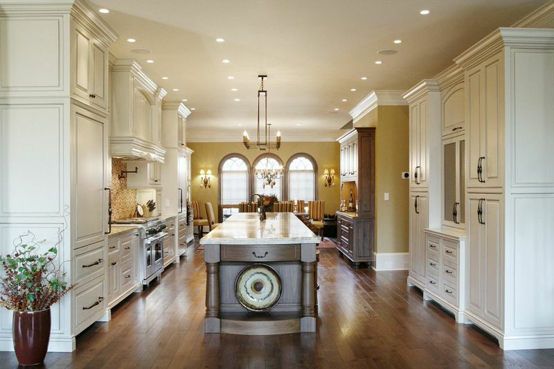
Showing posts with label Kitchen Remodel. Show all posts

Thursday, March 24, 2016

A Drool Worthy Kitchen Remodel


I don't like to play favorites with my projects, but every now and then a project comes together in such a way I can't help but want to put it in a tiny bottle and hang it around my neck so I can look at it whenever I want. Of course I realize this concept is totally unrealistic as no one kitchen is going to go with all of my outfits, so instead I write blog posts about them for all to enjoy.

In all seriousness I really have a treat for you guys today! I truly feel like kitchens like this are the reason why people (including myself) just can't resist a white kitchen. Elegant, classic, bright, happy.....so many adjectives, so little time. Let's dig in...

I first met this kitchen in the summer of 2014. The homeowner has great taste and the entire house and property is just beautiful, but the kitchen had never been touched. I so wish I had a before picture of this space, but I don't....Architecturally speaking the kitchen has really great bones with the beams and the skylights, but it was time for a more refined and updated look for this family.

This kitchen is unique in that every wall of this space is a focal in and of itself. There are four entrances into the kitchen from other parts of the house, so it was important to give each side of this kitchen it's own dose of personality, balance and beauty so regardless of which way you enter the room, something pretty is in your line of sight. The kitchen is separated from the family room by a two-way stone fireplace. You can see the mantle poking out in the picture below.


While the fireplace acts somewhat as a boundary line I love the fact that you can see around and through the fireplace into the family room or vice versa, into the kitchen, making this space feel like one big room. Cabinetry speaking, there really are two strong focal points in the actual kitchen space of this big room - the hood wall and the window wall. Luckily the size of each wall allowed for the cabinetry to have great balance. 

Here is a shot of the window wall. This is the view you would have entering the kitchen from the dining room and front hallway. 
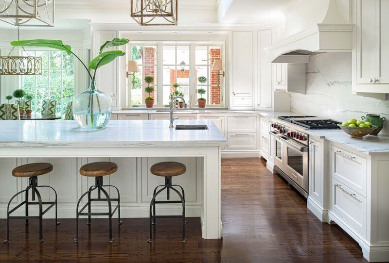


The original window was removed and replaced with this much larger window. I love the natural light that pours into the kitchen, both from this window as well as the skylights above. The sink was centered on the window and we designed wall cabinets down to the countertop and a wooden valance to frame in the window on all four sides. The homeowner picked out some pretty sconce lights that coordinated with the large pendant lights that hang over the island. The lights were installed on the side of each wall cabinet which really helped accentuate the beautiful window and sink.

The custom hood was centered on the back wall over the 48" range. 


As I said, because of the dimensions of this wall, the cabinetry flanking the range was not only functional but symmetrical. Spice and crock pullouts as well as large pot drawers were designed to go  on each side of the range. And wall cabinets with custom brackets were designed to hang on each side of the hood. Symmetry really is a kitchens best friend. 

Across from the window wall sits the refrigerator wall. 


A refrigerator column and freezer column were centered on the wall. While the units themselves are only 84" high we made the wood appliance panels much higher to create a cool visual. The space above the refrigerator was covered with a finished panel so when you open the door to either unit, everything is nice and finished inside. Tricks like this make the appliances feel more like a piece of furniture. We kept all cabinetry on this wall tall so as to provide more storage. The microwave sits on a shelf inside the far right tall unit, so it's within reach when needed without being an eye sore. 

Each and every cabinet was considered. From rollouts and two trash cabinets to a LeMans blind corner cabinet and spice and crock pullouts, we made the most of every piece of storage. All cabinetry is inset bead from Bell Kitchen & Bath Studios Signature collection. And while this space looked beautiful once we did our part the homeowner really brought everything to life with her tasteful styling and elegant touches. As soon as you step into this space you feel happy and that my friends is what a successful kitchen remodel is all about. 

Photography by Galina Coada for Bell Kitchen & Bath Studios. 

Monday, June 15, 2015

Tuscan Kitchen Remodel


A few weeks ago I showed you all some cabinetry that Keri Perry and I designed for some animals. Well, those animals happen to have owners and while we were at it we designed some cabinetry for them too! We're considerate like that. :)

This project began as so many do, as a simple kitchen remodel. Well, maybe simple is the wrong word...From the beginning we had free reign and a blank space with this project. Freedom to move or remove walls and completely revamp and rethink the flow and bones of the kitchen. The only items on the client's wish list were: a fourteen foot island, a LOT of storage and a Tuscan aesthetic.

Let's start with some before photos:


As you can see the kitchen wasn't small, but the layout was choppy and stuff seemed to be every where. We worked through several different ideas but ultimately decided the only way to get a 14 foot island in this space was to completely remove the butler's pantry and the walk-in pantry, both of which made up the space between the existing kitchen and dining room. As much as the client was all about changing things up and improving the overall flow, she was very reluctant to loose the walk-in pantry. It's a fear a lot of people have and one I actually just wrote about over on about.com. Walk-in pantries are great, don't get me wrong, but there are times when they can be be a major hindrance to the design and this was definitely one of them. After much discussion we assured the client that we would design a cabinet solely dedicated to pantry storage, and make it SO wonderful and  SO functional she would never think of that old walk-in pantry again.

On paper we could see there was going to be a LOT of storage in this kitchen, but just to set our clients mind at ease, Keri and I literally mapped out where everything would go. Basically she showed us her stuff and we made a little road map on her kitchen drawings showing where everything would be stored. It might sound like overkill, but this approach is actually really smart and can make moving back into your space less stressful. It can also help you decide to purge items that you no longer use or want taking up valuable space.

So, after much planning, considering and designing we ended up with this:


By completely opening the space up, not only could we incorporate the large island but we were able to create a bold focal wall, loaded down with storage and symmetry on one side of the room. And a large pantry and hutch on the other.


The range wall is complete with a large, detailed hood, two Sub-Zero IT36 units (refrigerator on top, freezer drawers on bottom), spice and crock pullouts, pot drawers and two Avento lift cabinets for small countertop appliance storage. 

And here's a shot of the pantry cabinet which is loaded down with rollouts, adjustable shelves and door mounted spice racks for additional storage. 


Because we also removed the Butler's Pantry we designed a China Cabinet & a Hutch to store the dining room serving and entertainment pieces. Here is a shot of the china cabinet:


Because this piece sits right in the dining room we really wanted it to feel like a piece of furniture. So, we had it painted the same color as the perimeter cabinetry in the kitchen, and we included a walnut countertop, a v-groove cabinet back and wire mesh to give this piece a true china cabinet vibe. 

Across the room, on the same side of the wall as the pantry we designed this hutch. 


This cabinet was designed in walnut, which is the same finish as the island, but we added custom features such as the feet, a paneled backsplash, a walnut countertop and valance detail to really give it it's own personality. We wanted every piece of the kitchen to be Tuscan, but really paid close attention to the scale and balance of the colors and details to ensure the whole space felt cohesive. 

The island has been present in just about every photo because it's big and can be seen from all angles. How big you say? Well, the island ended up being 190" or 15 feet long. Yes, a fifteen foot island...HELLO STORAGE! It's made completely of walnut and houses an apron front sink, a dishwasher, a microwave drawer, a double trash cabinet, a warming drawer, a cabinet dedicated to tray storage and drawers to house cutlery and other miscellaneous items. And that's just the front. The sides and back of the island also have storage. We have full depth, full height storage with rollouts on the back of the island and two small, but useful curved drawers on each end. Of course there is also room for seating on the back of the island. It's a beast. A big, functional, beautiful beast. 

No Before & After is really complete without a good side by side comparison but this kitchen makes that almost impossible as nothing from the original is even remotely recognizable in the finished product. Projects like these can be challenging, but they are always so rewarding. To be able to completely re-think a space can be extra hard if you live within the walls every day, but sometimes when a new set of eyes gets the chance to imagine what could be, you can end up with a space you never even knew your house was capable of. Cheers to thinking outside the box and making spaces all they can be, no matter how big or how small!

Contractor: Don Overton - GO Construction
Interior Decorator - Rose
Cabinetry & Design - Bell Kitchen & Bath Studios

Before photos by Keri Perry | After photos by Barbara Brown Photography

Wednesday, November 5, 2014

My Kitchen Part 3 - Backsplash

Remember that time, I designed my own kitchen and then took F O R E V E R to show it to you? Yeah, sorry about that! Good news, I'm back today to tell you all about how Brent and I DIY'ed our backsplash.

So, last we talked our marble countertops had been installed and the space was really coming together.


The finish line was in sight and with 3 weeks left until our wedding we were grasping for that light at the end of the tunnel. If you've ever renovated a space before, you know that the whole process goes really fast and then really slow and then really fast and then really slow. It's the whole hurry up and wait scenario. So, we demoed, which wasn't exactly fast, but fast-ish compared to the 6 weeks we waited for cabinets. Then, the countertop people rushed out to template the tops and then we waited for a week for the install. Once the tops went in, it was time to put rush into overdrive and get the backsplash installed. We had from Friday afternoon until Sunday, exactly 2 1/2 days to install our backsplash before appliances went in on Monday. 

We had long ago decided we wanted a brick backsplash. We planned to paint it white and take it to the ceiling. Because the space is small and we already had some focal points in the yet to be revealed refrigerator panels and the veining in the marble, we wanted the backsplash to be powerful, but quiet.  So we researched around and ended up purchasing brick pavers from a local tile store.  


All green space (in the first picture above), aside from inside the refrigerator opening, would be getting bricked. Looks simple enough, but there were a lot of cuts to be made, around the window, at the ceiling, where the brick would meet the underside of the cabinets, around the vent opening, etc. There was a lot to consider and it is at moments like that when I am SO thankful to be married to a brain. A brain that rises to the occasion during uber technical situations like this. Brent took measurements and began cutting the bricks with his wet saw.  Because we have neighbors and the wet saw is loud, we didn't want to be cutting too late into the night, so Brent made sure to get a lot of the bricks cut before the sun went down so we could get them installed as late as we wanted. Once the bricks were cut and ready to go, we applied thin-set mortar, like butter to the back of each brick


and stuck the bricks to the wall. 


Initially we had planned to grout in-between the bricks, but after lining it up, we decided we liked the look of the bricks butted together with no mortar lines between.  The process was messy, but thankfully there was a clear film on the countertops which protected them from the brick dust and thin-set mortar drips. All brick had to be installed by the end of the day on Saturday so the thin-set mortar could set up and dry and we could begin painting on Sunday. It was late and we were tired but we got it up there.


Bright and early Sunday morning we got out the Benjamin Moore White Dove Paint (same color as cabinets and wall) and went to town.


Because we didn't have mortar lines between the bricks, there were gaps where many of the bricks met, as many of the pieces were not perfectly rectangular.  We liked this look because it gave the wall depth and texture. However, painting these little nooks and crannies was THE hardest part. Trying to push paint in tiny little holes, with no drips and without getting paint all over the other finished parts of the kitchen was challenging to say the least. The painting literally took hours and a few coats, but the transformation was so powerful it was incredible watching it come together right before our eyes. 


Standing back and looking at our work that Sunday night was SO satisfying. Every step of this project was fun and important, but for some reason these bricks really made the space feel alive. As I've said before, anytime you design a space with a reoccurring color (for this space it was white) it is imperative to mix up the textures to create interest and depth and the bricks did just that. Once it was all said an done we were SO happy we skipped over the grout because the spacing between the bricks (the black part) creates the perfect amount of drama.

The next day the appliances rolled in and our renovation train kept on chugging along, but that's a story for another day, another blog.

All photos are my own. 

Wednesday, May 7, 2014

Bridgett Court Kitchen - Before & After


I believe a good Before & After story is good for the soul. To see a room totally transformed can awaken your imagination and encourage you to consider the abundance of options awaiting you and your space. Today I want to feed your souls some serious grub AKA show you a recently completed kitchen remodel I did with Chris Pfahl of Dreamweaver Building &  Remodeling.

Let's face it, there are 101 ways to layout any given room, but for most - knowing that is overwhelming. Plus, it's hard to imagine what could be, when what you have, is what you look at everyday. That's where bringing in a fresh set of eyes can be a good idea. Like most projects I do, I met this one on paper. As I've said before I truly think this is the best way to start the creative process, because it allows me to focus in on functionality only.  All I could see was the black and white reality of what was going on, which allowed me to pinpoint areas that could use improvement right off the bat. Here's where we started:

Photo my own. 


Unlike some spaces we dive into, this Before was not begging for love. In fact, overall it looked fine. There were no glaring issues, but there were certain aspects the homeowners wanted to improve upon both aesthetically and functionally in the space. One of the main requests was to move some of the major components of the kitchen around, namely - get the cooktop off the island. They also wanted to increase the storage and brighten the space up.

After...


As you can see the cooktop was moved to the back wall which created a beautiful focal point with the wood angled hood and the dramatic marble accent piece. The cabinetry was taken to the ceiling, allowing the homeowners additional storage. The perimeter cabinets were painted Benjamin Moore's Smokey Taupe 983, which really brightened up the space, making the room feel larger.

Photo my own. 
The above wall had a large amount of open shelving and some storage, but because of it's positioning in the old kitchen design it felt sort of out of the loop. When we moved the cooktop to the back wall, we had to find a new home for the refrigerator. The above wall made the most sense and allowed for a larger refrigerator.


There was a little space left over which made for the cutest breakfast (coffee, toaster) + TV area you ever did see.


Across the room sat the sink and double ovens, both of which stayed in the same location in the new design. 


For a wall that changed very little layout wise, I think it's one of the most beautiful.


How pretty is this shot? I love the apron front sink, the beautiful tile all the way to the ceiling and the cabinetry proportions. The cabinetry is Bell Custom Cabinetry by Bell Kitchen & Bath Studios and is Inset Construction. I really love the delicate detailing of each and every door, not too heavy but subtly elegant.

The original island had a small overhang for stools. As practical as this is for a lot of kitchens, it really wasn't necessary for this one. The breakfast table sits a few feet away, plus utilizing stools in this location would of encroached on a heavy traffic zone. So, in the new design we scrapped the overhang and added shallow depth, full height cabinetry to the back of the island instead.


Not only does this approach offer more storage, but it gives the island a more furniture-like vibe. Speaking of furniture-like vibe - the island was constructed in alder wood and stained. I love how this finish offers a nice contrast to the floor and the perimeter cabinetry. 

So, what do you think? Pretty radical transformation, eh? I love the light, airy, elegant vibe of the space. The natural light is so good and the details are plentiful. The original kitchen was fine, the new kitchen is, let's see, how do I put this...awesome? Yeah, I'd say that adjective fits the bill! :)

Unless otherwise noted all photography is by Jen Wunderlich Photography. 

Wednesday, October 16, 2013

Chattanooga Project Reveal

Boy do I have a treat for you this week. As many of you know I'm from Ringgold, GA right outside of Chattanooga, Tennessee. After college I moved to Atlanta where I have been working and living ever since. As fate would have it, last year I happened to answer the phone for a lady looking to remodel her kitchen.... in Chattanooga. What are the odds? As I talked with her about her project I learned she and her husband were renovating a home on Elder Mountain. It wasn't until I saw this home in person that I realized it looked like Tara, you know the beautiful home from Gone With The Wind? Except this Tara was literally hanging off the side of the mountain.

Photo from my cell phone.

Literally....the views are breathtaking and the house is beautiful. The homeowners were doing house-wide renovations, and I was brought on to help with the kitchen portion. Of course I was super stoked to work on this project, as I knew my job site visits would allow me to visit my old stomping grounds and pop in on family while I was in town. I dubbed this project my #ChattanoogaProject and tweeted and instagramed about it a few times over the last few months. I worked on this project remotely and it all started with a few conversations and sketch.

Photo my own. 

The kitchen space is huge. Walls had been removed and the entire space was opened up. While this sounds like a designers dream, sometimes really large spaces can be difficult to design because you don't want your clients to have to walk a mile to retrieve the pop-tarts from their pantry in the morning. Things have to jive and zones have to be determined. All the while you want the space to feel warm and inviting, not like a middle school dance with all parties clinging to the walls while the dance floor is empty.

Style/finish wise the homeowner had some very specific thoughts of her own. She actually came to us at Bell Kitchen & Bath Studio after seeing our display in Phipps Plaza. She and her husband identified with this space and wanted a similar vibe in their home. The cabinetry was to be inset bead with a painted perimeter and a stained island. As far as design/storage requirements go the homeowners wanted two refrigerators, pantry space, a mantle hood and a large island. The large kitchen space would house both the kitchen and breakfast area. The whole space sits right off of the living room which leads to the back deck with the amazingggg views. Because of all of the windows, certain cabinetry placements just made sense,  sink in front of window, hood on main wall facing family room, etc..The finished product left us with 4 zones of cabinetry all serving different purposes and all working together to make the space work to it's fullest potential.

Let me show you around:


The above shot gives you a pretty good idea of the space. This is the view standing with your back to the living room looking into the kitchen. As you can see the first area you come to is the breakfast area. For this space a hutch piece was designed that serves several functions: serving piece, bar and storage. This area is complete with a under counter wine unit, a wood counter top (that matches the island, but more on that later) and plenty of door and drawer storage for alcohol, serving pieces and dish ware. 


The custom mullion doors with mirror were designed to give the space some personality and help the piece look more like a piece of furniture rather than cabinetry. The addition of this hutch piece really helps give the breakfast area it's own identity all the while amping up the storage. 

Moving on into the kitchen:


You will notice we have three walls of cabinetry, let's start with the hood wall. 


The mantle hood creates a beautiful focal wall with a lot of symmetry and balance. This is a true cooking zone complete with several add-on features to increase functionality and add storage capacity. 


Deep drawers were put under the cook top to hold pots, pans, lids, etc...pullouts flank each side of the cook top. The pullout to the left holds spices while the pullout to the right holds cooking utensils such as wooden spoons and spatulas. 


The cabinet to the far right of the hood, the corner cabinet, was designed to come down to the countertop. This application is a good way to put a period at a cabinet run. Wall cabinets were nixed on the sink wall, so we needed a way to end the cabinetry run coming from the hood wall. By taking this   cabinet to the countertop, additional storage space was achieved and all was balanced and happy on this side of the room.


Across the way, the pantry is nestled between the two refrigerators. Because the original pantry for the house was part of the demo/remove wall phase of the project this pantry would be the only one so it needed to be functional with a capital F. 


The two center doors open to two stationary roll outs installed at the bottom portion with three adjustable shelves above. Below the shelves sits the microwave and a few more drawers and door to store additional supplies/serving ware/kitchen gadgets. You will notice the TV is tucked in up top, out of the way, but in the perfect position for the cook to enjoy while whipping up the next meal.


The island is a beast at 116" long, but completely in scale with the space. 

Funny story, when the client initially called me to inquire about our services she asked how long the island was on display at Phipps. I told her this island was over sized because it was in a mall and that most homes could not accommodate an island that big. She swore that hers could. I was all like, "OK, surrrrre...." soon enough I found out that she was 100% right, her large kitchen area needed an island this big. Sure showed me!

The island was constructed out of alder wood and stained dark walnut color. The ends of the island both received drawers with open shelving below which gives the piece such a unique look.


Shallow depth cabinetry was placed at the back of the island for seasonal storage. 

It's always a treat to revisit a job once the dust has settled and the family has unpacked and begun living in the space. This kitchen seems to serve there needs nicely and let's be honest, it's not hard on the eyes either. Speaking of eyes, the homeowner has a great one for decor, so needless to say, the whole house is furnished and decorated beautifully, this room included. From job site to home is always such a fun transition!

A big shout out to Tania and Zack of Gentle Giant Photography  out of Chattanooga, for taking these pictures. Beautiful shots of a beautiful space - well done!

Wednesday, November 7, 2012

O' Holiday Project Deadline

O' Holiday Project Deadline, O' Holiday Project Deadline, how terrible areeeee your limitationsssss. In case you can't tell, I'm singing. You have to read/sing the above to the tune of "O' Christmas Tree." Get it? I know, I know, I'm good - move over Taylor Swift.....

It's only 7 days into November and I can already feel the hustle and bustle of the holidays! I feel like I've seen and heard more about Christmas as of late than I usually do the entire month of December. Granted, I do realize this proclamation comes from the girl who posted about a Christmas House last week (cough, cough hypocrite.) But, so far, I've seen a lit Christmas tree in someone's front window (THE DAY BEFORE HALLOWEEN, mind you) and yesterday at lunch I drank from a crystal goblet with painted holly around the rim. Oh, and hello! Walk into countless department stores and find holiday decor for sale galore! But, in my world the most common holiday topic is:

 "If I begin my kitchen or bath remodel now, could it be completed by the holidays?"

The answer: Maybe, but at what cost?

I think there's something in the air right after Halloween that has a certain way of lighting a spark within people prompting them to hurry and complete, or in some cases start, projects before their holiday parties begin and their guests arrive. It's like all of a sudden somewhere around late October it occurs to people that their houses will be full of friends and loved ones and they want to bring out the magic wand and POOF - all projects = complete.

As on board as I am with a home being at it's best, especially during a time of such high foot traffic, I think it's important to keep in mind the holidays are stressful enough without the looming completion of giant project that has a way of taking over not only your house but your life.


If the face you see above doesn't look like something you want to be sporting this holiday season, let me recommend pumping the breaks on impending projects if they haven't started yet. As I've mentioned before, those projects that are carefully considered and thought out ALWAYS turn out the best. By beginning any project with a tight or unrealistic time frame you are literally setting yourself up for stress and half-arse results all wrapped up with a shiny red bow.

So, instead of allowing this time of year to stress you out and cause you to irrationally jump into projects ill prepared , use this time to your advantage. Think about it, you spend more time entertaining in your home and actually cooking in your kitchen during the holidays than any other time of year. And if you're not typically the host, you spend more time being entertained in the homes of others than any other time of year. So....observe, notice, critique and begin jotting down things you love, things you hate, things you would do differently if you could, etc..etc...And then after the hustle and bustle of the holidays is over you can begin the process of working on your space, on your terms.

Give yourself the greatest gift of all - choice. A kitchen or bath remodel is a fun process that deserves a lot of your attention and consideration. Don't sell yourself short.  Get what you want and take the time to figure out what that is. Then, before you know it, it will be November 7th, 2013 and you will be thrilled to showoff and utilize the space you poured so much of yourself into. And better yet, that time you spent pouring yourself into the project will not have resulted in you pulling your hair out so you will have beautiful locks and a new kitchen/bath to boot!

All photos are from google search.