Wednesday, April 16, 2014

Copper is Coming.


Doesn't the title of this post sound like something from a horror film? Hide your children, lock your doors....COPPER IS COMING!!!! Well, fear not - this post is not scary at all, in fact it's joyful. I'm happy to report I have a strong gut feeling, nay prediction, that a new popular finish is on the horizon.


Yep, Copper....Mmmmm.

I've noticed this warm finish popping up here and there - on the web, in stores and in my dreams. Copper is no stranger to interiors, it's had several heydays in it's time, but in the past copper brought with it a more country vibe. This time around copper can be found adding pizazz to an assortment of decorating styles in a slew of different ways

Photo from Pinterest.

There is so much to drool over in the above photo - the textured wood wall, the cluster of industrial lights and the unique spindles on the stairs. The copper finish really works in this space, adding warmth and interest.

Like it's friend brass, copper really pops against most colors and has the ability to add a layer of elegance to a piece. I love how the copper hardware above, takes this gray cabinet from pretty to striking.

World renown kitchen designer, Christopher Peacock has been utilizing copper in his designs for years.


 There is a really pretty, understated "cool factor" with the mixture of shiny copper and industrial pieces of hardware. As you can see the copper doesn't take the kitchen down a country road, in fact it adds to the clean and sleek vibe.


What succulent wouldn't love a pretty copper home? As we discussed a few weeks ago, I'm all about mixing things up finish wise in a space. A copper planter is the perfect way to integrate this new trend  into your home in small doses.

I'm currently wrapping up the final design details for a new in town studio my company, Bell Kitchen and Bath Studios is opening. Take a look at the color scheme for the designer office:

Cabinetry - Sherwin William's Cascades SW7623


+

Copper Cabinet Pulls

Yep, I've decided to dip my toe in and give this new trend a whirl. Pretty sharp combo, eh?

 I. CAN'T.WAIT......finished photos coming soon. In the meantime, let me know, are you on board with the new trend on the block?

Wednesday, April 9, 2014

Spotted - Gulf Coast Bride


Exciting news - Brent and my wedding is featured in the winter edition of Gulf Coast Bride Magazine!


It's been almost a year since we got married (May 4, 2013) and this magazine feature is just the icing on the cake for the great first year we've had!

For those of you who don't know, we got married in Florida in Brent's Grandparents, Dandy & Papa's back yard on the bay.  We couldn't of asked for a prettier backdrop, full of mossy trees, lush landscaping and the beautiful St. Andrews Bay. Our wedding planner, Beck England of BE Events really helped us bring our wedding day dreams to life and our photographer, Tisha Saunders of Flashback Photography, was around every corner to capture the special moments, leaving us with beautiful shots we will cherish forever.

Since getting married we've had a whirlwind year and I've been a terrible post bride; posting maybe 2 wedding pictures...so, my patient, loving wedding party will finally get to see some of the magic captured on our special day. Speaking of our wedding party...


Pretty good looking group, eh? 


Our wedding was layered with details both aesthetic and personal, the above photo is my bouquet with two broaches attached. The birds next broach belonged to my Grandma. My sister had the same broach on her bouquet at her wedding :). And the other broach belonged to my Great Grandmother. 


Here I am with my bridal party! We were sequestered to the gazebo pre wedding to avoid being seen by the guests as they arrived. 


The guests sat in these pretty gold chivari chairs. 


Here I am peeking out from behind the curtains on the gazebo right before it was time for my Dad and me to make our big walk down the isle. 


The above shot is of the reception, under the nights sky and a sea of lights. There was dancing, toasting, eating and visiting - our reception was such a great end to a magical day.


And the final shot.....a little kiss before we left the reception. 

Wow - what an honor it is to have our wedding day featured in a magazine!  I swear, sometimes I feel like I would be totally justified to pinch myself 24/7 at this life of ours. Lucky, lucky, lucky! Thanks Gulf Coast Bride - what a great 1st Anniversary present!

All photos by Tisha Callaway Saunders of Flashback Photography from Gulf Coast Bride Magazine's website. 

Thursday, April 3, 2014

Spotty Dotty


Earlier this year I posted about the progress in our upstairs den. New couch, new curtains a turtle shell suspended on a curtain rod…things had improved in a snap, but in order for you to have an accurate understanding of  how far this room has come I need to show you the other side of the room - The built-ins:


This room came with the built-ins and I was excited from day one. I love built-ins and I'd never gotten to decorate and style my own. Happy Courtney!! As soon as the house was officially ours and the renovations had begun I began thinking about what I wanted to do to the bookshelves. Obviously I could add books and knick-knacks but I wanted to take it to the next level and customize them a bit. What to do, what to do? As is typical I day dream about such things and one random day I remembered this wallpaper I'd seen on several blogs over the last few years.  

Tiffany Richey Design. Photo via Google search. 
Meredith Heron Design. Photo via Google search..
Dalmatian Spots - I'm a fan. In fact I've been a fan for sometime….anyone out there remember Spotty Dotty, the Sanrio character? 

Photo from Google Search. 
She was my obsession during my elementary school days! 

Anyways, back to the built-ins. I loved the look of the dalmatian spot wallpaper, it was fun, fresh and just the pop I was looking for. Boom! Decision made, I was ready to go. But I knew our budget was pretty tied up with other renovations (cough,cough KITCHEN) so purchasing wallpaper didn't seem feasible. Plus, installing wallpaper... what a pain! After looking at the pictures I decided I was going to tackle this look myself! I was going to spottily my bookcases. As soon as I made this decision I was practically elbow deep in spots. The back ground for the spots was already there and the supplies were on hand - black paint, small paint brush - I went to town.  

This particular day, Brent was downstairs, caught up in his own project, when he realized he hadn't seen or heard from me in a while...  He ventured up stairs and this is what he found... 


TOO LATE TO TURN BACK NOW!!!
 

I fast became obsessed and crouched myself in and round each opening until I had spotified each one.  I'm really good at instant gratification projects. I could see the concept coming to life right before my eyes which just encouraged me onward. 

Once my shelves were spotted they sat in all of their glory for months, empty waiting for some love.  It wasn't until we bought the couch that we  got ourselves in gear and began stocking the shelves. I focused on styling the shelves, which was fun and challenging at the same time. I loved integrating accessories and keepsakes we have collected individually and as couple over the years. 


I also switched out the undersized knobs for some fun Anthropologie hardware that I spray painted gold. 

Photo from my Instagram

Brent tackled turning the giant cavity on the far right into a space for a TV. He had to build a platform for the flat screen to sit on and in doing so created two smaller spaces for the stereo and Playstation 3 consoles; because, according to Brent, no room in our house is complete without a TV and Playstation.


The spots are everything I'd hoped they would be and more. This is definitely a DIY project anyone could take on to jazz up their own space. The spots are a fun, little unexpected surprise and frankly all of our do-dads look better sitting in front of them. It's instant happy! 

Unless otherwise noted all photos are my own. 

Wednesday, March 26, 2014

Metal Mixing


A common kitchen and bath related question I'm often asked:

Can you mix and match finishes within a space?

For years it was an interior design taboo to mix finishes. If you chose oil rubbed bronze for your faucet than it was expected that your light fixture, hardware and curtain rod would to be oil rubbed bronze too. The same concept was true for fashion accessories, if you chose gold hoop earrings to compliment your ensemble then your other jewelry needed to be gold toned as well. This concept was tried and true for a long time but as of late I've noticed a revolt against the matchy-matchy.

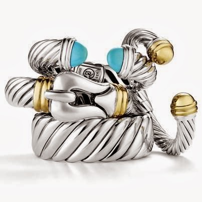
It's hard to say exactly when the mixing of metals became acceptable, but I'm crediting David Yurman with the trend. For years he has being designing iconic pieces mixing gold and silver in his creations.

Photo via google Pinterest search. 


It's interesting how gold and silver are both beautiful metals in their own right, but combined, they really pop and the elegance is undeniable.  For my wedding day I wore an arm full of silver and gold DY bangles and gold earrings.

Photo by Tisha Saunders of Flashback Photography.
I even mixed it up for my wedding set with a white gold engagement ring and a yellow gold wedding band. I love the freedom this combination gives me; with such a staple part of my everyday jewelry ensemble being two toned metal I feel I can mix and match as I please. Obviously, you want to do so in a way that looks intentional and not so much like you got dressed in the dark, but overall I'd say mixing metals is 100% acceptable as far as fashion is concerned.

But what about when it comes to interiors?

Chrome, Oil Rubbed Bronze, Antique Brass, Polished Nickel, Brushed Nickel, Black, Polished Brass, Stainless Steel, Copper, Satin Nickel...SO.MANY.OPTIONS! Can they play together?

Below is a picture of my 2013 Holiday House Kitchen. If you look closely you will see there is a lot of metal mixing going on.

Photo by Barbara Brown of Barbara Brown Architectural Photography.
The metal strips on the hood and all cabinetry hardware have an antique brass finish. The sinks and faucets are stainless steel and the light fixture is aged iron. It's a smorgasbord, but it works.

Below is a photo is of my Grandmother's Kitchen. All of the appliances are stainless steel and all of the hardware and the faucet are antique brass.
Photo my own. 
The cabinets are light gray and while it would of been easy to go with a more silver toned finish for the hardware and faucet because of the stainless appliances, I felt that would evoke a more modern look. We really wanted the space to have a casual elegant vibe and I knew the antique brass was just the right finish to help us achieve that look. To marry the two finishes we selected a light fixture with a champagne finish. The finish has depth with both silver and gold tones within, which brings the whole look together. 

Photo by Barbara Brown of Barbara Brown Architectural Photography.

Above is a kitchen designed by Mike Bell. As you can see this space has stainless steel appliances, polished nickel hardware and black lights. Black and white is always a classic combination. While black knobs would of worked in this space the polished nickel hardware really ties in nicely with the stainless steel and adds a layer of elegance to the room.

The whole concept of mixing metals is so liberating to me. It allows us to focus on what finish works best for each specific element within a space. That's not to say sticking with the same finish throughout a room can't work, it can and does. But isn't it satisfying to know you don't HAVE to? To me, accessories be they interior or fashion based, are meant to enhance a space or an outfit. It's easy to get caught up in the abundance of choices when attempting to select the right finish for your project. My advice, take a step back, consider your space and the overall look you are trying to achieve and then make one selection at a time. The devil is in the details folks, take your time and know, no two rooms or outfits are alike - pick what works for you!

Wednesday, March 19, 2014

Homes of Distinction Kitchen


I've been fighting a nasty cold/allergy bug this week. I blame it on the fickleness that is Atlanta's weather lately. One minute the sun is out and Spring seems so close, and then WHAM, the next day it's pouring freezing rain and I feel the need to stock up on bread and milk. I look like Rudolph the red nose blogger. FUN TIMES! 

So, this week I want to share some pretty, because everyone knows the best cure for the common cold is pretty viewing...like sunshine on the skin, good for the soul. 

Back in January, I mentioned I was designing the cabinetry for one of the show houses on the Roswell Women's Club Homes of Distinction Tour. This event has come and gone, but for those of you didn't get a chance to stop by and see the homes in person I want to give you a little tour of the kitchen. 


The home was built by Thrive Homes and was a new construction project. When I got ahold of this kitchen it was but a wee architectural floor plan. The kitchen laid out pretty organically with the hood centering in the room creating a pretty and symmetrical focal wall. 


The far right wall houses the refrigerator and pantry. The feature that hands down received the most positive feedback was the "hidden pantry".  In the above photo you see one of the tall doors next to the refrigerator is open.


By opening both doors you have full access to the pantry. The pantry wraps around and fills a large space behind the entire width of the refrigerator.  The shelves inside were done through house trim; We simply covered the entrance into the pantry with cabinet doors to create a more seamless look.


On the other side of the room there is additional cabinetry storage in addition to a microwave drawer and appliance garage. 


I had a lot of fun designing the island ends. Because of the orientation of the kitchen in the home, I knew the island would be visible from several angels - the breakfast room, living room and sitting room. I think the diamond mullion pattern adds sophistication and spunk to this tranquil space. 

All cabinetry in this space is inset construction by Bell Kitchen & Bath StudiosThe countertops are quartz by Cambria and the appliances are Wolf Sub-Zero.

Here I am all smiley and proud standing in front of the kitchen during the show. I don't know if I'll ever get used to the excitement I feel when I see a space go from paper to reality!

Photo from my Instagram
Whenever I work on a show house  project like this I try to sprinkle layers of interest throughout the space, but not so much so that the kitchen is no longer relatable. To me, the key to good design is creating a space that you can envision yourself living in. When you close your eyes you can see yourself being comfortable doing everything from eating cheerios at the island while paying bills to hosting fun parties. If the majority of people feel the warm and fuzzies when they see this kitchen, then I've done my job.

Unless otherwise noted all photography by Barbara J. Brown Photography

Thursday, March 13, 2014

DIY Console Table


Furnishing our home has been a slow process. We have really been trying to think through each and every decision before making big commitments, and as hard as it is, we are really trying not to buy things just to fill the space. It's a challenge, because every day you walk into your house and you yearn for certain rooms, especially those you spend a lot of time in to feel finished. When I feel that itch to go buy, buy, buy I remind myself that the warmest and most intriguing spaces are those furnished with items and pieces that have been collected over time with a story and soul of their own. So, instead of making impulse purchases we make mental notes of items we are looking for and then wait for them to come to us.

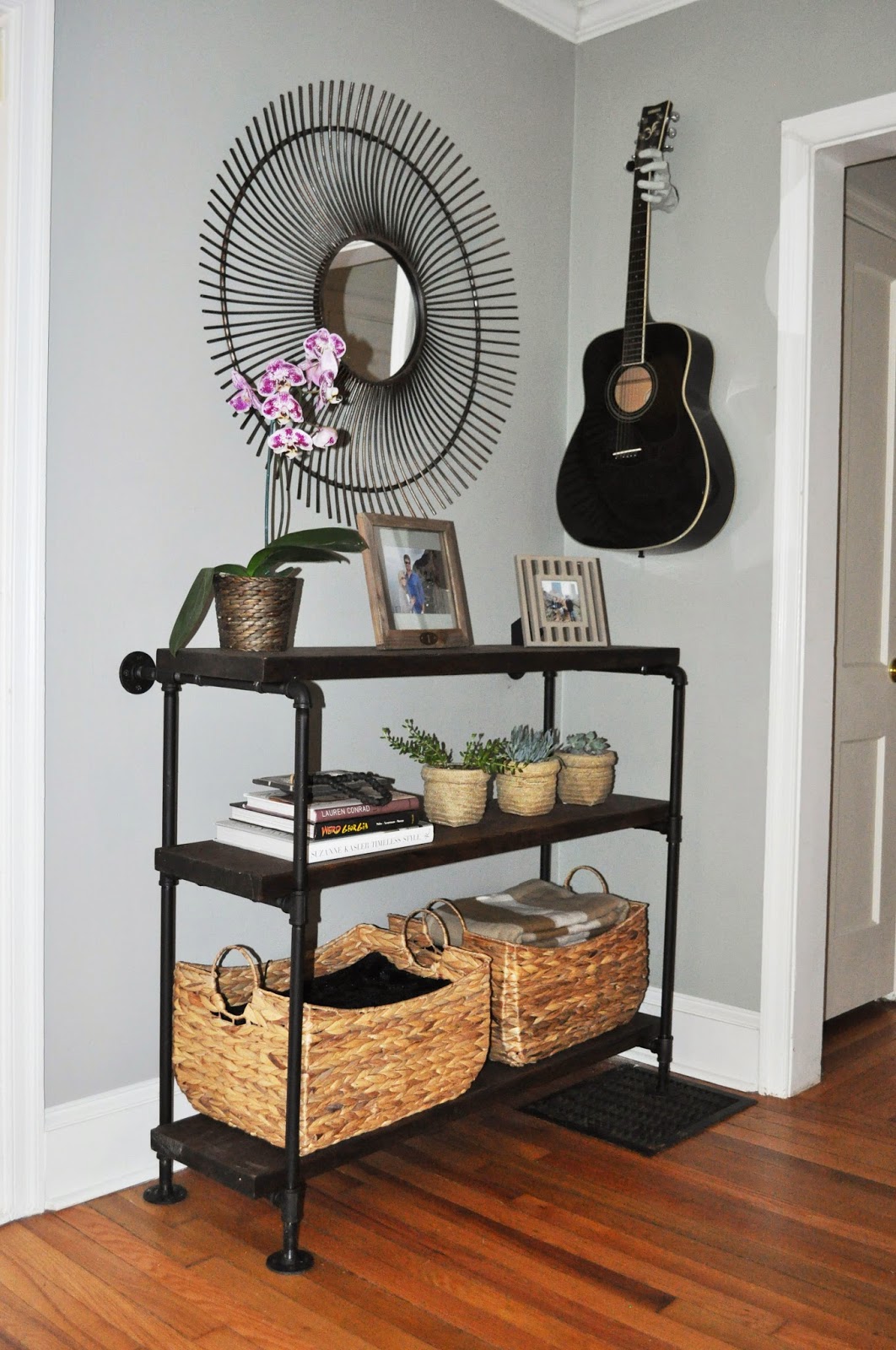
One item we had been after for sometime was a console table to fill the wall space to right of the entrance into the solarium from the living room. This is the wall you see as soon as you walk through the front door, so picking the right piece was essential. We had some criteria for our perfect console - we envisioned a table with open shelving perfect for housing books, knick-knacks and baskets. Because this piece would sit on the same wall as the large Barmoire, we wanted it to be shorter with plenty of wall space above for art.

We kept our eyes open for the perfect table for months and seriously considered a few options, but ultimately the contenders we found were lacking in one way or another. Then, one day we came across a picture on pinterest of a table made of plumbing pipe and wood. The wheels started turning and we realized we could make the table ourselves and customize it to incorporate all of our wants.

So, we headed to our home-away-from-home, Home Depot, to peruse their selection of metal piping.


We wanted the table to be 46" wide x 36" high so we bought an 8' piece of metal, which the nice guys at Home Depot cut and thread into (4) 18" pieces for us.   


We also picked up (10) 12" pre-cut pieces to form the top shelf and the cross bars.  Finally we topped off our basket with wall mounts, T joints, elbow joints and other miscellaneous metal pipe to create all the feet and fittings.


Once home we started putting all of the parts and pieces together.


We screwed 3" pieces into the wall mounts (the technical term would be a base flange) to create the feet.  


Next we connected T joints and used 18" pieces to create the space between the first and second shelves, using 12" pipe to create crossbars where the wooden shelves would sit. We repeated the process for the next level using 12" pipe rather than 18".


Once the metal structures were assembled, we spray painted them black. 


While the metal portion dried, we went to work creating our shelves. Using a 2" x 12" x 12' plank, Brent cut (3) 46" pieces with his miter saw to form the individual shelves.


Next it was time to stain the shelves. We chose the Rust-Oleum's Varathane finish - "Ash".

Brent applied the stain....


and then wiped it dry....


Once all of the various components were dry it was time to install!

Brent screwed brackets into each shelf to hold it in place.


And then he mounted the piece to the wall.


Success!! We hung some art on the wall and accessorized the shelves.....


And just like that our console table dreams came true... (yes that is a hand guitar mount we found...LOVE!) 


I love all the extra storage space this little guy offers. We have this large block sub-woofer that was sitting on the floor in this location since we moved in...attractive, I know. I was bound and determined to find a basket that would hide that little devil so it didn't mess up our aesthetics. Luckily, I was able to find the perfect baskets to house not only the sub-woofer but also blankets, magazines and miscellaneous Playstation gear. 


Seeing this project completed is so satisfying. Not only does the piece look great and possess all of the features we were looking for, but it was pretty darn easy to make and much more affordable than a lot of the console tables we found online or at stores.  The all-in cost of materials was less than $100!!! And if you want to take on a similar project but don't have a miter saw, Home Depot can cut the wood for you! 

The living room feels SO much more finished now that this wall is filled and I love that we were able to fulfill a need for our home and create a fun piece without sacrificing aesthetic, function or budget. Three birds, one stone - DONE!

All photos are my own. 

Thursday, March 6, 2014

Luxury Living Show 2014


Y'all I had a design baby. It was a very long labor, but my baby was officially introduced to the rest of the world on Sunday, March 2nd. 

 He weighs +/- 10,000lbs and is around 399.5" long.

You may remember I mentioned back in January I was designing the kitchen for the Atlanta Homes & Lifestyles Luxury Living Show. For months Mike Bell and I planned and schemed, designed and tweaked this kitchen that would sit in the middle of Phipps Plaza, a luxury shopping mall here in Atlanta for the entire month of March.

This project became my pet and I doted on it often. Carefully considering every finish and selection. I visited our shop floor on the regular to observe the progress of many of the main parts and pieces. Finally, last week our crews packed up the cabinetry and headed to Phipps Plaza to install the kitchen smack dab in the middle of the mall.

I can't say enough good things about the amazingness that is our installation crew, but they really rose to the occasion on this project. Because the kitchen sits in Phipps Plaza, a mall, all installation had to happen while the mall was closed AKA the middle of the night.

So, of course I did what any crazy obsessed designer would do and headed to Phipps to lend a hand where applicable, and watch my design come to life. It was SO cool, rewarding, exciting and entertaining watching this kitchen come together piece by piece. Thankfully, Brent, my favorite partner in crime joined me and snapped photos of the entire process.

Brent put all of the pictures together and created a video so you all can see the transformation. I'm pretty pumped as this is The Cow Spot's first video. Take a look:


Pretty cool, eh? 

On Sunday bloggers from across the country were in town for the Design Bloggers Conference and a lot of them stopped by Phipps to hear Suzanne Kasler speak IN FRONT OF MY KITCHEN! 


Talk about a cool, pinch me moment! All of the bloggers were super sweet and really had great things to say about the kitchen. Music to my ears! :)

The Luxury Living Show officially kicks off this weekend - Saturday March 8th. There will be chef's doing cooking demonstrations in the kitchen starting at noon - 3:00 p.m. The kitchen will be on display the entire month of March.

As you saw from the video there are a lot of details to see in this kitchen and like all projects this one was a giant collaboration. Here are some of the specifics about the kitchen and it's various components: The cabinetry is  Bell Cabinetry by Bell Kitchen & Bath Studios, the appliances are SubZero-Wolf,  the counter tops are Cambria from Construction Resources, tile is from Traditions in Tile, the lighting is from Circa Lighting, the faucet is Grohe, the sink is Elkay, all internal cabinetry components and lighting are from Hafele and last but definitely not least, Huff-Dewberry staged and decorated the kitchen.

I'm still pinching myself that it all came together and the space has been so well received. I'll probably stop smiling in a few weeks days. :) :)

One more photo for the road....


Oh you know, it's just me and Suzanne Kasler hanging out in my kitchen! 

If you all are in or around the Atlanta area, I hope you get a chance to stop by, I'd love to see you! 

All photos and videos are my own.