Thursday, June 26, 2014

Spotted - Atlanta Homes & Lifestyles Magazine July 2014


Well, speak of the devil. Just last week I was filling you in on the behind the scenes details of the herringbone hood from the Luxury Living Show and now that same kitchen is featured in the July issue of Atlanta Homes & Lifestyles!

Photo from Atlanta Homes & Lifestyle's website.
It's always a bit of a "pinch me moment" to see a space you've worked so hard on grace the pages of a magazine. This project in particular was so fun and really allowed me to flex my creativity muscles. I beamed a little when I first saw the pictures of the kitchen all glossy and pretty in the spread.

Photo from Atlanta Homes & Lifestyle's website.
This week marks my 6th year as Kitchen & Bath Designer! Six years seems impossible, it feels as if it was only yesterday that I was running around like a chicken with my head cut off trying to complete my final designs for graduation. I guess time flies when you're having fun! The last six years have been a sweet mixture of challenging and rewarding experiences and projects like this one have made the journey that much sweeter.

Be sure to pick up a copy of the magazine, on stands now!

Thursday, June 19, 2014

Behind the Scene: Herringbone Hood


We all love to look at the pretty picture. The pretty picture of the kitchen, of the flower, of the outfit, etc...But do you ever stop and think about how that pretty picture came to be? For Kitchen & Bath Design there are a LOT of behind the scenes happenings that take place before an idea can become a reality. With that in mind, I thought it might be fun to start a new series where I pick a "pretty" that I designed and tell the story of how it came to be.

Today's story is all about the herringbone hood I designed for the Luxury Living Show 2014.

Late last year I was doodling around when the concept for a herringbone hood hit me like a ton of bricks. At the time I was in the thick of working on designs for the Luxury Living Show and  I thought "ding, ding" - this hood concept could be perfect. I quickly started sketching out the vision, all the while smiling to myself because I just had this gut feeling this was going to be awesome.

One of the many perks to working for a custom cabinetry shop is when one has such ideas there are people that can make those dreams ideas a reality. Here at Bell Kitchen & Bath Studios the design possibilities are endless.  Our mantra - if you can think it (and we can draw it) we can make it. This has been wildly exciting to me from day one. I'm constantly trying to think of out-of-the-box ideas that only someone with custom capabilities could make happen and this herringbone hood was just that. 


Before we were ready to bring the sketch to life we had some details to work out; the first of which was the proportions of the hood. We had a good grasp on the overall length and height but we played around with the width of the planks as well as the angle of the herringbone pattern. Various sized planks were cut and we laid the hood out on the floor and tweaked and tweaked until it felt right. Once we got all of those details nailed down we focused on the material and the finish. We went back and forth  between painting and staining. Both were intriguing options, but after much discussion we decided to go with a stained knotty walnut with a natural finish. Walnut is such a beautiful wood with varying colors so we felt it would really accentuate the herringbone pattern, not take away from it.

With  the species and the color nailed down, it was time to start assembling. The guys in the shop cut a piece of  plywood  and drew out the herring bone pattern. Then they cut the pieces of walnut and we began playing with the layout. We wanted a random mix of light and dark pieces as well as a random mix of knotty and smooth. It was like a puzzle, moving pieces from here to there until we were satisfied.


We also wanted the hood to look old and not too "perfect", so we had the guys in the shop sand down the corners of certain pieces so the hood had depth and didn't lay completely flat.

Because this hood was going in the Luxury Living Show, the whole thing was assembled so countertops could be templated, which allowed me a mini-preview of the final results. 


It was definitely in the rough stage with no finish, but the proportions felt right and even sitting there all unfinished and raw it was cool, which made me that much more excited to see the finished product.

It wasn't long before the kitchen was installed and the hood was hanging smack dab in the middle of Phipps Plaza in the Luxury Living Kitchen

Photo by Barbara Brown Architectural Photography.
And here is a close up of the hood with all of the details we spent hours deliberating and discussing. I was so happy with the final results, it was everything I had envisioned and more!


As a designer, creative concepts are plentiful, but there is usually a circumstance or a person standing by ready to pop your "I'm-so-excited" bubble. I feel so fortunate to work for a company where our creative thoughts have a fighting chance and most of the time a future. It's a true thrill to watch as an idea becomes a sketch and a sketch becomes a reality and the reality becomes a fixture hanging in a kitchen that real life people can enjoy every single day. What a rush!

Unless otherwise noted all photos are my own. 

Wednesday, June 11, 2014

Top Taupes


Taupe is the Pharrell Williams of paint colors. It's hot on the charts right now and oh, so happy! 

When I think of taupe, I think of the color that is formed when coffee is mixed with milk. 

Photo from Google.
Taupe is a whisper of a color - soft and warm and very much chameleon like in nature. It offers color without being too heavy or dark and offers sleekness without being too cold and sterile. It's a happy color that brings a touch of softness and elegance to a space. Of course like all things, there are many versions of taupe. Like grays, taupes can be tricky and the road to the perfect taupe can be a painful one. The undertones play a big part in how pink/yellow/brown the taupe you choose comes out.  I've dabbled a lot in the taupe world as of late so I thought I would share my favorites with you.


Photo by Barbara Brown Architectural Photography
Indian River was the cabinetry color in my Homes of Distinction Tour Kitchen. This color is everything taupe was meant to be and more. It possesses the perfect amount of gray in the undertones which keeps the color light and airy but enough brown to darken it up just enough to add a touch of warmth. I love how this taupe contrasts beautifully with the white backsplash as well as the brown hardwoods. So, so good.


Photo by Barbara Brown Architectural Photography
We used York Gray for the perimeter cabinetry in the 2013 Holiday House Kitchen. While the word gray is in the name of this color, I'm still filing this color under taupe. A very light taupe, but taupe nonetheless. This color is about as close as you can get to having a white kitchen without in fact having a white kitchen. There is just enough color - created with very light yellow/brown undertones.


Out of all the taupe's I've played around with, this one is probably my favorite. Smokey Taupe is just a really good color. I've used it numerous times including the wet bar pictured above, which was part of my #Northcliff Kitchen, and I've never been disappointed.  I call this color a whisper, because it's just so elegant and soft.

Photo by Jen Wunderlich Photography.
Here it is again at one of my more recent kitchen remodel's - Bridgett Court. I love how this color instantly becomes so much more present when used next to white. It just pops. There are slightly red undertones in Smokey Taupe so depending on the light it can have a very light pink hue which you can see a little bit if you compare the base cabinets in the photo above with the wet bar shot. However, it's never overpowering thanks to the also present light brown undertones.

Colors are always fun to explore and I've really been digging the way our taupe selections have turned out. There are some others I've come across that I haven't tried yet like Sherwin William's Balanced Beige which looks like it might be nice. What about you guys, any favorite taupes to pass along? I'd love to add to my list!

Unless otherwise noted all photos are my own. 

Thursday, June 5, 2014

Nesbit Lakes Basement Bar


Welcome to every sports fanatics dream - a basement remodel complete with a beautifully stocked bar, SIX televisions, a pool table and loads of sports memorabilia adorning the walls. 


Speaking of sports memorabilia - check out the fun stadium seating from the old Braves stadium...love the pop of red!

Chris Pfahl of Dreamweaver Building & Remodeling gave this entire basement an overhaul and invited me to the remodeling party to design the bar.


Bars can be tricky little devils to design. Often times bars have a lot of the same components as kitchens - appliances, sink/faucet and cabinetry. So it's important to focus on creating a space that feels more "Bar" and less Kitchenette. There are several ways to go about this, starting with the appliances. Nothing screams kitchenette like appliances, especially full sized units. So, we kept the appliances, all FIVE of them under counter and panelized everything we could.


From the get go we knew this space would play host to hungry, thirsty, sports crazed friends and family, so it was important that it pack a lot of functionality. As I said, there are five appliances in this bar including a microwave, under counter refrigerator, dishwasher, under counter wine unit and ice machine.  All of that in addition to a trash pullout, sink base and roll outs offer plenty of space to store bar ware, liquor, wine, beer, coozies, napkins, snacks and other bar necessities. 

For the back wall I designed open shelving flanked by wall cabinetry to the countertops. Antique mirror was installed for the backsplash and on the wall cabinets. The cabinetry to the ceiling in addition to the mirror gives the room height and depth and the open shelving provides the perfect place to store and display liquor bottles.


The clients really wanted the bar to be a place you could "belly up" and hang out. To create this vibe a bar rail was added to the wood top and a brass foot rail was installed along the bottom, both of which  create a bold visual and a comfortable space to have a drink and relax.


Every angle of this bar is relevant because depending on which way you enter the basement this bar is always in sight. For the back of the bar, which you see upon entering the basement from the upstairs, I designed deep dish panels to be installed along with posts and large corbels. These types of beefy details are a bar's best friend.


 I'm so pleased with how this space transformed and I could definitely see myself enjoying the ambiance and relaxing with a cold drink - especially around football season! Again, a huge shout-out to Chris Pfahl of Dreamweaver Building & Remodeling who was responsible for all of the ins and outs of this project, once again he delivers an exceptional experience and product to his clients! All cabinetry is by Bell Kitchen & Bath Studios and the photography is by Jen Wunderlich Photography

Cheers to great clients and a beautiful space!


Photography by Jen Wunderlich Photography.

Thursday, May 29, 2014

Our Closet Makeover Part 2


Genius ideas are fabulous, especially when they actually work. Mid closet rod upgrade I had a thought that I instantly believed could improve life as I knew it and take this closet of ours from good to great. The idea? Hold on to your seats....A sliding full length mirror. Think full-on Beauty & the Beast sliding ladder style.

The idea manifested from pure need. Would you believe we've gone over a year without a full length mirror in this house? Here I am a girl that very much considers every aspect of an outfit - and for one whole year in order for me to see my outfit in it's entirety each morning I had to stand atop the toilet. You can imagine how glamorous I felt...We've been on the hunt for a full length mirror for a while, but didn't know where we would put it. All walls are occupied in our master bedroom and while we could integrate one into the master bath, there was no clear cut place in there either.

It wasn't until we were smack dab in the middle of our closet rod upgrade that it occurred to me that we could install one more piece of plumbing pipe the full length of the closet and then hang a mirror from the pipe that would slide from side to side.  Told ya - genius....


Pretty snazzy, right? But wait, the other thing about ideas, especially genius ones, is you have to be able to actually execute them. That's where my husband, Brent-the-brain comes in.  He did some thinking and came up with a plan to make my sliding mirror dreams come true.

Here was our process:

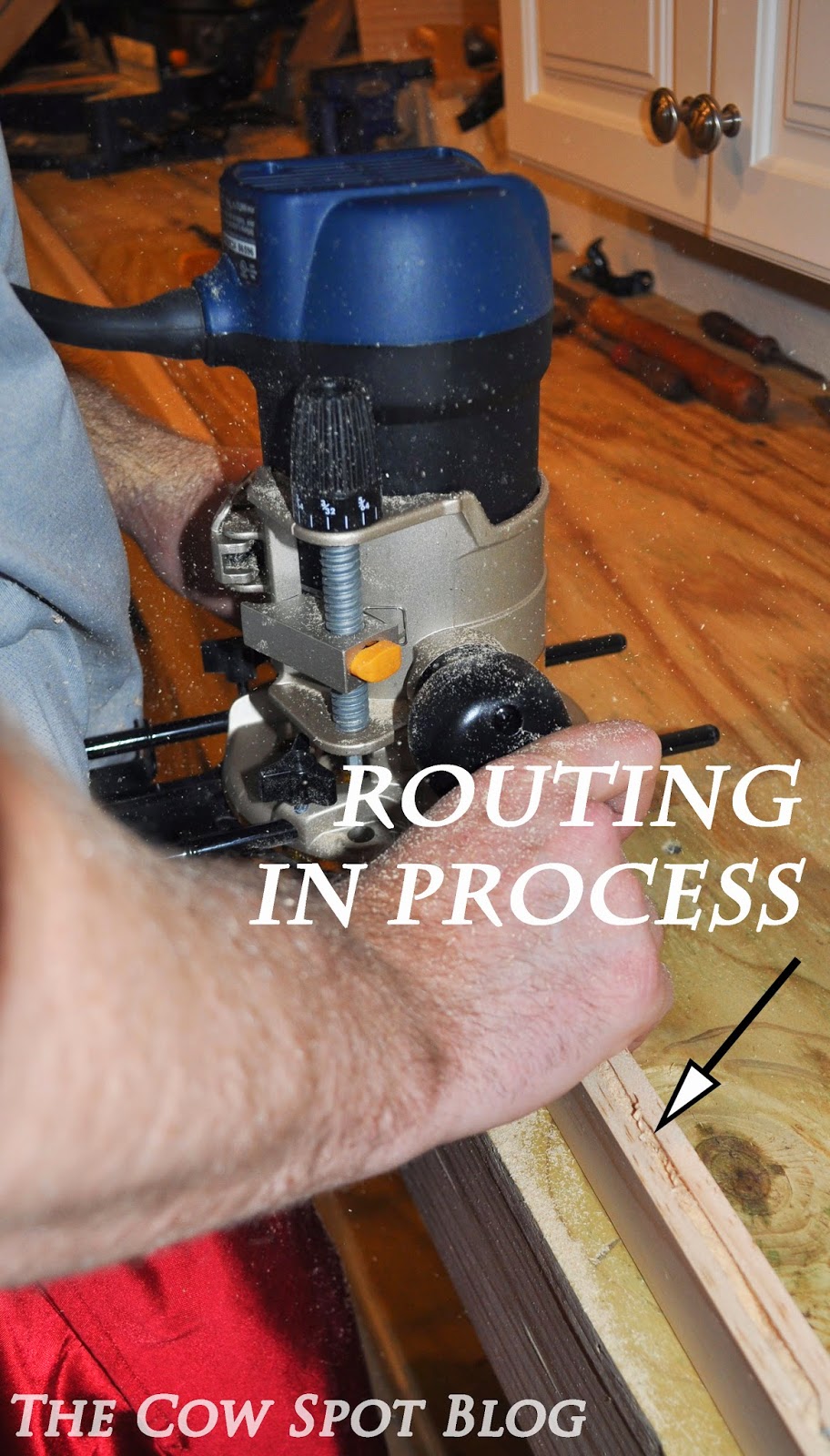
We bought some 2" x 1" pine lumber for the mirror frame. Using his router, Brent bored a 1/4" channel down the center of each piece to house the mirror glass.


We purchased a 16" x 60" mirror, so Brent miter cut the pieces of the frame and then used a joiner tool to fasten the frame together. 


Once assembled we sanded the entire frame smooth. 


Next Brent started assembling the track mechanism using a 2" x 2" and some cute little wheels purchased at Home Depot. 


Once all pieces were assembled, we stained the wood using Varathane's Ebony stain. We wanted the mirror frame to be very dark so it would blend with the black pipe. 


We let the pieces dry and then Brent slid the mirror glass into the frame. Luke was always close by supervising the progress. He like mirrors too, I mean the man is wearing a tux 24/7. He likes to admire his studly self.


To create a tight fit, Brent flipped the mirror over installed wood shims and filled the gaps in the back with silicone.


Next up we installed the plumbing pipe across the length of the closet. For this piece we used the 1" thick pipe and fastened it to the top shelf using U-bolts.


Below is the finished track mechanism. The pipe fits perfectly between the 4 wheels for a gentle slide. 


Brent fastened the sliding mechanism to the back of the mirror. 

*Alert*Alert* we have our first Shirtless-Shearer sighting of the season!


And then attached it to the pipe. 


Below is a little video we did to demonstrate how the mirror works. 
(if video has stopped, just reload this page)


Zip, zip from one side of the closet to the other. So simple and effective. I can now take the most perfect full outfit selfies, so obviously dreams are just coming true left and right around here :) We briefly worried the mirror would stick out too far and make the closet feel small and crowded but it doesn't. In fact the mirror actually gives the closet depth and makes it seem bigger. After living with the installation for a few days, we have no complaints - only praise for our new favorite toy! 

Fun fact: This entire contraption cost under $100.

All photos are my own. 

Wednesday, May 21, 2014

Our Closet Makeover


So, we sorta kinda accidentally updated our closet. Yes, you read that right and no I'm not necessarily the luckiest person in the world, but I'm pretty close ;)

Ok, so how does one go about accidently updating their closet? Good question...

Let me start from the beginning....Our house actually came with a pretty great master closet set-up. If you've ever been in a 1940's bungalow you know that storage space is not one of their strong suites. In fact, typically the closets are so painfully small that most girls would break into a panic attack upon laying eyes on them. However, Brent and I really lucked out because the previous owners added an entire second level to our home, adding a full master suite complete with a walk-in closet.

JACKPOT

We were all smitten and grateful for our closet for close to a year, but then a certain oka.B photo shoot took place at our house and we had to remove a lot of the clothes from the closet for this shot:

Photo by Peter Ho Studio.
You know how it goes, once you tear something apart it's real tough to just throw it back together without taking a moment to re-evaluate. So, with our closet partially dismantled we decided to edit our clothing and consider some issues we had observed over the past year, namely a couple of sagging rods.


This little dilemma just wouldn't do, you see - We  I gots lots of clothes... and we didn't really see that changing anytime soon. We decided to capitalize on the half empty closet and remedy this issue before a rod snapped and the entire closet went to shambles. First things first, we had to empty out the rest of the clothes....


All the shoes too....


With our closet emptied out it was time to get crackin' on some new rods. As we considered our options, we knew we wanted to use a material that would be very strong, so the sagging wouldn't become an issue in the future. We knew metal would be stronger than wood and coming fresh off our DIY Console Table project where we used plumbing pipes, we decided the same material would be a cool concept for our closet rods as well.

There are rods in 5 different areas of the closet, so we took some measurements to determine the length of each space. Just like with the console table we had the guys at Home Depot cut and thread the pipes to our desired lengths.


We assembled the rods, joints and flanges to form T's for the top of the closet and one cross piece at the bottom. 


Once assembled, Brent spray painted all of the pieces black so everything would be uniform. 

Installation was pretty simple. To begin Brent measured to ensure the clearances were appropriate for the hangers. Next he made sure each rod was level and then simply screwed the flanges to the wall. 


Everything fit together seamlessly and I really love the unexpected industrial vibe the plumbing parts create.


Plumbing parts in a closet...random yes, but oh so effective! This concept was relatively inexpensive and totally customizable, not to mention these pipes could hold up a dangling linebacker. It was just the solution we needed and we really like how it turned out. In fact we liked it so much our little brains kept ticking away and before we knew it we had come up with another random, possibly genius idea, that we went for. Unfortunately for now I'm going to have to leave you with a big fat dot dot dot here:
. . .
(I'm feeling literal today)

Adding it to this post would make for one ginormous post and I just don't feel like getting carpal tunnel this early in life, so I'm going to be sharing part 2 with you next week. You know the drill, stay tuned! 

Unless otherwise noted all photos are my own. 

Tuesday, May 13, 2014

A New Direction for the Solarium


We move around this house like a bouncy ball. Up and down, here and there, in and out. It's like we have decorating A.D.D.  I'm not complaining, simply stating facts. To be honest, this process works for me and my brain. I need to execute one concept at a time, let it soak in and then go from there. If I try to bite off the whole thing at once, I often rush things and end up regretting decisions or purchases. So, a human bouncy ball it is.

One space we have really been taking our time with is the solarium. We have definitely rolled in and out of this room a few times. Since moving in we have painted the ceiling and stenciled the flooring, leaving us with this:


With the space looking better and better with each completed project the question continued to arise - what was the end game? When I initially thought about the future of this room I envisioned a proper sunroom - flowy drapes, a sisal rug and some wicker furniture, you know the usual. But the longer we lived in this house, the harder it was for me to picture a room filled with pretty furnishings that no one would ever use. Of course people would walk through the pretty room to and from the deck, but no one would ever actually hang out in there. Some might argue that we would read, have tea or just sit with friends and chat, but when your house is right under 2000 square feet, allotting that much space to an "every now and then" used room seemed wasteful.

When we let ourselves stop and think about the out-of-the-box possibilities we realized we had one big glaring need this room could easily fill - Organization. We have important papers, computers, chargers, notepads, bills, pens and other work related paraphernalia EVERYWHERE! It took us 30 minutes to locate our marriage license when I went to change my last name. We are constantly chasing our tails trying to remember where we put stamps, our passports, the checks... It's insane! Our "to shred" stack is huge and there are three of them. You get the point, our lives would be SO much....well... more organized if we had one central location to house the above items AKA an OFFICE!

So, we broke out the sketch pad and began dreaming about our perfect space. We wanted a place to store the printer and shredder, a drawer for files in addition to a separate knee space for each of us. After a few tweaks we landed on this:

CAD drawings by my favorite CAD wizard - Wanda. 
Once the idea slipped from our brains, into conversation and onto paper, the more and more we knew this was the perfect use of this space. The room is bright with tons of natural light - making it a great design work space. Plus there is an entrance from the outside. So, if I ever needed to work from home clients would have a straight path to my work zone that doesn't include coming through the front door.  Because this room is the bridge between the house and the back deck, it sees a lot of traffic when we entertain. This was the only negative for placing the office here, UNTIL we realized the desk will easily double as a buffet (with a table cloth over it of course) when we have parties. We also plan to keep some of the bar ware in the far right cabinet right next to the deck for easy access. We are all about Multi-functional spaces!

Once we ironed out all of the details, things really started coming together; we had the electrician out a few weeks ago to install outlets on the wall and the cabinetry should be ordered this week. Plus, we happened upon the world's cutest office chairs last weekend at Scott's Antique.


We've been on the lookout for chairs for some time, but everything we found fell short in one way or another. When we found these chairs WITH WHEELS, arms and cushions, it was love at first sight. The existing upholstery is pretty worn and will have to be replaced. I love the fact we have the opportunity to customize them to add another layer of cool to the space. I have no idea what upholstery treatment they will get but I'm excited to explore the options. I smell a whole blog dedicated to these chairs coming up, wink - wink :)

A room with a plan - I love it! I'm confident this is the right direction for this room and I can't wait to see it all come together. Stay tuned -  cabinetry should be installed in June and it's full steam ahead from there! 

All photos my own.