Showing posts with label Mike Bell. Show all posts

Wednesday, March 26, 2014

Metal Mixing


A common kitchen and bath related question I'm often asked:

Can you mix and match finishes within a space?

For years it was an interior design taboo to mix finishes. If you chose oil rubbed bronze for your faucet than it was expected that your light fixture, hardware and curtain rod would to be oil rubbed bronze too. The same concept was true for fashion accessories, if you chose gold hoop earrings to compliment your ensemble then your other jewelry needed to be gold toned as well. This concept was tried and true for a long time but as of late I've noticed a revolt against the matchy-matchy.

It's hard to say exactly when the mixing of metals became acceptable, but I'm crediting David Yurman with the trend. For years he has being designing iconic pieces mixing gold and silver in his creations.
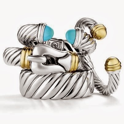
Photo via google Pinterest search. 


It's interesting how gold and silver are both beautiful metals in their own right, but combined, they really pop and the elegance is undeniable.  For my wedding day I wore an arm full of silver and gold DY bangles and gold earrings.

Photo by Tisha Saunders of Flashback Photography.
I even mixed it up for my wedding set with a white gold engagement ring and a yellow gold wedding band. I love the freedom this combination gives me; with such a staple part of my everyday jewelry ensemble being two toned metal I feel I can mix and match as I please. Obviously, you want to do so in a way that looks intentional and not so much like you got dressed in the dark, but overall I'd say mixing metals is 100% acceptable as far as fashion is concerned.

But what about when it comes to interiors?

Chrome, Oil Rubbed Bronze, Antique Brass, Polished Nickel, Brushed Nickel, Black, Polished Brass, Stainless Steel, Copper, Satin Nickel...SO.MANY.OPTIONS! Can they play together?

Below is a picture of my 2013 Holiday House Kitchen. If you look closely you will see there is a lot of metal mixing going on.

Photo by Barbara Brown of Barbara Brown Architectural Photography.
The metal strips on the hood and all cabinetry hardware have an antique brass finish. The sinks and faucets are stainless steel and the light fixture is aged iron. It's a smorgasbord, but it works.

Below is a photo is of my Grandmother's Kitchen. All of the appliances are stainless steel and all of the hardware and the faucet are antique brass.
Photo my own. 
The cabinets are light gray and while it would of been easy to go with a more silver toned finish for the hardware and faucet because of the stainless appliances, I felt that would evoke a more modern look. We really wanted the space to have a casual elegant vibe and I knew the antique brass was just the right finish to help us achieve that look. To marry the two finishes we selected a light fixture with a champagne finish. The finish has depth with both silver and gold tones within, which brings the whole look together. 

Photo by Barbara Brown of Barbara Brown Architectural Photography.

Above is a kitchen designed by Mike Bell. As you can see this space has stainless steel appliances, polished nickel hardware and black lights. Black and white is always a classic combination. While black knobs would of worked in this space the polished nickel hardware really ties in nicely with the stainless steel and adds a layer of elegance to the room.

The whole concept of mixing metals is so liberating to me. It allows us to focus on what finish works best for each specific element within a space. That's not to say sticking with the same finish throughout a room can't work, it can and does. But isn't it satisfying to know you don't HAVE to? To me, accessories be they interior or fashion based, are meant to enhance a space or an outfit. It's easy to get caught up in the abundance of choices when attempting to select the right finish for your project. My advice, take a step back, consider your space and the overall look you are trying to achieve and then make one selection at a time. The devil is in the details folks, take your time and know, no two rooms or outfits are alike - pick what works for you!

Tuesday, July 3, 2012

Size Matters

Have you ever walked into a room and instantly loved it for so many reasons, none of which you can put your finger on? This has happened to me countless times. Some houses, rooms, spaces, even outfits just work and while the how is unclear, the fact is, design magic has happened.

There are several factors that come together to spark design magic, but one of the most important of those is scale. Scale is as important to design, as cheese is to cheese dip. Dead serious. Scale is one of those silent components that can really make or break a room.

Scale is the size relationship from one object to another.

Scale comes into play a lot in design. From the way you decorate your mantle, to the cabinets you choose to put on the same wall as your oven, to the pieces of art you choose for both large and small walls in your home. Scale is relevant everywhere.

Let's start with scale gone wrong.

This blog has been a long time coming. The final straw/slap in the face inspiration came while I was in Chicago in April, for the KBIS show.

This photo is my own.
THIS is my hotel room, and that tiny spec you see on the wall is not a cockroach, it's art. The only art on the entire wall. I mean, obviously they're trying (dear God, let's hope) to make some kind of understated design statement by choosing this size art for this size room, but I don't get it. All I see is a whole lot of wall and I'm bored.


It's hard for me to be negative about this room, I mean it has a COW RUG for crying out loud. But, alas I must critique. The scale in this room is off, specifically on the back wall. The frame and accessories used  are far too small to carry off this large wall. A collection of three frames that size over the bed would have worked much better. Also, I would group the gold candle stick holders together instead of having them flank anything. Sometimes too much matchy-matchy balance can be just as bad.


The one picture featured on this wall is WAY to small. While the white space around the fireplace is not vast, the picture still gets lost on the wall around it.


This Kitchen has good and bad scale. The cabinetry scale in this kitchen is good. The cabinets have good symmetry and the variation of depth add interest. The window however, kills the whole thing. While I like the window in general it is far too small to be located where it is with nothing on either side of it. The window  should either be bigger or they should have incorporated more wall cabinets on each side.

Scale done Right.

This room has great scale.There is a lot going on in this room but everything balances, and does so without trying too hard. There are some matchy-matchy elements like the fur ottomans (love), but then other items like the lamps balance without being identical. Another big plus is the mirror, notice the width and height are appropriate for the location within the space. Due to the scale and symmetry, this room feels complete.


While some might find this space really cluttered, I find it fun and unique. Notice that the walls to either side of the fireplace are not equal. The right side is much larger than the left. While this fact could seriously derail some, whoever designed this space brilliantly decorated these walls in such a way that your eye probably doesn't even notice the two walls aren't the same until you look closely. I'm also loving the mixture of shapes, sizes and materials. On the fireplace wall alone we have large mirrored circles, a small round frame, and three varying sized rectangular frames. The mixing of these elements gives the room depth. Depth AND Scale... Home run, every time.


CLAPPING!!!!!!!! This is scale done right, right here. This Kitchen was in the Atlanta Homes & Lifestyle's 2010 Christmas House and was designed by Mike Bell of Inspirations Design Studio. While this kitchen looks vast, it is only 200 square feet. Because the space was small, scale was very important. As you can see all cabinetry goes to the ceiling, but glass cabinets were cleverly used at the top to make the space appear taller. This kitchen is very symmetrical and it's clear a lot of attention was paid to scale, which is one of the main reasons this space is so pleasing to the eye.

As you can see, scale is very important and something to really consider when investing in your space. Scale can truly make the difference in a "ho hum" space and a great space. You want your space to feel complete, not like a piece is missing. I'd rather see a completely blank wall than a wall with two dinky frames floating in the middle, giving the impression there was a BOGO (buy one get one) sale at Hobby Lobby. Don't get me wrong, I'm not knocking Hobby Lobby, you can find all kinds of treasures there. But at the end of the day it's about considering the size of the space you're accessorizing in relation to the size of the accessory you are looking to buy.

Unless otherwise noted all photos are from google search.