Showing posts with label Barbara Brown Architectural Photography. Show all posts

Thursday, June 19, 2014

Behind the Scene: Herringbone Hood


We all love to look at the pretty picture. The pretty picture of the kitchen, of the flower, of the outfit, etc...But do you ever stop and think about how that pretty picture came to be? For Kitchen & Bath Design there are a LOT of behind the scenes happenings that take place before an idea can become a reality. With that in mind, I thought it might be fun to start a new series where I pick a "pretty" that I designed and tell the story of how it came to be.

Today's story is all about the herringbone hood I designed for the Luxury Living Show 2014.

Late last year I was doodling around when the concept for a herringbone hood hit me like a ton of bricks. At the time I was in the thick of working on designs for the Luxury Living Show and  I thought "ding, ding" - this hood concept could be perfect. I quickly started sketching out the vision, all the while smiling to myself because I just had this gut feeling this was going to be awesome.

One of the many perks to working for a custom cabinetry shop is when one has such ideas there are people that can make those dreams ideas a reality. Here at Bell Kitchen & Bath Studios the design possibilities are endless.  Our mantra - if you can think it (and we can draw it) we can make it. This has been wildly exciting to me from day one. I'm constantly trying to think of out-of-the-box ideas that only someone with custom capabilities could make happen and this herringbone hood was just that. 


Before we were ready to bring the sketch to life we had some details to work out; the first of which was the proportions of the hood. We had a good grasp on the overall length and height but we played around with the width of the planks as well as the angle of the herringbone pattern. Various sized planks were cut and we laid the hood out on the floor and tweaked and tweaked until it felt right. Once we got all of those details nailed down we focused on the material and the finish. We went back and forth  between painting and staining. Both were intriguing options, but after much discussion we decided to go with a stained knotty walnut with a natural finish. Walnut is such a beautiful wood with varying colors so we felt it would really accentuate the herringbone pattern, not take away from it.

With  the species and the color nailed down, it was time to start assembling. The guys in the shop cut a piece of  plywood  and drew out the herring bone pattern. Then they cut the pieces of walnut and we began playing with the layout. We wanted a random mix of light and dark pieces as well as a random mix of knotty and smooth. It was like a puzzle, moving pieces from here to there until we were satisfied.


We also wanted the hood to look old and not too "perfect", so we had the guys in the shop sand down the corners of certain pieces so the hood had depth and didn't lay completely flat.

Because this hood was going in the Luxury Living Show, the whole thing was assembled so countertops could be templated, which allowed me a mini-preview of the final results. 


It was definitely in the rough stage with no finish, but the proportions felt right and even sitting there all unfinished and raw it was cool, which made me that much more excited to see the finished product.

It wasn't long before the kitchen was installed and the hood was hanging smack dab in the middle of Phipps Plaza in the Luxury Living Kitchen

Photo by Barbara Brown Architectural Photography.
And here is a close up of the hood with all of the details we spent hours deliberating and discussing. I was so happy with the final results, it was everything I had envisioned and more!


As a designer, creative concepts are plentiful, but there is usually a circumstance or a person standing by ready to pop your "I'm-so-excited" bubble. I feel so fortunate to work for a company where our creative thoughts have a fighting chance and most of the time a future. It's a true thrill to watch as an idea becomes a sketch and a sketch becomes a reality and the reality becomes a fixture hanging in a kitchen that real life people can enjoy every single day. What a rush!

Unless otherwise noted all photos are my own. 

Wednesday, June 11, 2014

Top Taupes


Taupe is the Pharrell Williams of paint colors. It's hot on the charts right now and oh, so happy! 

When I think of taupe, I think of the color that is formed when coffee is mixed with milk. 

Photo from Google.
Taupe is a whisper of a color - soft and warm and very much chameleon like in nature. It offers color without being too heavy or dark and offers sleekness without being too cold and sterile. It's a happy color that brings a touch of softness and elegance to a space. Of course like all things, there are many versions of taupe. Like grays, taupes can be tricky and the road to the perfect taupe can be a painful one. The undertones play a big part in how pink/yellow/brown the taupe you choose comes out.  I've dabbled a lot in the taupe world as of late so I thought I would share my favorites with you.


Photo by Barbara Brown Architectural Photography
Indian River was the cabinetry color in my Homes of Distinction Tour Kitchen. This color is everything taupe was meant to be and more. It possesses the perfect amount of gray in the undertones which keeps the color light and airy but enough brown to darken it up just enough to add a touch of warmth. I love how this taupe contrasts beautifully with the white backsplash as well as the brown hardwoods. So, so good.


Photo by Barbara Brown Architectural Photography
We used York Gray for the perimeter cabinetry in the 2013 Holiday House Kitchen. While the word gray is in the name of this color, I'm still filing this color under taupe. A very light taupe, but taupe nonetheless. This color is about as close as you can get to having a white kitchen without in fact having a white kitchen. There is just enough color - created with very light yellow/brown undertones.


Out of all the taupe's I've played around with, this one is probably my favorite. Smokey Taupe is just a really good color. I've used it numerous times including the wet bar pictured above, which was part of my #Northcliff Kitchen, and I've never been disappointed.  I call this color a whisper, because it's just so elegant and soft.

Photo by Jen Wunderlich Photography.
Here it is again at one of my more recent kitchen remodel's - Bridgett Court. I love how this color instantly becomes so much more present when used next to white. It just pops. There are slightly red undertones in Smokey Taupe so depending on the light it can have a very light pink hue which you can see a little bit if you compare the base cabinets in the photo above with the wet bar shot. However, it's never overpowering thanks to the also present light brown undertones.

Colors are always fun to explore and I've really been digging the way our taupe selections have turned out. There are some others I've come across that I haven't tried yet like Sherwin William's Balanced Beige which looks like it might be nice. What about you guys, any favorite taupes to pass along? I'd love to add to my list!

Unless otherwise noted all photos are my own. 

Wednesday, March 26, 2014

Metal Mixing


A common kitchen and bath related question I'm often asked:

Can you mix and match finishes within a space?

For years it was an interior design taboo to mix finishes. If you chose oil rubbed bronze for your faucet than it was expected that your light fixture, hardware and curtain rod would to be oil rubbed bronze too. The same concept was true for fashion accessories, if you chose gold hoop earrings to compliment your ensemble then your other jewelry needed to be gold toned as well. This concept was tried and true for a long time but as of late I've noticed a revolt against the matchy-matchy.

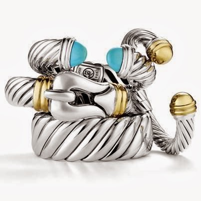
It's hard to say exactly when the mixing of metals became acceptable, but I'm crediting David Yurman with the trend. For years he has being designing iconic pieces mixing gold and silver in his creations.

Photo via google Pinterest search. 


It's interesting how gold and silver are both beautiful metals in their own right, but combined, they really pop and the elegance is undeniable.  For my wedding day I wore an arm full of silver and gold DY bangles and gold earrings.

Photo by Tisha Saunders of Flashback Photography.
I even mixed it up for my wedding set with a white gold engagement ring and a yellow gold wedding band. I love the freedom this combination gives me; with such a staple part of my everyday jewelry ensemble being two toned metal I feel I can mix and match as I please. Obviously, you want to do so in a way that looks intentional and not so much like you got dressed in the dark, but overall I'd say mixing metals is 100% acceptable as far as fashion is concerned.

But what about when it comes to interiors?

Chrome, Oil Rubbed Bronze, Antique Brass, Polished Nickel, Brushed Nickel, Black, Polished Brass, Stainless Steel, Copper, Satin Nickel...SO.MANY.OPTIONS! Can they play together?

Below is a picture of my 2013 Holiday House Kitchen. If you look closely you will see there is a lot of metal mixing going on.

Photo by Barbara Brown of Barbara Brown Architectural Photography.
The metal strips on the hood and all cabinetry hardware have an antique brass finish. The sinks and faucets are stainless steel and the light fixture is aged iron. It's a smorgasbord, but it works.

Below is a photo is of my Grandmother's Kitchen. All of the appliances are stainless steel and all of the hardware and the faucet are antique brass.
Photo my own. 
The cabinets are light gray and while it would of been easy to go with a more silver toned finish for the hardware and faucet because of the stainless appliances, I felt that would evoke a more modern look. We really wanted the space to have a casual elegant vibe and I knew the antique brass was just the right finish to help us achieve that look. To marry the two finishes we selected a light fixture with a champagne finish. The finish has depth with both silver and gold tones within, which brings the whole look together. 

Photo by Barbara Brown of Barbara Brown Architectural Photography.

Above is a kitchen designed by Mike Bell. As you can see this space has stainless steel appliances, polished nickel hardware and black lights. Black and white is always a classic combination. While black knobs would of worked in this space the polished nickel hardware really ties in nicely with the stainless steel and adds a layer of elegance to the room.

The whole concept of mixing metals is so liberating to me. It allows us to focus on what finish works best for each specific element within a space. That's not to say sticking with the same finish throughout a room can't work, it can and does. But isn't it satisfying to know you don't HAVE to? To me, accessories be they interior or fashion based, are meant to enhance a space or an outfit. It's easy to get caught up in the abundance of choices when attempting to select the right finish for your project. My advice, take a step back, consider your space and the overall look you are trying to achieve and then make one selection at a time. The devil is in the details folks, take your time and know, no two rooms or outfits are alike - pick what works for you!

Wednesday, May 29, 2013

Wine and Kitchen Petting? Yes Please...

I'm back from the most wonderful two weeks in Italy. Brent and I had so much fun on our honeymoon and enjoyed every second! We got back on Saturday and it was so nice to have a few days to decompress before getting back to the real world. But alas, here I sit, in the real world and I can honestly say I'm refreshed and happy to be back in my routine. As excited as I am to share some photos from our trip, I felt it necessary to share these pictures of the Luxury Living Show Kitchen with you.


As I mentioned a few weeks ago, Mike Bell and I had the privilege of working on this project with Joel Kelly of Joel Kelly Designs. This year's kitchen is a bit more modern than previous Luxury Living Show kitchens, but it's full of functionality and fun. I mean, it has a ladder, does it get more fun than that? The cabinetry is by Bell Kitchen & Bath Studio and is pecan with a weathered gray stain. The countertops and the hood are Cambria, color: Wellington.

This kitchen was on display at Monarch Court in Phipps Plaza down in Buckhead this past month of May. If you didn't get a chance to check it out FEAR NOT! The display has been moved to the Atlanta Food & Wine Festival, which kicks off this Friday.

This year's kitchen has pops of interest layered throughout the space. Make plans to head down to the Atlanta Food & Wine Festival so you can sip on some wine while you open the drawers, feel the countertops and explore the organizational elements scattered throughout the space.

Click here for more information regarding the Atlanta Food & Wine Festival.

All photographs by Barbara Brown of Barbara Brown Architectural Photography.