Thursday, March 29, 2012

Do Fret

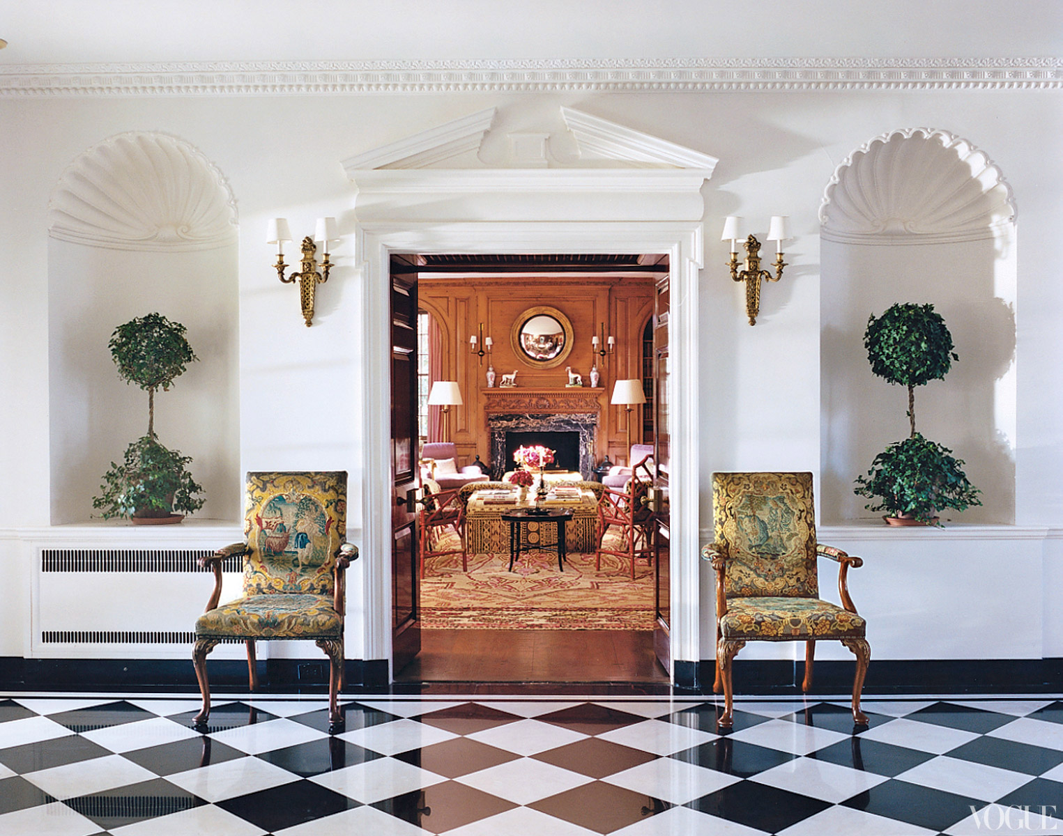
When designing a kitchen or bath, it is important to make sure the space is functional.  But let's be honest,  while function is very important, we want our kitchens and baths to be pretty! The goal is to satisfy all functional needs while aesthetically creating a timeless look with just enough pizazz to give your kitchen or bath a look of its own. Because cabinetry is such a big part of both the kitchen and the bath, it's a good place to really add detail. Over the years we have played with design techniques such as staggering cabinet depths and heights and two-toned kitchens with island and perimeter cabinets being different colors, finishes and wood species. Also the addition of feet, posts, valances, bead board and corbels add that extra layer of depth and detail to a space. While all of these techniques are still very much relevant, a new favorite addition of mine is fretwork. Fretwork is the ornamental design in wood consisting of three-dimensional frets. Fretwork can be done many different ways but this custom addition gives cabinetry a more furniture style look. 


While there was no other color or texture introduced through the fretwork you see above, the detailed design really gives this sink base some personality. 


How elegant is this? This fretwork is incorporated with glass doors which gives these wall cabinets a china cabinet feel to the space. I really love the detailed design and how the light bounces off the glass. 


I've shown this kitchen before, but I just love it! This kitchen is actually here in Atlanta, GA and was part of the Atlanta Symphony's Decorator Show House 2010.

You will notice the fretwork on the three large doors to the left of the hood. Not only do I love the fretwork design but I love that this kitchen incorporates the fretwork with mirrored doors. Mirrored doors are a good option, because you don't have to keep the contents of those cabinets "show ready" because you cannot see through them like the glass cabinets. There is a lot of detail in this kitchen, which is one reason it is so beautiful. With that being said, I really like how they kept the fretwork to only the three cabinets shown above so as not to overwhelm the space.

This photo is from Cindy's Glasswork Designs.
The picture above shows custom stain glass french doors by Cindy Shearer of Cindy's Glasswork Designs, but they look like fretwork! This particular photograph has gotten a lot of attention on her site, and I think it's because people really respond to the detail and elegance of this look. 


Wouldn't these two furniture pieces make the coolest vanities? While both fretwork designs and colors are different, both show the fretwork with mirrored doors. They are both statement pieces that could be utilized in any room of your home. 

This post was inspired by a project I'm currently working on. I've been working on this project for sometime and we are very close to finalizing the designs. Recently, upon the home owner's request (she's a dream client, constantly tweaking and making the space fit her needs to a tee), we added Gothic style fretwork to two large cabinets on one of three cabinetry walls, and WOW... do they make that space come alive! Like all things, you don't want to overdo fretwork, but just the right amount can really make a space pop. So, don't fret over your project, but DO fret in some cabinetry!

Unless otherwise noted all photos are from google search.

Sunday, March 25, 2012

Splurge-a-rific Bathroom Add-ons


There are those add-ons in life that you never knew you needed until you got them. Take a car for example, there are so many amenities that are offered today, from heated seats, GPS and heated steering wheels to hands free phone devices and car TVs. The truth is, once you live with some of these add ons it's hard to live without them. In a world where everything you buy comes with an upgrade option, it's hard to decipher what items/add-ons are splurge worthy and which ones are just frivolous. As you navigate through a kitchen and bath remodel I know you are always looking for ways to spend more money, right?? Didn't think so, but spending a little extra for certain things can go a long way and really pay off in the long run.

TOTO Washlet E200 Series
Photo from Tot's website.
Allow me to introduce you to the Rolls Royce of toilet seats, the Toto Washlet. The Washlet is essentially a smart toilet seat with a long list of features that are cleverly hidden inside the seat. Some of the features include, heated seat with temperature control, an integrated wand that releases a warm, soothing stream of aerated water, warm-air drying with a variable three-temperature setting, massage features, automatic air purifier and a toilet lid that is activated by sensors and opens and closes on its own. Oh, and did I mention it has a wireless remote control with large LCD panel? Because this seat has all of the functions (and more) of a bidet AND it will fit on most standard toilets, it's an economical and aesthetic way to kill two birds with one stone. While these seats are not inexpensive, you can achieve both a toilet and bidet in one purchase. Washlet prices range from $727.00 to $1,890.00.

A spa like retreat has been a popular trend for many bathroom remodels. Nothing says spa like being greeted after a shower or bath with a nice warm towel, especially on a cold winter day. Towel warmers are the epitome of luxury. 
Warmly Yours Electric Towel Warmer
Photo from Warmly Yours website.

This towel warmer can be plugged into an outlet or hardwired; making this a good choice for someone who wants a towel warmer but doesn't want to involve an electrician. Wall hung towel warmers come in several different designs but for the most part have a more contemporary feel, maybe because most of them come in a stainless steel finish.


Warming drawers are typically found in the kitchen but are easily adaptable for bathroom use as towel warmers! Just like warming drawers you find in the kitchen you can panelize the appliance (add a cabinet front) so, upon entering the room the warming drawer is concealed - genius! The addition of a warming drawer is a good option for someone who is getting new cabinetry. Retro- fitting a warming drawer (towel warmer) to fit in an existing cabinet hole is not advisable.

MTI's Trina freestanding tub.
Photo from MTIs website.
At a point luxury is getting what YOU want, with features that benefit YOU and that's exactly what MTI Tubs is about. From an aesthetic standpoint the styles are endless, plus you can choose from  so many different features to make your tub fit you and your preferences. The choices begin with hydrotherapy type: soaker, whirlpool, airbath or a combination. If your tub has jets you can specify the placement of jets, which is a helpful feature especially for someone with back and joint pain. Other add ons include, aromatherapy which is the use of different aromatic essences used to induce relaxation and increase energy. Chromatherapy is the therapeutic use of different colors of light which can add to overall health and well being.  Audiotherapy is another add on option which is an invisible audio system that delivers full- bodied sound through the tub, harnessing the healing power of music. Today bathtubs serve as a major focal point for many spaces, so why not have it all - looks and function, now that's luxury.

Warmly Yours floor warming system with Smartstat thermostat.
Photo from Warmly Yours website.
Floor warming systems are a popular add for bathrooms, especially in those areas of the world with cold mornings. A large percentage of bathrooms have tiled flooring and cold mornings with bare feet on tile is definitely not the happiest of ways to wake up. Floor warming systems are installed underneath the flooring and produce heat that comes through the floor. The system can be controlled by a thermostat that you can actually set to come on say 15 minutes before your alarm goes off, so the bathroom is nice and toasty when you get up. I've read that one in five people or  20% of potential home buyers say that floor heating is a desired luxury when searching for and buying a new home.

As you can see there are many ways to take your bath to the next level. If you find your splurge wish list is getting too long, consolidate! Skip the warming drawer and just lay your towel on your heated floor while you are in the shower or tub and when you get out...wa la a heated towel! :)


Unless otherwise noted all photos are from google search.

Friday, March 16, 2012

Brass is Back

You may expect to see a pig sprout wings and fly across the sky before you believe a statement like this, but it's true - brass is back! I know a lot of you are thinking you JUST got the dreaded brass out of your house, but fear not, today's brass is anything but drab, overdone and shiny shiny. As we've talked about in previous posts, brass got its bad wrap due to its overuse in the 90's. Overuse and pairing with lots and lots of white. If every house one visited over the course of a decade didn't have this blahhhh combination, maybe we'd think differently, but unfortunately this is the ugly truth. So, brass' reputation has been one that has been hard to shake for many people, but it appears the time has come when the possibilities are many for doing brass right!


We've seen this kitchen a thousand times; white perimeter cabinetry paired with a darker contrasting island. Most of the time you see this look paired with polished chrome, satin nickel or black hardware. While I love that look the addition of the brass hardware, faucet and light fixtures gives this kitchen an edge, something different that maintains the timeless look with addition of some elegance.


This is a bathroom I worked on in 2010 and is one of my favorites to date. This space is very tranquil and elegant. My client is the one who initially wanted to use the polished brass. My first reaction was, "really??" Especially because the cabinetry was going to be a painted white color, hello 1994, I thought. But as the selections for the space came together it became clear the brass added to the richness and warmth of the space.  Plus, today's plumbing, lighting and hardware options have so much more detail than they had years ago, so the brass finish can really enhance the pieces.

For example:

Both of these knobs are from Top Knobs. Notice how the detailing in these knobs is really highlighted with the brass finish. They look heavy and substantial and much more stylish than the brass knobs from the past which had a tendency to be smooth with very little detail.


To me, this is where brass is really cool right now - used with the popular gray cabinetry. It's such a cool contrast, mixing both cool and warm tones. I especially love how the brass hardware in the first picture is almost an exact match to the gold veining in the marble countertop.


Here we are again with the white kitchen! Brass hardware was used in this space, but what I'm really digging in this kitchen is the brass light fixtures and pot filer you can see wayyyy back on the back wall, I think they go really nicely with the funky black and white flooring.

My two cents: One thing I'm not loving about this photo, the sink appears to be stainless. In my opinion you should try to keep all finishes the same. Or, if you are going to mix, you should do so in a way that makes sense. For example, your island hardware is one finish and your perimeter hardware is another. I do not like the idea of having your apron front sink or faucet be a different finish from the hardware and light fixtures that surround it. While there are not many options for brass apron front sinks, I would of gone with a white sink in this space, but that's just me - to each their own!

So, there you have it - brass is making its modernized debut! Good news is, if you are still too scarred by the brass of the past to take the plunge, other finishes such as polished nickel, satin nickel, black and oil rubbed bronze are still relevant and kicking. So, as always go with what you love!

Unless otherwise noted all photos came from google search.

Wednesday, March 7, 2012

At Home with Tory Burch


Tory Burch is no stranger to Vogue magazine, but this month I was BEYOND excited to find, not only Tory Burch, but Tory's HOUSE featured in the March issue on stands now.  

This is Tory in her dining room. Look at those fabulous walls - A Paris based wallpaper designer created custom panels based on Persian Iznik tiles.

I am a true lover of fashion and interiors, so it's not surprising that I found this article fascinating to say the least.  As I've mentioned before, I believe the similarities between fashion and interiors are many. I believe that our homes and our personal style are the canvases in our life we have the opportunity to define. Coco Chanel said, " An interior is the natural projection of the soul;" isn't that such a true statement? If you think about it, you can really tell a lot about  a person by spending time inside their home. So many characteristics including personality, temperament and style are recognizable through how one chooses to live in their private, inner world.


So, with that being said, what a cool opportunity to see how an admired fashion designer chooses to design, furnish and decorate their home. Not sure how familiar you all are with Tory Burch and her fashion designs, but "knowing her"(I wish!) as I flipped through the magazine to her feature, I was half expecting to see bright orange front doors with shiny gold trim. Turns out, I could not of been more off...


The house was built in 1929 and is located in South Hampton. The magazine states, "Not wanting it to look shiny and new, Burch trawled the auction houses and local estate sales for antique furnishings, which she mixed with pieces from her Long Island and Pennsylvania houses and well-loved treasures from her parents. Burch worked with two old friends to blend these elements harmoniously."


This is a shot of the main hallway. Isn't it so clean, crisp and elegant? I'm loving the black and white flooring which, to me, is a little bit of the retro Tory coming out.


This is my favorite room - it's elegant and fun at the same time. I love how she successfully mixed funky elements such as the white lamps, flanking bright colored bird statues and tangerine tango - ish curtains with traditional style furniture and a mixture of traditional and contemporary art work. She inter-twines several different fabric patterns in this room, from solids to birds to florals.  With the walls being very neutral she lets all of the decorative elements bring the room to life, and lets the paneling and moulding serve as architectural anchors to the space.  This is definitely an eclectic look, but it works.

This is the Solarium (fancy room for sun room). 
I'm really loving the color scheme of this space. Very neutral with pops of blues and greens. I especially love the choice of wallpaper over paint in this room. It's hard to believe wallpaper is coming back, but like all things - if done right it can really work. And here, it works.

The article touches on the fact that Tory Burch is a mother to three sons, twin boys age 14 and an 11 year old son. She said, "I wanted to embrace the house's grandeur but make it much more casual and relaxed and a little offbeat...and nothing off limits for my kids." I think a lot of us can relate to this, you never want your house to be like a museum. You want people, especially those living in the house to feel comfortable and "at home" no matter if the home is big or small, or in this case, gigantic.

I really like the fact that Tory didn't just go out and buy brand new items just because she could. In fact , her architect suggested she "camp out" for  the first summer to establish how she wanted to live in the space. She took her time and collected pieces as she came upon them; mixing the new with the old, the traditional with the antique and modernized elements. This type of decorating, to me, makes for a much more interesting final product with depth and usually some good stories attached.


All photos are from google search.

Friday, March 2, 2012

Ta Da - Facelift Series Reveal

Over the past few weeks we have explored the various components used in this bathroom facelift; but, no matter how awesome one or two of those elements are, the true mark of an aesthetically pleasing space is how well all of the elements in the room come together to compliment each other.

So, here we go! It's time to wipe our brows, take a step back and look at the finished product. This is the best part of the design process, looking on with excitement, pride and admiration at the project you have just put so much of yourself into. So, without further adieu.....


( .....................Insert Angels singing................................)

As always, it's all about the details. While a lot of the big details have been covered in previous posts(here, here, here & here), it's the small details (the jewelry to the outfit) that finish off the space.

Purchased Details:

We will start with what may of been the luckiest find of the whole project (well, second to the hole in the wall) - the countertop...


 The countertop is Calcutta Gold marble from Atlanta Kitchens in Decatur. Atlanta Kitchens has a huge sale twice a year, we found out about the sale on the fly and just decided to check it out "for the fun of it."  As we perused the slab yard we came across this beautiful remnant piece, and would you believe it was literally the perfect size for this vanity?! It was meant to be and really adds so much to the room!

The shower curtain is from West Elm and was one of the first items purchased for the space. I liked the addition of  the "wall of fabric" in a room full of tile. The faucet is a single lever Delta faucet in Satin Nickel and came from PDI here in Atlanta (great source for plumbing). Because of the limited amount of counterspace, I felt the single lever was the best choice and offered a cleaner look. The hardware is from Restoration Hardware and is also in Satin Nickel. All of the towels and the shower curtain rod came from Target.

Details brought to life by Homemade Creativity:


The framed photograph you see was taken by Lori Foster. The photograph is of an outhouse at the country home of Jack & Mary Andrews, located in Carnesville, GA. The outhouse is over 100 years old!! I thought it was beautifully ironic to have an antique "bathroom" framed in a modernized bathroom.

And finally, you may have noticed the door knob and backplate in the first picture. For those of you just tuning it, this bathroom is in a 1930's bungalow here in Atlanta. The crystal door knob and backplate are original to the house. I've always loved the elegance the crystal knob and back plate brought to the home, but this love was intensified when I decided to paint the backplate Sherwin William's Caviar to match the vanity. The crystal knob just pops against the dark color adding the final pizazz to the space.

We packed a lot of punch into this little bathroom, but I'm so pleased with how peaceful, clean and dramatic the space turned out to be. It's times like this that I REALLY wish I had taken a before picture so you could truly appreciate how far this little space as come. But, I didn't so you will just have to imagine it, in all of its apple/lime green, white-on-white-on-white with a touch of blah glory! :)

Thanks for taking the journey with me!