Saturday, October 31, 2015

About.com - October Recap

Happy Halloween! If you are anything like me you are hanging in at home this evening anxiously awaiting the doorbell rings! One of my favorite things about our neighborhood is Halloween. It is a legit event here with so many kids out and about. They are all so cute and excited and it's so fun to see them all dressed up! Anyways, I thought I would give you a little reading material in the form of my October About.com kitchen articles to fill your time between trick-or-treaters. I'm so thoughtful, no? :)

Enjoy! 


I love a ceiling fan in the den. In the bedroom. Heck, even on the back porch...but the kitchen?? After a little digging I have come to the conclusion that it CAN work, but only in certain situations. 


I'm really loving Buffalo plaid lately. In clothes AND in interiors. 


The TV is about as annoying as the microwave in the world of a kitchen and bath designer. I understand people want them in the kitchen, but from an aesthetic point of view I die a little each time I have to plan for one. Kidding...kind of. This article is full of advice for where the heck to put one of these suckers if they are a must in your future kitchen plans. 


I love a good focal wall and believe almost every kitchen can have one IF you plan ahead and really dig into the best layout and selections for your space. 


I feel the slab door style is misunderstood so I wrote an entire article about when and where a slab door can really be the best answer for your kitchen. 


Ooooh the "X" it's popular folks! Read a few ways you can pop an "x" into your kitchen design for major impact. 

And just like last month in addition to writing new material (everything above) I also updated 5 articles that were written by the Kitchens Expert before me. 


Thanks for tuning in, let me know if there is a kitchen topic that you are just dying for me to talk about. I'm all ears! 

Sunday, October 25, 2015

A Kitchen Remodel Full of Fun, Function & An Island Inspired by a Pot


I've got a kitchen remodel bursting at the seams with function and personality that I've been excited to share with you all for awhile now. I was initially called out to this kitchen to simply re-design the island. At the time the homeowners were satisfied with the perimeter layout, but the island just felt really big and bulky in the space.

To begin, the island was multi-level which really cut down on the continuous counterspace and made the actual working space choppy. The limited continuous work space was especially an issue because the cooktop and a prep sink were located on the island making the space tight. In addition, the countertops themselves had a really thick edge detail which was pretty, but it made the already large island feel even bigger. We decided pretty fast the best solution would be to make the island all one level to help with the visual weight as well as increase the usable workspace.

With the design nailed down we started talking about the aesthetics and the homeowner showed me a picture of this pot.


I love how inspiration can come from literally ANYWHERE! She had seen this pot out and about and loved the overall vibe, particularly the depth of color and the wear that shown through in certain spots. This pot was her island color inspiration and I was 100% on board! I took the picture to our finishers at Bell Kitchen & Bath Studios and they played with several color combinations before nailing it with a custom mix of Benjamin Moore's Sylvan Mist CSP-740 + a Charcoal rub. 

About the time we had all of the details squared away for the island the homeowners talked and decided they wanted to go ahead and redo the whole kitchen. In general I think if you are able, remodeling an entire space all at one time is a way better idea then doing pieces here and there along the way. It allows your house and life to be uprooted once, even if it is for a few months, but once it's over you are done and your space as a whole is complete. We left all major mechanical components (refrigerator, sinks, etc...) in the same general vicinity, but did redesign certain elements to increase storage and functionality and of course add some custom layers of interest throughout the space. 

Let me show you around:


This is the view from the family room. The house is full of fun art and decor which pops so nicely off the neutral tones of the cabinetry. For the most part the perimeter cabinetry was done in alder wood with a dark stained finish and was taken to the ceiling. 


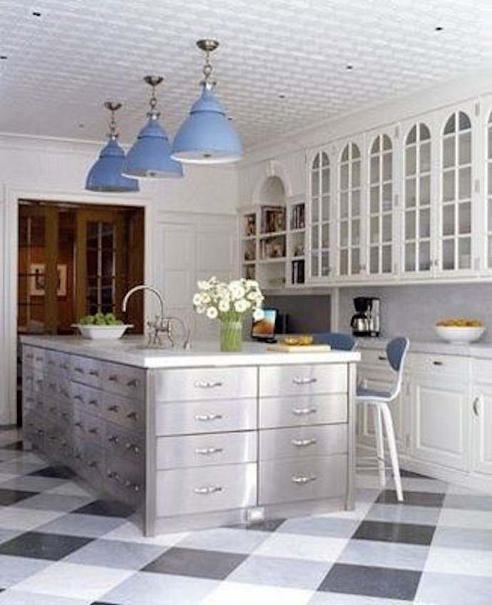
The island is the unexpected star of the show, full of personality and function! How great did the color turn out?

To layer in some additional visual interest we kept a portion of the perimeter cabinetry on the back wall off the ceiling to give this space more of a hutch look. By reducing the overall height and changing the finish (Benjamin Moore's  Smokey Taupe 983) this piece really looks more like a piece of furniture. I also designed a custom backsplash (remember this Instagram sneak peek from last year?) with antique mirror and then Construction Resources provided the most beautiful wood countertops to really finish off this piece. 


The two doors that come down to the counter are actually appliance garages to store items like the toaster, blender, etc...and the glass doors are the perfect place to display pretty glassware. 

The one big design change that we did make was the removal of a desk area that filled the entire corner next to the refrigerator. While the desk worked nicely as a landing pad for any and all organization, it took up valuable kitchen storage space. The desk was moved elsewhere and in its place we designed tall pantry storage. Not only did this up the functionality, but I think the towers visually flow better off the tall refrigerator cabinetry. 


The countertops are Perla Venata quartzite from Walker Zanger and were fabricated and installed by Construction Resources. They are truly stunning with their simple edge detail and beautiful movement. 


The floors were also redone and the best part? They are tiles, not wood which makes them much easier to upkeep. The tile is a 6" x 16" Vein Cut Travertine called Prado, also from Walker Zanger.

This was certainly a fun project to work on and the clients could not of been more open minded and cool. Does it get better than increased functionality and loads of personality layered into one kitchen remodel? Nahhhh, didn't think so.

All finished photography by Galina Coada

Sunday, October 18, 2015

So This Just Happened...


So, I have some big news to fill you guys in on...
On Friday we officially sold our first home. 
You know the one....


Crazy, right!?  Lord knows we loved that house and poured our hearts, sweat, tears and imagination into every square inch, but on August 30th a new plan unveiled itself to us and we had to jump. In a nutshell, another house in our neighborhood that we had long admired went up for sale and we decided to pop into the open house on a whim. Well, one thing led to another and by the end of that week we were under contract on the new house with the contingency of selling ours.

A "Coming Soon" sign went up in our yard and before the house officially went on the market it was under contract.

W H I R L W I N D


It's hard to believe how fast this whole thing has gone down. While all of the paperwork, inspections, appraisals, etc...were happening between the two houses we kind of went along, living our lives business as usual. You know, working full time, being pregnant, all that fun stuff. Then, last Sunday we got busy packing, wrapping and getting everything organized for the big move. For such a small little house we sure managed to acquire some stuff, so thankfully Brent's Mom, Cindy, was in town to help us get everything done. I've learned one is not nearly as useful and or productive whilst donning a major gut (me and my baby bump).

The plan was to close on both houses on Friday, meaning we had to be out of house #1 by 10:00 a.m. Friday morning. Thus all of our moving happened on Thursday. It was crazy fast paced and we spent all day Friday, Saturday and some of today getting unpacked and organized. My family came by yesterday and everyone pitched in to empty as many boxes as possible and things are really starting to feel relatively calm around here.

Speaking of "here" the new house is in the same neighborhood, only 10 houses down from our first house! It is the perfect spot for us to really settle in and raise a family and we are still pinching ourselves that it's ours! I can't wait to give you the formal tour, but for now here is our obligatory, WE JUST BOUGHT A HOUSE PICTURE for our Second Home:


All photos are my own.

Monday, October 12, 2015

Red Red....Crib


I can not believe I am officially 7 months pregnant. SEVEN MONTHS! In all seriousness this pregnancy has been pretty dang easy. I really have no complaints other than the fact that it's going by really fast and I pretty much feel behind 24/7. But you know one thing we are on top of? 
The Crib. 
Back in August I mentioned we were tossing around the idea of using the crib Brent and his brothers used when they were babies which also happens to be the crib their mom, Cindy, used when she was a baby. Bottom line...the crib is no spring chicken. Old is great in interiors, in fact sometimes I prefer it, however when it comes to babies, old can actually be dangerous. There are several features prevalent in older cribs that have been known to hurt babies, the two main concerns are:
  1. The distance between crib slats and spindles should not be too wide. The minimum size is 2 3/8" wide. Anything larger than this poses the risk of the baby slipping through completely or the torso slipping through which would trap the babies head. 
  2. The drop-side. The ability to drop the crib is convenient but over time the hardware can give way and a gap can form between the mattress and the drop side creating a dangerous area where babies can become trapped and suffocate. 
So, we set out to DIY some fixes to these concerns and give this crib a fun new life for our little mini. 

Here is a shot of the crib before 

To solve the issue of the spindles being spaced too far apart we purchased wooden dowels at Home Depot to place in between each spindle. Not only would this bridge the gap, but I was excited for the aesthetic interest it would add to the crib. 


Brent cut each dowel to the correct height and then drilled holes and slipped the dowels into place. 

With the new dowels installed we drug all four sides of the crib to the back yard to paint. 


As for the color we talked about several options but I had one color on the brain...RED. I know, it's a little random for a baby room, but I love the color red, it's happy and bright and just seemed like the perfect choice for this room. Especially considering it could work for a boy or a girl. Our red of choice? Stiletto Love by Behr.

To tackle this paint job we enlisted our favorite tool - the paint gun! 


It is amazing how much quicker the whole painting process goes with this gun. In a matter of minutes one whole panel was evenly sprayed. Brent sprayed one coat, let it dry an then flipped the pieces over to spray the other side. 


Once each side had dried Brent created a little homemade rig to hold the pieces vertically so he could easily get all of the sides, nooks and crevices. 


Meanwhile I was busy tending to the metal pieces. The crib came with a metal vertical rail for the drop part of the crib to slide up and down. While we planned to nix the ability to actually move the sides up and down we wanted to keep the metal rail for the cool factor. So I sprayed the metal rails, all hardware and the metal spring that the mattress will sit on in this bright silver paint. 


We hung fishing line between the deck and a tree for the metal pieces to hang on for easy access and full coverage as I sprayed them. In our experience this is the best approach for spray paint - less runs, even coverage and faster drying.


Once everything was painted we left the crib and it's parts outside to bake in the sun for a few hours to get nice and dry. Later that night we brought everything back inside and Brent began assembling.

To solve the issue of the drop sides we drilled the side walls of the crib into the head and foot boards to ensure the sides would not move. 

And finally.....


Here's a close up shot of the metal detailing along with the added dowels. 


Pretty dramatic transformation, eh? We love how the crib turned out and can't wait to add the bedding and other finishing touches. Speaking of finishing touches, we had our first baby shower Saturday! It was so much fun and we got so many cute, adorable, useful, awesome, practical and fun things!  It kills me how the cuteness factor of basic things like say, a sock,  is literally amplified by about 200% when seen in miniature form. CUTENESS OVERLOAD OVER HERE and there isn't even a baby roaming around yet.

All photos are my own.