Showing posts with label Construction Resources. Show all posts

Sunday, June 11, 2017

Bell Cabinetry & Design's New Showroom Sneak Peek


Holy radio silence my people, I'm sorry for the drought over here in blog land but I have been busy with a capital B. Last spring I mentioned that I was heading up the opening of Bell Cabinetry & Design's Buckhead showroom. Since that time I have been working with my team to bring our 3000 square foot space to life.

Over the past few weeks we really stepped on the gas and focused on getting this space finished! Last week we stripped the paper covering off the windows and had a photo shoot with Atlanta Homes & Lifestyle Magazine for their August issue! You will get the chance to see some full shots of the showroom then, but in the meantime I thought I would give you a little sneak peek of the finished product.

Cabinetry can be technical, overwhelming and scary to some but we wanted to create a space that showcases our various cabinetry construction offerings in a way that is relatable and inspiring.

The opportunity to be creative and focus on the custom capabilities of Bell Cabinetry was really fun. Anyone can design a cabinet, but it's fun to think outside of the generic cabinet box and focus on details and elements that truly make a space unique and personal. 

Inspiration was pulled from anywhere and everywhere and it was like Christmas Morning time and time again as all of the little details began to come to life before our eyes. From hardware placement to cabinetry colors, no element or selection was left to chance. 

The Design Studio:

...where all of the magic will happen. 


Our cabinetry is always made even more beautiful thanks to it's surroundings and in this showroom we are excited to have worked with and showcase some of the best in town. Sub-Zero Wolf Appliances, Countertops from Neolith & Construction Resources, Tile from Renaissance Tile & Bath and plumbing from PDI

To say this process has been long is an understatement.  It has been  A LOT y'all. From finding the perfect studio location and space planning every square inch to designing, sourcing and styling the various vignettes the journey been equal parts exhausting and exhilarating.

Every last detail has been considered, re-considered, analyzed and talked through no short of 1000 times. There is literally a why behind all the things, big or small. And while I'm a believer that it is that level of heart and consideration that makes any space, home or room go from good to great, the process of getting there on any type of time-line or budget is not easy. The seemingly simple act of pouring your heart and soul into anything can be emotionally and creatively draining, but once you wade through the challenges the end results are so sweet and rewarding. We are located in ADAC West, so come say hi and let's design some cabinetry!

All photos are my own. 

Sunday, May 7, 2017

Luxury Living Show 2017


For eight years Bell Cabinetry & Design, the company I work for, has been designing, creating and installing the Atlanta Homes & Lifestyles Magazine Luxury Living Show Kitchen at Phipps Plaza. For those that have never seen the set up at the mall, there is a "Dream Kitchen" and a "Dream Bath" that sit in Monarch Court for the month and this year Bell is doing both! For the past 3 years I have designed the kitchen (here, here and here), but this year I'm the bath designer!

I was pretty excited to shake things up and try my hand at a bath design because believe it or not, I've never designed a bath that would sit in the middle of a mall.  Regardless, I was pumped for the challenge. As I began considering what I might do, I dug through my archives (my camera roll) to get inspired. I don't know about you, but I'm constantly taking pictures and screen shots of anything and everything that catches my eye, never knowing when I might need to pull them up.

Speaking of, I've had this gem for awhile and just loved the soft and happy vibe.
Photo via Pinterest
I also loved the subtle pop of pink. I knew early on I wanted a blush hue to bring the drama and interest into my design and this photo just sealed the deal for how elegant blush + marble + wood tones could be. After a lot of scheming and about 20,945,029 sketches later, this is what I ended up with:


There are so many awesome pieces in this bath like the Neolith shower surround, the beautiful MTI tub and the cool flower sconces, but my favorite part is the blush linen cabinets with the splotchy antique mirror, I'm obsessed!!


We installed both displays last week and I felt like a college student all over again with the late hours.    But as always our Bell crew knocked it out of the park and we are all so proud to have our work on display for the rest of the month. Plan to stop by and check it out in person if you are in or around Atlanta in May! 

Sources:

Cabinetry: Bell Cabinetry & Design | Cabinet Hardware: Atlas | Countertops: Compaq, Color: Absolute Blanc, Installed by Construction Resources | Lighting: Circa | Shower Surround: Neolith, Calcutta Gold From Stone Center, Installed by Construction Resources | Tub, Shower Pan & Sinks: MTI | Glass (Antique Mirror, Mirror Glass & Shower Surround: Atlanta Glass & Mirror | Plumbing: KWC | Styling: Lauren DeLoach Interiors

All photos are my own. 

Wednesday, January 25, 2017

New Marble Fireplace Surround


GUYS!!!!!!!!!!!!!!!!!!!!

We got a new marble surround for our dining room fireplace! To recap, we inherited this beautiful 100 year old beauty a few months ago.


Immediately upon getting the new fireplace in the house Brent went to town tearing the old one out.

And we were left with this:


And like this it sat and sat......

We knew the first step to getting this ball rolling was to figure out the fireplace surround before we could put the new mantle in place. So late last fall, we made our way over to Construction Resources where we picked out the most beautiful remnant piece of white marble. They had a LOT to choose from so we had them pull several contenders.....


And after a little deliberation we made our selection.   


We loved this slab because of the beautiful color and movement in the veining, plus the size was right for our particular application. Once the slab was picked out we were ready for the Construction Resources' crew to come out and measure, but we knew this would not be your typical, measure/template/fabricate/install situation. Because of the integration with the antique wood mantle, our fireplace surround would have to be done in 3 phases.

Phase #1 - The Hearth 


Once the hearth was in place Brent moved the wood mantle into place and nailed it to the wall, so the guys could come back out for template round 2.

Phase #2 - Legs & Back


This was definitely the most visually exciting phase, what with all the exposed bricks finally getting covered up. However, because the wood mantle doesn't sit flush with the walls we were left with holes that bridged the new marble backing and the back of the mantle leg.


So the guys came out for a 3rd and final trip to template and a week later the last few pieces were added....


And we had ourselves a beautiful, finished marble fireplace surround.


We are so so so happy with the finished look. The elegance of the marble goes so well with the decorative grandness of the mantle. Basically this whole side of the room is just so fancy now and I love it. 

Now that the there is (finally) a check mark next to this item on the to-do list, what's the next step? Figuring out how we want to finish the wood mantle....dun, dun, dun......

So.Many.Options.

We are currently stewing on this one and hope to make a decision soon so we can keep this room chugging along. 

PSA: If you are an Atlanta local, do yourself a favor and visit Construction Resources if you are in the market for anything countertop related. I've been to a lot of countertops companies and in my opinion, Construction Resources is always the best. Not only do they have a ton for you to look at in all different genres - granite, marble, quartz, quartzite, etc...but they are so nice and accommodating. Every single experience I've ever had with them has been great. From the showroom to the install and every piece of coordination in-between they make the whole process fun and easy. 

#notsponsored #justfacts #:)

All photos are my own. 

Sunday, October 25, 2015

A Kitchen Remodel Full of Fun, Function & An Island Inspired by a Pot


I've got a kitchen remodel bursting at the seams with function and personality that I've been excited to share with you all for awhile now. I was initially called out to this kitchen to simply re-design the island. At the time the homeowners were satisfied with the perimeter layout, but the island just felt really big and bulky in the space.

To begin, the island was multi-level which really cut down on the continuous counterspace and made the actual working space choppy. The limited continuous work space was especially an issue because the cooktop and a prep sink were located on the island making the space tight. In addition, the countertops themselves had a really thick edge detail which was pretty, but it made the already large island feel even bigger. We decided pretty fast the best solution would be to make the island all one level to help with the visual weight as well as increase the usable workspace.

With the design nailed down we started talking about the aesthetics and the homeowner showed me a picture of this pot.


I love how inspiration can come from literally ANYWHERE! She had seen this pot out and about and loved the overall vibe, particularly the depth of color and the wear that shown through in certain spots. This pot was her island color inspiration and I was 100% on board! I took the picture to our finishers at Bell Kitchen & Bath Studios and they played with several color combinations before nailing it with a custom mix of Benjamin Moore's Sylvan Mist CSP-740 + a Charcoal rub. 

About the time we had all of the details squared away for the island the homeowners talked and decided they wanted to go ahead and redo the whole kitchen. In general I think if you are able, remodeling an entire space all at one time is a way better idea then doing pieces here and there along the way. It allows your house and life to be uprooted once, even if it is for a few months, but once it's over you are done and your space as a whole is complete. We left all major mechanical components (refrigerator, sinks, etc...) in the same general vicinity, but did redesign certain elements to increase storage and functionality and of course add some custom layers of interest throughout the space. 

Let me show you around:


This is the view from the family room. The house is full of fun art and decor which pops so nicely off the neutral tones of the cabinetry. For the most part the perimeter cabinetry was done in alder wood with a dark stained finish and was taken to the ceiling. 


The island is the unexpected star of the show, full of personality and function! How great did the color turn out?

To layer in some additional visual interest we kept a portion of the perimeter cabinetry on the back wall off the ceiling to give this space more of a hutch look. By reducing the overall height and changing the finish (Benjamin Moore's  Smokey Taupe 983) this piece really looks more like a piece of furniture. I also designed a custom backsplash (remember this Instagram sneak peek from last year?) with antique mirror and then Construction Resources provided the most beautiful wood countertops to really finish off this piece. 


The two doors that come down to the counter are actually appliance garages to store items like the toaster, blender, etc...and the glass doors are the perfect place to display pretty glassware. 

The one big design change that we did make was the removal of a desk area that filled the entire corner next to the refrigerator. While the desk worked nicely as a landing pad for any and all organization, it took up valuable kitchen storage space. The desk was moved elsewhere and in its place we designed tall pantry storage. Not only did this up the functionality, but I think the towers visually flow better off the tall refrigerator cabinetry. 


The countertops are Perla Venata quartzite from Walker Zanger and were fabricated and installed by Construction Resources. They are truly stunning with their simple edge detail and beautiful movement. 


The floors were also redone and the best part? They are tiles, not wood which makes them much easier to upkeep. The tile is a 6" x 16" Vein Cut Travertine called Prado, also from Walker Zanger.

This was certainly a fun project to work on and the clients could not of been more open minded and cool. Does it get better than increased functionality and loads of personality layered into one kitchen remodel? Nahhhh, didn't think so.

All finished photography by Galina Coada

Tuesday, March 3, 2015

Luxury Living Show 2015


While most people living in or around Atlanta scurried home last Wednesday afternoon trying to avoid the impending snowpocalypse 2.0 I headed to the mall. Priorities people, shoes don't buy themselves you know. Just kidding, I did my shoe shopping the weekend before, Wednesday I made my way to Phipps Plaza to watch as the 2015 Atlanta Homes & Lifestyle's Luxury Living Show Kitchen I designed made it's big debut.


It's not every day you get to design a kitchen that will be on display in the middle of the mall. What a cool/random/awesome/terrifying opportunity, right?! For the second year in a row my heart and soul sits in the middle of a mall for all to see and I couldn't be more excited.

For months myself and the Bell Kitchen & Bath Studios team have been working hard dreaming, scheming, designing, drawing, tweaking, building and installing this year's Luxury Living Kitchen. A Kitchen that debuted in front of design bloggers from across the country and will sit on display for 5 weeks in the middle of Phipps Plaza.

For this year's design we wanted to show something a bit more modern. Atlanta is a Traditional market, no doubt about that, but as of late there has been a growing interest in modern design. Last year the President of Bell K&B Studios, Mike Bell dubbed the phrase Southern Modern. An idea that a space could have clean lines and a sleek vibe while maintaining the warmth and elegance associated with the south. For so many, a modern aesthetic is synonymous with cold and sterile features which is sad because modern design really can be warm and layered. So, we decided to showcase what Southern Modern looked like to us. 

We kept the overall design sleek and clean with details like acrylic cabinetry, lucite hardware and a waterfall countertop around the perimeter of the kitchen. 


Mahogany accents were integrated throughout the space, around the center towers, floating shelves and on the island. Not only does the stained wood add a layer of warmth to the kitchen, but it contrasts nicely with the taupe/gray acrylic cabinetry, allowing one to pop off the other.


We wanted the island to feel very furniture like, so a more detailed drawer style (as opposed to the totally sleek slab drawers used on the perimeter) was selected. In addition I designed an all drawer look for the front of the island which became increasingly visually interesting with the addition of the knobs. The power of hardware never ceases to amaze....

Speaking of amaze, can we please talk about the back of this island? 


QUATREFOILS!!!! Nay...MAHOGANY QUATREFOILS!!!!!!! I love the detail they bring without being overpowering. When you see the kitchen as a whole they are definitely there, but more as a whisper than a shout. I have a whole post I want to do on these bad boys, but for now let's just say I have to hold myself back from stopping by the mall to pet them every day. 

And finally, no kitchen is complete without the insides of the cabinetry looking just as polished and considered as the outside. 

We stocked this space full of cool cabinetry components, like this pullout to the right of the cooktop. 


There is a space for wood spoons and utensils at the back and a knife block in the front. The cool part? The knife block is made out of a foam like material so the knifes can be placed anywhere within the area.

How about some pot/pan/lid storage action?  I don't know about you and your kitchen, but I could seriously use a drawer like this. Finding a pot with it's matching lid takes WAY longer than it should in my space. 


Projects like this are always a giant collaboration as it takes many a layer of beautiful items and finishes to bring these spaces to life! The kitchen was styled by the lovely ladies of Cloth & Kind - Tami Ramsay & Krista Nye Schwartz. The countertops are Cambria, color: Summerhill and they were done by the great folks over at Construction Resources. The appliances are Subzero- Wolf from Westye Group Southeast and the lights are from the Alexa Hampton Collection at Circa Lighting. The tile is from Renaissance Tile & Bath and was installed by Giovanni's Tile Design. All internal cabinetry components are by Rev-A-Shelf and the cabinetry hardware is by Atlas. The sink and faucet are Franke and the kitchen design and cabinetry are by Bell Kitchen & Bath Studios.

The kitchen will be on display for the whole month, stop by and pet it see it if you get a chance!

All photos are my own.

Wednesday, August 6, 2014

White Marble - 1 Year Later


As many of you know, updating elements of your home can be an intense process similar to a game of domino's. Typically one decision leads to another, and so on and so on. During the 5 months between the time we purchased our home and the time we moved in we were in a WHIRLWIND. Smack dab in the middle of wedding planning and house renovations - things were crazy!  We spent nearly every moment we were not sleeping, eating or working, at the house getting it move-in ready. We had about 100 balls in the air and were making decisions left and right - hoping for the best. So, 16 months later I thought it might be fun to visit some of the selections we made and discuss whether or not we feel we made the right decision. And maybe more importantly, if given the opportunity would we do it again?
The first topic - White Marble. 

 Brent and I chose white marble for our kitchen and downstairs bath countertops. 


While we did have a lot going on we did NOT make this decision on the fly. Countertops are not cheap so we really considered the options - read all about the selection process here.  As a designer I knew all about marble and it's porous ways. However, I was also very much aware of the unique beauty marble has to offer. At the 11th hour we finally felt comfortable biting the bullet and buying the marble slabs we loved after the nice people at Construction Resources introduced us to a 15 year sealer from DuPont that protects marble from food and drink stains.


Photo from Google. 
DuPont's StoneTech Sealer was applied right after the tops were installed and has worked like a charm. We have definitely put it to the test by simply living our lives. Brent loves to cook and we've hosted many get togethers where red wine and other Marble Killers were present and over 1 year later there are no stains.

No stains = happy consumers. HOWEVER, while there are no red wine splotches there are water marks AKA light etching. As far as I know, and according to everything I have ever read about marble, etching is unavoidable. Etching is a chemical reaction between the calcium carbonate in your marble and acid. Acid can come from a slew of different foods, drinks and cleaning materials and etching can happen in a flash. Basically the chemical reaction instantly causes the marble to loose it's shine, creating a dull spot.

For us, our etching has been caused by water sitting on the top too long. For example, if I'm drinking a glass of water and sit it on the countertop and it begins to sweat, a ring will form on the countertop where the glass was sitting.

I took a picture of the peninsula in the kitchen and if you really look (and follow the arrows) you will see the spots.


Our etching/water marks are not glaringly obvious, but are more apparent when the light hits the spots just right. Because our marble is polished (shiny) the spots show up more so then they would if the marble had been honed (not polished). We went with polished for the texture. I know I haven't officially debuted the kitchen on the blog, but it's a whole lot of white on white on white. This may sound sterile and scary, but thanks to the layering of textures (cabinets, countertops and backsplash) the space has life.

Lucky for us, almost immediately after our countertops were installed we got married and headed to Italy for a 2 week honeymoon. While there, we saw marble EVERYWHERE! It wasn't pristine, it was worn and scratched and etched and stained, but it was still beautiful. We decided then and there that we were not going to stress about our marble. We were going to use our kitchen, entertain our family and friends and live our lives and  just let the marble be the natural, porous stone that it is. We invested in the 15 year warranty which gave us some peace of mind, but outside of that we knew that our investment would be wasted, no matter how beautiful the countertops were, if they kept us from really  enjoying the spaces we had worked so hard to create.

So, in summary, our love affair is still strong for our Marble. Aesthetically, we have absolutely no complaints. Function wise, it would be nice if water marks were not an issue HOWEVER, it's a small price to pay for the look of the marble we so love. If I had it all to do again, I would still go with marble, but this time I would have it honed to help camouflage those inevitable water marks!

Unless otherwise noted all photos are my own. 

Thursday, July 24, 2014

The Little Bathroom That Could


I'm happy to report another room in our house is COMPLETE! 

The lucky space?? Our downstairs Bathroom!

This little bathroom is a pretty big deal... With the master bath upstairs, this space serves not only as our guest bath, but our powder room for visitors. Given the central location of the bath, and the number of people that would frequent this space, we knew this little bathroom needed to pack a big punch, aesthetically and functionally. I really wanted the space to feel classic and a bit dramatic, despite it's petite size.

Great things come in small packages, right!??!?! 
Dear Lord let's hope...

Let's start with the Before:


This bathroom was once the one and only of the house, so while it is not very big, it does have a full shower/bath that sits directly across from the vanity/toilet wall. While the room is small, the natural lighting is really nice and the space as a whole has great bones. All tile is original to the house and something I was excited to work with. 

Paint was the first item on the to-do list. I really wanted to paint the walls a dark color, as I said before I was looking for drama and nothing says drama like dark walls. The space is small yes, but I knew no amount of light colored paint was going to change that, so I decided to go for it and paint the walls Navy. Martha Stewart's Wrought Iron to be specific.

With the painting underway, it was time to figure out how to increase the storage capacity of this little space. With a tiny vanity and a mirror that doubled as a medicine cabinet, there was really no where to go but up from where we were.


In 2012 I posted about a bath remodel we did at Brent's old house. We were working with a similar medicine cabinet situation in this space. To up the storage and the aesthetic we removed the medicine cabinet and built custom shelves and added a mirror that slid from side to side with cabinet guides. 

We were so pleased with how well this approach turned out before, we decided to do it again in this space. Brent popped the old medicine cabinet out, framed up a new one, added guides and hung the mirror. 


For the mirror, we brought the one used in Brent's old house because it was his Great Grandmother's and has beautiful detailing. We went back and forth about what color to paint the mirror but ultimately decided to paint it Wrought Iron as well so it would blend with the walls. I love interest layered in through texture as opposed to color. 


For the vanity I designed a custom cabinet through the company I work for, Bell Kitchen & Bath Studios. We needed this cabinet to be as functional as possible so we made it as large as we could to allow the door to still open and close past it.  I designed the false front drawer to flip down to optimize storage capacity. 


We picked a beautiful remnant piece of white marble for the countertops from Construction Resources. In order to increase counter space we had the top banjo, meaning extend over the toilet to the wall. Not only did this increase the usable counter space but it elongates the room, making it feel deeper.

During this update whirlwind, we replaced the toilet (Home Depot), light fixture (Rejuvenation), faucet (Kohler) and sink (Porcher). We also added fluffy white towels and a soap dispenser (Target) as well as a fun shower curtain (Crate & Barrel). Things were coming together quickly and we were able to get the bulk of this space completed before we moved in, making this one of the most finished spaces of the house for a long time. 


The above photo represents how the bathroom looked for over a year. It was taken by photographer, Barbara Brown when she was at the house shooting the kitchen.

As much as we loved the space, there was one giant item standing between us and calling this bathroom complete....The window treatment. We loved the natural light that flowed in but for some reason our guests were averse to a bare window you could see straight through. Can you say high maintenance??? ;)

We needed a solution that would allow light to come in, offer privacy and be visually pleasing. Once we really thought about it we knew the answer was a stained glass piece. It just so happens Brent's Mom is a stained glass artist, nay genius. She is the name behind Cindy's Glasswork Designs and she does custom work all over the Southeast; in fact, she made the window we hung in the bathroom at Brent's old house. For this space we wanted something totally different and Brent came up with the perfect concept. He sketched the idea out and talked through the vision with his Mom/Cindy. 


Once the idea was transferred, things moved pretty fast. Measurements were taken, glass options were presented and the frame finish was considered.  A few weeks ago the piece was finished and Cindy brought it up to Atlanta to install.


Three panels were designed to virtually float between the frame. The panels are suspended from from springs, giving the piece an industrial - modern vibe. The frame was stained dark brown to tie into the vanity color.


It's unbelievable what an instant impact this stained glass window had on the room. Not only is it a bold focal piece, but it allows light to pour through (so much so that it's hard to photograph) and offers privacy - everything we were looking for and more!

We are so happy with how this space turned out. Not only do we love how it looks, but we feel we optimized every inch of functionality we could and really helped this little room be the best it could be!

Unless otherwise noted all photos are my own. 

Thursday, March 6, 2014

Luxury Living Show 2014


Y'all I had a design baby. It was a very long labor, but my baby was officially introduced to the rest of the world on Sunday, March 2nd. 

 He weighs +/- 10,000lbs and is around 399.5" long.

You may remember I mentioned back in January I was designing the kitchen for the Atlanta Homes & Lifestyles Luxury Living Show. For months Mike Bell and I planned and schemed, designed and tweaked this kitchen that would sit in the middle of Phipps Plaza, a luxury shopping mall here in Atlanta for the entire month of March.

This project became my pet and I doted on it often. Carefully considering every finish and selection. I visited our shop floor on the regular to observe the progress of many of the main parts and pieces. Finally, last week our crews packed up the cabinetry and headed to Phipps Plaza to install the kitchen smack dab in the middle of the mall.

I can't say enough good things about the amazingness that is our installation crew, but they really rose to the occasion on this project. Because the kitchen sits in Phipps Plaza, a mall, all installation had to happen while the mall was closed AKA the middle of the night.

So, of course I did what any crazy obsessed designer would do and headed to Phipps to lend a hand where applicable, and watch my design come to life. It was SO cool, rewarding, exciting and entertaining watching this kitchen come together piece by piece. Thankfully, Brent, my favorite partner in crime joined me and snapped photos of the entire process.

Brent put all of the pictures together and created a video so you all can see the transformation. I'm pretty pumped as this is The Cow Spot's first video. Take a look:


Pretty cool, eh? 

On Sunday bloggers from across the country were in town for the Design Bloggers Conference and a lot of them stopped by Phipps to hear Suzanne Kasler speak IN FRONT OF MY KITCHEN! 


Talk about a cool, pinch me moment! All of the bloggers were super sweet and really had great things to say about the kitchen. Music to my ears! :)

The Luxury Living Show officially kicks off this weekend - Saturday March 8th. There will be chef's doing cooking demonstrations in the kitchen starting at noon - 3:00 p.m. The kitchen will be on display the entire month of March.

As you saw from the video there are a lot of details to see in this kitchen and like all projects this one was a giant collaboration. Here are some of the specifics about the kitchen and it's various components: The cabinetry is  Bell Cabinetry by Bell Kitchen & Bath Studios, the appliances are SubZero-Wolf,  the counter tops are Cambria from Construction Resources, tile is from Traditions in Tile, the lighting is from Circa Lighting, the faucet is Grohe, the sink is Elkay, all internal cabinetry components and lighting are from Hafele and last but definitely not least, Huff-Dewberry staged and decorated the kitchen.

I'm still pinching myself that it all came together and the space has been so well received. I'll probably stop smiling in a few weeks days. :) :)

One more photo for the road....


Oh you know, it's just me and Suzanne Kasler hanging out in my kitchen! 

If you all are in or around the Atlanta area, I hope you get a chance to stop by, I'd love to see you! 

All photos and videos are my own. 

Tuesday, June 25, 2013

My Kitchen Part 2 - Countertops

As is often the case, you can only remain topless and classy so long. Cabinetry speaking of course....:)

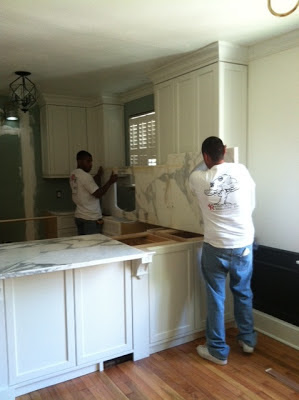
Last we talked the cabinets had been installed and we were ready for our countertops to be templated. Weeks earlier, while we were finalizing the designs for our kitchen, we took a break and headed to Construction Resources for a little countertop shopping. 

Lord knows there are a lot of countertop options out there, from natural materials like granite and marble to man-made materials like quartz and solid surface and Construction Resources has them all.  We went in with an open mind, not overly committed to one type of countertop, only to the idea that the top we chose needed to aid in opening up our space and add an additional layer of interest to the room. As we walked the isles contemplating all of the options we found ourselves being drawn to the marble slabs. The white marble slabs.  GASP!!!! As most of you know, marble is a natural stone with a bad rap for being porous and staining. Being in the design industry I've heard the horror stories and I was aware of the cons associated with marble, especially white marble. But, even with allllll that knowledge we couldn't shake the fact that the white marble would look the best in our small space.  We knew the white marble would blend in nicely with the cabinet and wall color (Benjamin Moore's White Dove OC-17), but would add drama and depth through the veining.

We were torn. Pretty vs. Practical. What a beast of a dilemma

And then boom. A halo formed around the marble with a simple phone call from my sales rep. A 15 year warranty from DuPont was available that would protect the countertop from food and liquid stains. It was an additional cost, of course, but SO WORTH IT. So, we signed on the dotted line and a few days after the cabinets were installed they came out to template.  Then a week later this load of awesomeness arrived in my driveway....


It was literally like Christmas morning watching these bad boys make their way into my house. 


I held my breath as they lifted and maneuvered the heavy tops on and around the new cabinets. Yes, I was THAT client that was watching the whole process like a hawk. I was everywhere, snapping pictures acting like this was my first rodeo. But you know what, this is my first house, so I guess I have an excuse to be a little nutty and overly excited. 


I mean, does it honestly get prettier than this? The movement and colors in this top are insane. It's literally so beautiful and the guys from Construction Resources did such a great job lining up the seams so the veins flow with such a fluid movement. 

A few days after the tops were installed the guys came back out to apply DuPont's StoneTech sealer

DuPont's StoneTech Professional Warranty
Photo from Dupont's website. 

The literature that came with the product says, "The beauty of natural stone with true peace of mind." Doesn't that say it all? Like so many people, Brent and I really plan to (already are) use and entertain in our kitchen and we did not want to be haunted by the possibility of ruining our beautiful countertops on a daily basis. A coffee spill and a red wine drip will no longer haunt our dreams. This sealer offers us true enjoyment and usability in our space. 

Needless to say the addition of the countertops really took the room and the house to a whole new level of awesome and beautiful. But, what happened next and then what happened after that. WHOA, yeah it could make your heart stop. Stay tuned.....::evil laugh::

Unless otherwise noted all photos are my own.

Wednesday, May 1, 2013

Luxury Living Show 2013

Well, it's MY WEDDING WEEK!! In a mere three days I will be a married woman - crazy, crazy!

As most of you know there is no shortage of super exciting things going on in my life right now. Wedding, new house, NKBA's 30 Under 30, tons of fun projects and now this....... Mike Bell and I are featured in the May issue of Atlanta Homes &  Lifestyles magazine along with Joel Kelly for our work with this year's Luxury Living Show Kitchen.


Photo from Atlanta Homes & Lifestyles Magazine.
 This is the fourth year Atlanta Homes & Lifestyles has partnered with Phipps Plaza to host the Luxury Living Show here in Atlanta. This is also the fourth year Bell Kitchen & Bath Studios has built and co-designed the full sized kitchen, and this year I was a part of the team! 
 
Photo from Atlanta Homes & Lifestyles Magazine.
 
Mike Bell and I worked with Joel Kelly to bring this year's kitchen to life. While the 1st, 2nd and 3rd Luxury Living Show Kitchens were beautiful and special in their own unique way, we are very excited about what has been created this year. This year's kitchen features sleek lines and loads of functionality. The finishes throughout the space are unique and will add depth and interest that we hope will inspire viewers. For the first time, not only will the outside of the kitchen be beautiful but the inside of the cabinets will be a show all on their own - thanks Blum & Sur La Table.
 
Cambria countertops from every one's favorite Construction Resources, Sub-Zero Wolf appliances, Traditions in Tile and of course Bell Cabinetry will all be present at this year's show.
 
Below is a sneak peek of this year's kitchen......
 
 
Photo my own.
 
The cabinetry was put together last week so the countertops could be templated. Above is a fun shot of Mike Bell and install manager, Todd going over details of the space. After the countertops were templated, the kitchen was broken down and is currently being finished, getting ready for install later this week.
 
The show is right around the corner, May 9th - 12th AKA Mother's Day Weekend AKA days before I leave on my honeymoon ( I couldn't miss this show, Italy will have to wait :) ) So, grab the mother in your life and make plans to head down to Phipps Plaza to enjoy this year's beautiful dream kitchen.

**If you won't be in or around Atlanta May 9th - 12th, the kitchen will be on display all month at Monarch Court. **
 
Alright, this is my last official post as Courtney Foster, sniff, sniff...... :) See you all at Phipps in a few weeks!