Monday, August 10, 2015

About.com - July Recap


Good Lord, time is going too fast! I can barely keep up! WE ARE IN AUGUST. HOW IS THIS POSSIBLE? July flew by and now it's like August 12th or something....oh wait, it's only the 10th. Whatever, anyways you get the point. July was a pretty good month for me over on About.com. I'm really starting to get in a rhythm with my posts and I'm enjoying this unique platform that allows me to talk about any and every little kitchen topic that pops into this weird little brain O' mine.

Here's what I had to say last month...

1. How I Styled My Kitchen Countertops


Did y'all know I've had my kitchen professionally photographed three times? For the longest time I just couldn't figure out why I loved the kitchen in person, but in photos the space came across flat and lifeless. Then, one day it hit me. STYLING...hello, it's how you put your personal stamp on any space, even a kitchen!

2. Knife Storage Solutions


Clever storage solutions are arguably the best part about re-doing your kitchen in 2015. There are so many cool inserts, concepts and custom elements just waiting to make your life more organized and functional. Even knife storage.....there are options folks, check them out in this article. 

3. Christmas in July


This article is a happy escape to the most wonderful time of the year. You know....December when the air is cool, people are jolly and houses and their kitchens are bursting with holiday flair. 


Another day, another countertop option to consider. Quartzite....it's a beauty, but is it the right choice for your kitchen? Read to find out...

5. Red in the Kitchen


I have been obsessed with red as of late. So, naturally I went and wrote an article about it as a fun escape to research different ways to integrate this color into the kitchen. 

6. When Pendant Lights are a Bad Idea


Pendant lights are enticing no doubt, but some kitchens just don't need them. In fact they can be down right distracting to bigger, more expensive elements in the space. Before you go out and buy, buy, buy check out this article to see if pendant lights are the right choice for your space. 


Gosh, I could write a novel here. Oh wait, I did...well, not a novel but a pretty passionate article! :)


Sunday, August 2, 2015

At Home with Bethenny Frankel


I really love getting to peek into a celebrities home. You know, see how the other side lives decorates. Sometimes I daydream about all the weird and fabulous things I would buy if I had a limitless amount of resources. I mean seriously, if money was no object one could go crazy (in a good way) and really let their freak flag fly. 

Because kitchens are my jam I'm always especially interested in seeing that space if a home tour pops up on the radar.  People Magazine recently had a feature on Bethenney Frankel's new Bridgehampton farmhouse which included THIS shot of her kitchen:  


How pretty is this kitchen? I love the classic white vibe with the bold pops of red. It's so fun and fresh!

For those of you unfamiliar Bethenney Frankel, she is the genius creator behind the Skinny Girl product line, in addition to an author and television personality on The Real Housewives of NYC. If you follow Bethenney at all you know that red has been her signature color in everything from her branding to her outfit choices. With that being said I was not at all surprised to see the red hue pop up in her space. What I was surprised about was how much I liked it! 

It's weird because for a few weeks now I've been into red. I've always loved the color in clothes, accessories and nail polish, but rarely ventured in that direction for interiors. However, as of late I've been drawn to spaces utilizing red and seeing this kitchen just solidifies my new found love for this accent color! I think red, especially a bold fiery red, is most impactful and pretty when surrounded by classic elements. In Bethenny's kitchen the red, while the definite eye-catcher in the space, is actually minimal. The barstools are the main red components in the space, and even they are mixed with two other colors - brown and white. This approach allows the accent color (red) to shine bright and add a fun layer of unexpected fun and flare to the space without totally overwhelming it and making the room as a whole feel wild and un-relatable. 

Red is in and I'm on board...and ready to jump on the train, what about you? Are you feeling it?


Love celebrity house tours too? Check out the pads of Kourtney Kardashian and Tory Burch I've covered in the past. 

Photos from people.com.

Monday, July 27, 2015

Click, Click, Click.....You're Going to be a Grandparent!!!


Telling your family you are expecting a baby, which in turn will make them a grandparent or great grandparent, is obviously a big deal and an event we really looked forward to. We knew our families would be super excited about this news especially since this would be the first grandchild/great-grandchild for most of them, so we wanted to be sure the way in which we told them was special and memorable. 

Our goal was to tell as many of them together as possible so we decided to wait until Father’s Day weekend to reveal our news. This gave us some time to figure out how exactly we wanted to tell everyone. We tossed around a ton of ideas, but nothing felt right quite right until one day, out of nowhere Brent came up with a genius idea. 


Do you remember these things from childhood? They are called View-Masters and even if you didn’t actually own one, you are probably familiar with the concept. Insert picture reel, hold contraption up to your eyes and click through to view the images. So, Brent’s all like "what if we could find a way to have custom reels made for each dad/grandfather? And what if we filled their discs with pictures of us and them and then what if the last picture was the ultrasound..."

Um…..YES!!! It sounded like a great plan! No one would see it coming. The guys would think it was just a fun gag gift and would never in a million years expect to click to a picture that delivered that kind of news. It was brilliant, so we began perusing the Internet to see if custom reels were even possible. Well, guess what, they ARE possible and there is a company called Image3D that makes creating one simple with a capital "S". 

We had 5 reels to make and each reel had 6 slots so we began gathering pictures of each dad/grandfather/step dad and preparing the customized reels. The site allowed you to name and save the reels and edit each of them by adding or deleting photos as we refined our selections.


We had a lot of fun crafting each reel and working on the final product. We opted to purchase a view master with each reel so they would be good to go upon delivery. Each view master + real came in it's own small white box which we put a bow on and poof our Father's Day gifts were ready to go. 

Our plan was to give three of the view masters out in person and two would be sent down south to Tifton and Florida. To ensure no one was able to crack into the gift before we were ready we purchased two boxes from Michaels that Brent outfitted with locks and a note that said we would call them with the code when it was time to open. 

Father’s Day weekend rolled around and we were so excited to get this cat out of the bag! It had been a long 13 weeks! We had my dad and Brent’s dad in town and all of us headed to my PapaJack and Grandmother’s house for a lasagna dinner. We decided to be open with the exact timing of the gift giving. We didn’t want to seem too eager or unnatural so we just kind of let things unfold organically. After we finished eating, we were all sitting around the table chatting when I announced that Brent and I wanted to kick off the gift giving with a fun silly gift. I handed out the three boxes and we sat back and watched…..

Initially the table laughed when they saw the view masters and the dad’s began clicking through the pictures one by one. They thought it was fun and clever we got all of the pictures of them inside and laughed and commented as they click, click, clicked through. Suddenly, almost simultaneously they all clicked to the last slide:


 and said “WHAT!” 


Almost instantly the table burst into screams and gasps as everyone grabbed for the view masters for their chance to look through the lens. They screamed, cried, laughed, clapped and did all of the other things you do when you are genuinely freaking out. It was awesome! Shortly after we got on the phone with the rest of the gang and gave them the code to open their boxes. Their reactions were equally as hilarious and enthusiastic. It was awesome! I'm pretty sure we win the prize for best Father's Day present of all time and come December, we will have best Christmas present in the bag too. Sorry, siblings....muhahaha. 

Our parents and grandparents loved us before, sure, but this baby has been a game changer for us popularity wise.  It was literally as if in a flash you go from "oh yeah, we love you Courtney and Brent" to….YOU ARE OUR FAVORITE PEOPLE EVER!!!!!!!!!!!! Can we get you ANYTHING?! A sandwich, a back-rub, a  pony?? Instant rockstar status. 


As excited as we are about this baby, having our families in on the news just sweetens the deal!

Wednesday, July 15, 2015

DIY - Swing Bed


Our back deck has received a LOT of love and attention since we purchased our house back in 2012.  We have built our outdoor kitchen, installed a covered TV, painted the deck and now...... we have DIY'ed ourselves a swing bed!


It's 68" x 39" of pure swinging comfort. 

The whole set up is quite an upgrade from where we started and the ultimate cherry on top for our deck. Well, the ultimate cherry would probably be a hot tub, but I don't think we can DIY one those, so this is the next best thing.

Here's where we started:


The pergola and original swing came with the house and worked quite nicely for awhile. Then, one fateful day one too many people sat on the swing at one of our parties, something popped and well, the swing became a hazard. Instead of just replacing it with the same ol' thing we decided to try our hand at making a swing bed. We had seen a few swing beds in magazines and on home tours and Brent felt it would be relatively easy to DIY so we decided to give it a whirl.

We got the ball rolling by ordering the over sized swing cushion from The Porch Swing Company. This site had a ton of options in both size and color.

Once the giant cushion got here we headed over to Home Depot to pick up supplies. We bought:
  • (2) 4 x 4's to form the cross pieces and main supports of the bed.
  • (2) 2 x 4's which we cut into five pieces to create the bridge to the 4 x 4's. 


Slats were run across the 2 x 4's to form the seat. Oh, and Brent's brother Scott was a big player in this project, he has good ideas and muscles so in general he is always welcome around our projects. 


We went with the slats instead of a solid piece of plywood so water could easily drain through the seat when it rained. 


Using a Kreg Jig we screwed the newly formed bench into the 4 x 4's.


With the base of the bed complete, we screwed vertical 2 x 4's on the corners for main rail supports and evenly spaced 1 x 4's along the perimeter.


Scott decided to get creative and give the arm rests a little personality with deep flares as the arms come out. Here he is below perfecting the finished product.


With the arm rests finished they were drilled into the corner supports along with a 2 x 4 across the back. 


And to add just one more layer of cool to the arms, the boys decided to create built-in cup holders.  We brought down some drink props to identify the cutout diameter we would need and used a hole saw to drill a hole through each arm. 


With the swing constructed it was time to paint! Last year we had the deck and surrounding areas painted white and gray and decided to keep with these existing colors for the swing. Because the pergola was white we decided on gray for the swing and got to painting....


While the swing dried, we headed back to Home Depot to pick up supplies to hang the swing from the pergola. We tossed around a couple of different ideas like rope and over sized chain, but ended up coming up with something a little different. We were in the chain aisle when we came across some cable and thought THIS could be cool.  


We loved the idea that the cable and associated parts could really bring an industrial vibe to the overall look.


As Brent got everything installed and hooked up, we began to like the cable even more! It's so thin and understated while still providing the weight support we needed. It's perfect!


With the swing hung, it was time to adorn that beast with some pillows. As we looked around at the different options, we quickly realized outdoor pillows can be expensive! So we took our time and dug deep until we found some cool options that weren't a zillion dollars. (I've listed the resources to all of those still available at the bottom of the post.) To keep the pillows looking fresh I typically keep them inside unless they are being used. As for the big cushion, we just let him sit out in the elements all of the time (it's a mold resistant outdoor cushion). He's held up pretty well and he's pretty easy to wipe off before use. We may end up getting a cover for the winter. we will see how it goes. 

The whole set up is sturdy, sleek and a mid-day nappers paradise! We have really enjoyed having this little addition on our deck and while the whole process took us about two weekends to finish, it was relatively simple and inexpensive project, which is always a win-win around here. 


Resources | Large Outdoor Pillows, Floral Outdoor Pillows, Turquoise Outdoor Pillows, Buffalo Check Pillow (not outdoor fabric), Umbrella, Swing Bed Cushion and Rug.

All photos are my own. 

Sunday, July 5, 2015

About.com - June Recap


YOU GUYS...thank you SO much for the sweet, sweet comments on our big announcement last week. We so appreciate your excitement and encouragement, it makes the whole experience that much sweeter!

I just got back from 5 fun days in Jamaica, went to work for a day and now I'm enjoying a 3-day weekend. It's a hard life, I know....Despite all of the excitement surrounding June I have been somewhat productive and wrote 7 articles over on About.com, here's a little recap...


A taupe kitchen can be SO warm, inviting and chic'. Over the year's I've designed quite a few kitchens that donned the taupe hue and each and every time the results were beautiful. In this article I'm writing about my favorite taupe paint colors as wells as a few on my "to try list".

2. Meet the Steam Oven


The Wolf Convection Steam unit is truly the bomb dot com. I'm writing all about the features this little appliance has that is sure to make even the most amateur cook (cough, cough...ME! ) look like a pro. 

3. Walk-in Pantry vs. Cabinet Pantry


This comparison or "battle" may see nuts seeing as how most of us would agree that storage is storage...HOWEVER some spaces allow for one vs the other and the debate on which is better can get SERIOUS. People love their storage and over the years it's been hard to convince clients to re-think how they store their goods. In this article I talk about the pros and cons of each pantry solution. 


4. What's in a Name? Exploring Today's Most Popular Design Styles


A few weeks ago I posted about this Tuscan Kitchen Keri Perry and I designed and it got me to thinking....as designers we throw around words like Tuscan, traditional, modern and transitional all the time but what do these titles actually mean? I break down the specifics within several design styles in this article.  


5. 5 Easy Ways to Give the Standard Subway Tile Backsplash New Life


The subway tile is undoubtedly one of the most popular backsplash selections on the market today. In this article I'm talking about a few easy ways to add some pizazz to your subway tile that will set it a part and make it feel a lot more custom and considered. 


6. Is White Marble the Worst Idea Ever?


I can't tell you how many times I've been asked "is white marble the worst idea ever?" Heck, I even asked myself that same question when it came to picking the tops for my kitchen. It's a tricky question and people definitely have their opinions, both good and bad. In this article I'm sharing my honest opinion and experience regarding the tempting stone. 


Over the years I have worked with many different remodelers on various projects and I have seen first hand how important it is to pick the right remodeler for you and your project. Selecting the right team is not only crucial for the successful execution of your project but your sanity. In this article I'm full of tips and suggestions for finding your dream team. 

Well, that's a wrap on my June articles! As always I'm eager to hear from you all if you think up a topic you would like me to cover over on my About.com pageHappy 4th of July weekend everyone! 

Thursday, June 25, 2015

The Project of a Lifetime


Brent and I are excited to tell you all a little about our most recent DIY project. Like all of our projects this DIY was a joint effort and will definitely make our house feel more like a home.


WHOA I know....a BABY! We are having a baby. Holy cow, I just wrote that. 

This is actually not extremely new news to us as I'm 14 weeks pregnant at this point, but now that our family, friends and all of you know, things are starting to feel a lot more REAL. As fun as it has been to have this little secret brewing for all of these months, we are SO excited to finally be able to share our news!


This whole experience feels surreal, terrifying and thrilling all at the same time. Needless to say we are both so excited about this little person who will be joining our life this December. Merry Christmas to us indeed!


Monday, June 15, 2015

Tuscan Kitchen Remodel


A few weeks ago I showed you all some cabinetry that Keri Perry and I designed for some animals. Well, those animals happen to have owners and while we were at it we designed some cabinetry for them too! We're considerate like that. :)

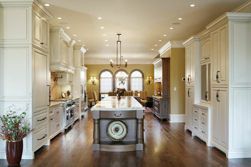
This project began as so many do, as a simple kitchen remodel. Well, maybe simple is the wrong word...From the beginning we had free reign and a blank space with this project. Freedom to move or remove walls and completely revamp and rethink the flow and bones of the kitchen. The only items on the client's wish list were: a fourteen foot island, a LOT of storage and a Tuscan aesthetic.

Let's start with some before photos:


As you can see the kitchen wasn't small, but the layout was choppy and stuff seemed to be every where. We worked through several different ideas but ultimately decided the only way to get a 14 foot island in this space was to completely remove the butler's pantry and the walk-in pantry, both of which made up the space between the existing kitchen and dining room. As much as the client was all about changing things up and improving the overall flow, she was very reluctant to loose the walk-in pantry. It's a fear a lot of people have and one I actually just wrote about over on about.com. Walk-in pantries are great, don't get me wrong, but there are times when they can be be a major hindrance to the design and this was definitely one of them. After much discussion we assured the client that we would design a cabinet solely dedicated to pantry storage, and make it SO wonderful and  SO functional she would never think of that old walk-in pantry again.

On paper we could see there was going to be a LOT of storage in this kitchen, but just to set our clients mind at ease, Keri and I literally mapped out where everything would go. Basically she showed us her stuff and we made a little road map on her kitchen drawings showing where everything would be stored. It might sound like overkill, but this approach is actually really smart and can make moving back into your space less stressful. It can also help you decide to purge items that you no longer use or want taking up valuable space.

So, after much planning, considering and designing we ended up with this:


By completely opening the space up, not only could we incorporate the large island but we were able to create a bold focal wall, loaded down with storage and symmetry on one side of the room. And a large pantry and hutch on the other.


The range wall is complete with a large, detailed hood, two Sub-Zero IT36 units (refrigerator on top, freezer drawers on bottom), spice and crock pullouts, pot drawers and two Avento lift cabinets for small countertop appliance storage. 

And here's a shot of the pantry cabinet which is loaded down with rollouts, adjustable shelves and door mounted spice racks for additional storage. 


Because we also removed the Butler's Pantry we designed a China Cabinet & a Hutch to store the dining room serving and entertainment pieces. Here is a shot of the china cabinet:


Because this piece sits right in the dining room we really wanted it to feel like a piece of furniture. So, we had it painted the same color as the perimeter cabinetry in the kitchen, and we included a walnut countertop, a v-groove cabinet back and wire mesh to give this piece a true china cabinet vibe. 

Across the room, on the same side of the wall as the pantry we designed this hutch. 


This cabinet was designed in walnut, which is the same finish as the island, but we added custom features such as the feet, a paneled backsplash, a walnut countertop and valance detail to really give it it's own personality. We wanted every piece of the kitchen to be Tuscan, but really paid close attention to the scale and balance of the colors and details to ensure the whole space felt cohesive. 

The island has been present in just about every photo because it's big and can be seen from all angles. How big you say? Well, the island ended up being 190" or 15 feet long. Yes, a fifteen foot island...HELLO STORAGE! It's made completely of walnut and houses an apron front sink, a dishwasher, a microwave drawer, a double trash cabinet, a warming drawer, a cabinet dedicated to tray storage and drawers to house cutlery and other miscellaneous items. And that's just the front. The sides and back of the island also have storage. We have full depth, full height storage with rollouts on the back of the island and two small, but useful curved drawers on each end. Of course there is also room for seating on the back of the island. It's a beast. A big, functional, beautiful beast. 

No Before & After is really complete without a good side by side comparison but this kitchen makes that almost impossible as nothing from the original is even remotely recognizable in the finished product. Projects like these can be challenging, but they are always so rewarding. To be able to completely re-think a space can be extra hard if you live within the walls every day, but sometimes when a new set of eyes gets the chance to imagine what could be, you can end up with a space you never even knew your house was capable of. Cheers to thinking outside the box and making spaces all they can be, no matter how big or how small!

Contractor: Don Overton - GO Construction
Interior Decorator - Rose
Cabinetry & Design - Bell Kitchen & Bath Studios

Before photos by Keri Perry | After photos by Barbara Brown Photography